
A large set of Microsoft Excel data without good formatting is difficult to read. Table objects automatically apply alternating colors from one row to the next, which is great for keeping your eye on a specific record, but if you’re working with grouped Excel data, the alternating lines aren’t particularly helpful. I’ll show you how to use a conditional formatting rule in Excel to apply a brightly colored border line to divide groups.
I’m using Microsoft 365 on a Windows 10 64-bit system, but you can use earlier versions through 2007. For your convenience, you can download the demonstration .xlsx file. Excel for the web will display the conditional format, but you can’t apply a formatting rule yet.
SEE: Software Installation Policy (TechRepublic Premium)
How to convert Excel data into a Table object
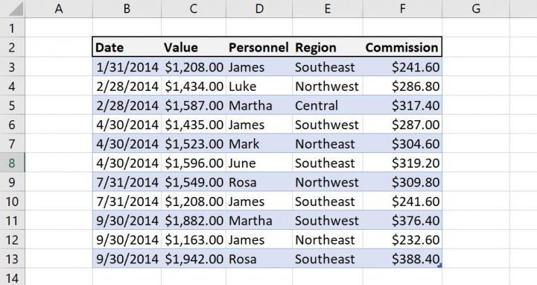
The easiest way to make Excel data more readable is to convert the data into a Table object (Figure A).
Figure A
To create an Excel Table object, click anywhere inside the data and press Ctrl + T. In the resulting dialog, make sure the range is correct and check or uncheck the My Table Has Headers options accordingly.
You’re not stuck with the default formatting. You can quickly reformat the entire Excel Table in two ways.
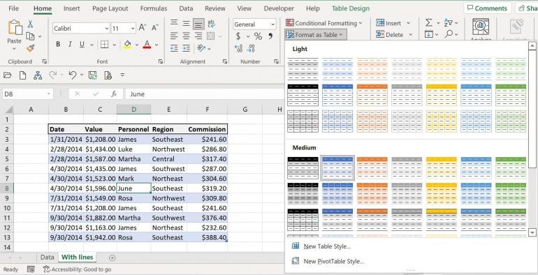
- On the Home tab, click the Format As Table dropdown in the Styles group and select any of the styles in the resulting dropdown (Figure B).
- On the contextual Table Design tab, choose any of the styles in the Table Styles group. The offerings are the same in both options.
Figure B
Knowing that you can make this quick change is enough; we’re not going to assign a new style at this time. What none of these styles offer is a way to distinguish groups.
How to display a conditional line in an Excel sheet
When you have a busy sheet with dozens of rows and several different data groups, not only will the groups be more difficult to distinguish, but mistakes are almost certain.
A quick solution is to apply an Excel conditional formatting rule that will display a red line between data groups. You can display that red line along the cells’ top border or bottom border. If you go with the bottom, you’ll end up with a line at the bottom of your Table, which you might not want. If the Table displays a Total row at the bottom, the red border will override the Table’s double line between the data and the Total row. I’ll show you how to apply the top border rule and mention the bottom border instructions when they’re different.
You must sort the Excel data by the group column for this conditional format to work. With a different sort parameter, the lines have no meaning and will add to the sheet’s noise. Subsequently, this technique is best applied to data that isn’t often sorted.
Now, let’s add that red border line.
- Select the data set but don’t include the header row (B3:F13).
- On the Home tab, click Conditional Formatting in the Styles group and select New Rule from the dropdown.
- In the resulting dialog, choose Use a Formula To Determine Which Cells To Format in the top pane.
- In the bottom pane enter the following formula: =$B2<>$B3
- You want to reference the header cell. That’s what makes it possible to display the border along the top of the cells. Enter =$B3<>$B4 instead if you prefer the border along the bottom. The $ character is required: If you omit it, the rule won’t work as expected.
- Click Format.
- Click the Border tab.
- Select the solid line type at the bottom of the Style list. Unfortunately, you can’t change the line weight.
- Choose red from the Color dropdown.
- In the Border sample box, click the top line (Figure C). If you want the bottom border, click it in the sample box.
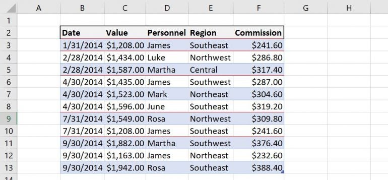
- Click OK twice to return to the sheet (Figure D).
Figure C
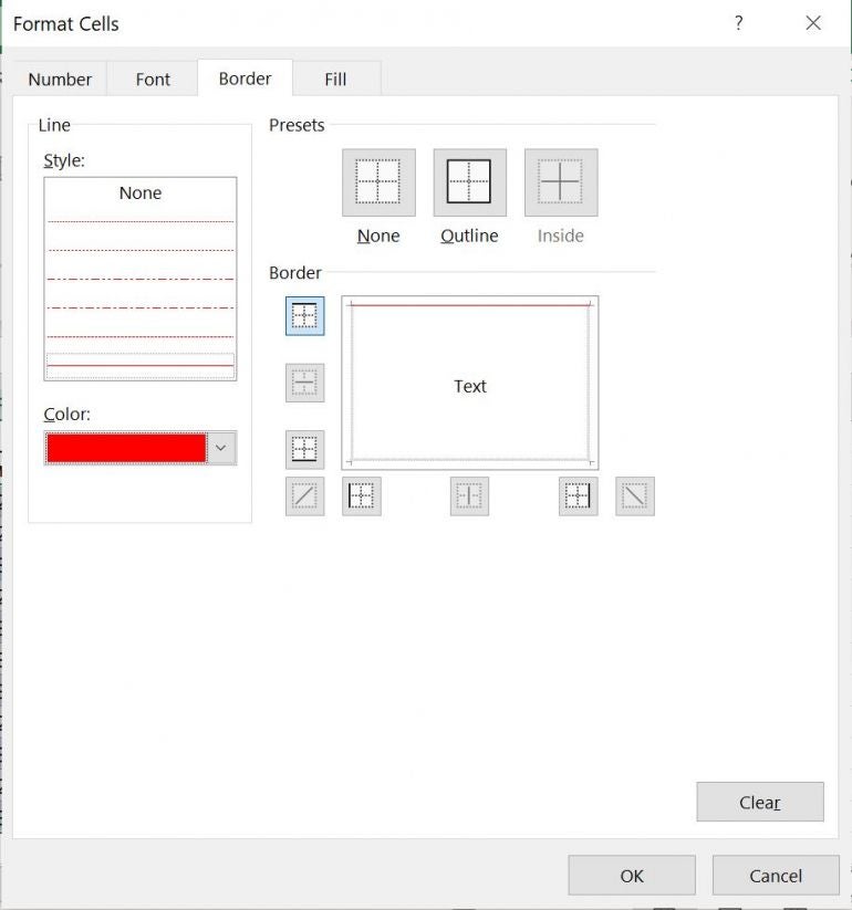
Figure D
You can change the border color and style, but as I mentioned, you can’t increase the weight. Remember to sort if you add new records or change the data for an existing record.
Stay tuned
Use Excel’s conditional formatting feature to display a border between data groups. In a future article, I’ll show you how to use a Fill property to distinguish groups.