Five Apps: Advanced tools for analyzing big data - TechRepublic

Five Apps: Advanced tools for analyzing big data

  • big-data-explosion.jpg

    Five Apps to turn your data into big data

    This\r\ngallery is also available as a TechRepublic article.

    Over the last few years, big data has become a big deal. Between\r\nsites like Data.gov, the massive amounts of\r\ndata each person generates both privately and on social media, and every\r\norganization’s rapidly increasing databases, big data is one of the most\r\nimportant things IT professionals need to understand and deal with. Reports and\r\nDashboards are just the beginning with big data – requirements now include\r\npredictive analyses and other more advanced tools.

    \r\n\r\nFor this edition of Five\r\nApps, we take a look at five tools to help you analyze your big data.

    \r\n\r\n

    Credit: Image by Wally\r\nBahny for TechRepublic

  • a1_datameer.JPG

    Datameer 1

    Five Apps

    \r\n\r\n

    1. Datameer

    \r\n\r\n

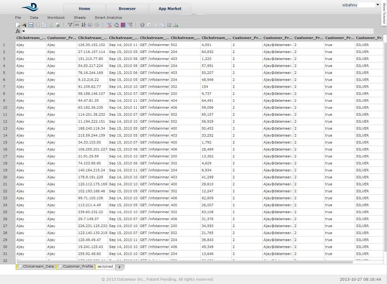
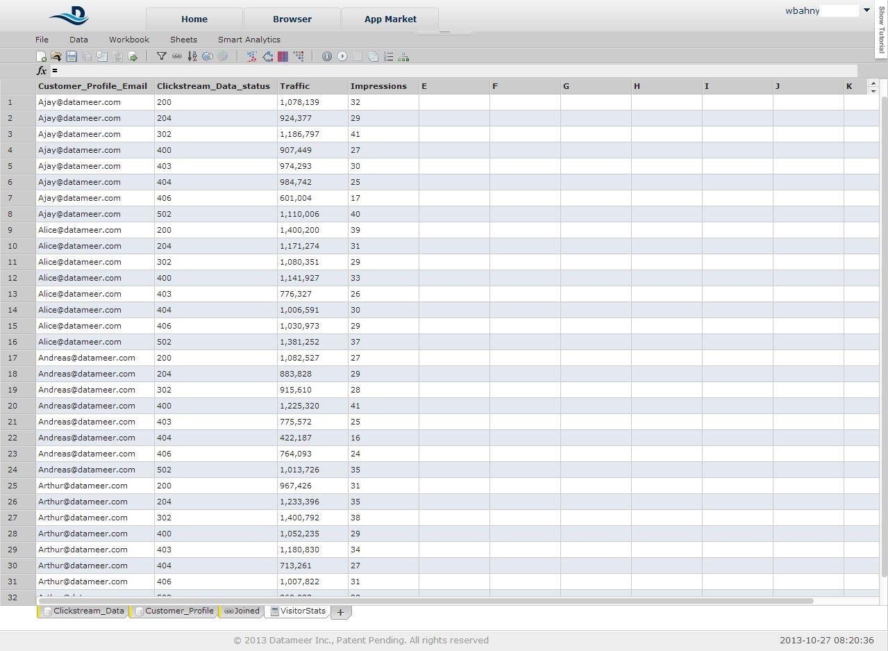
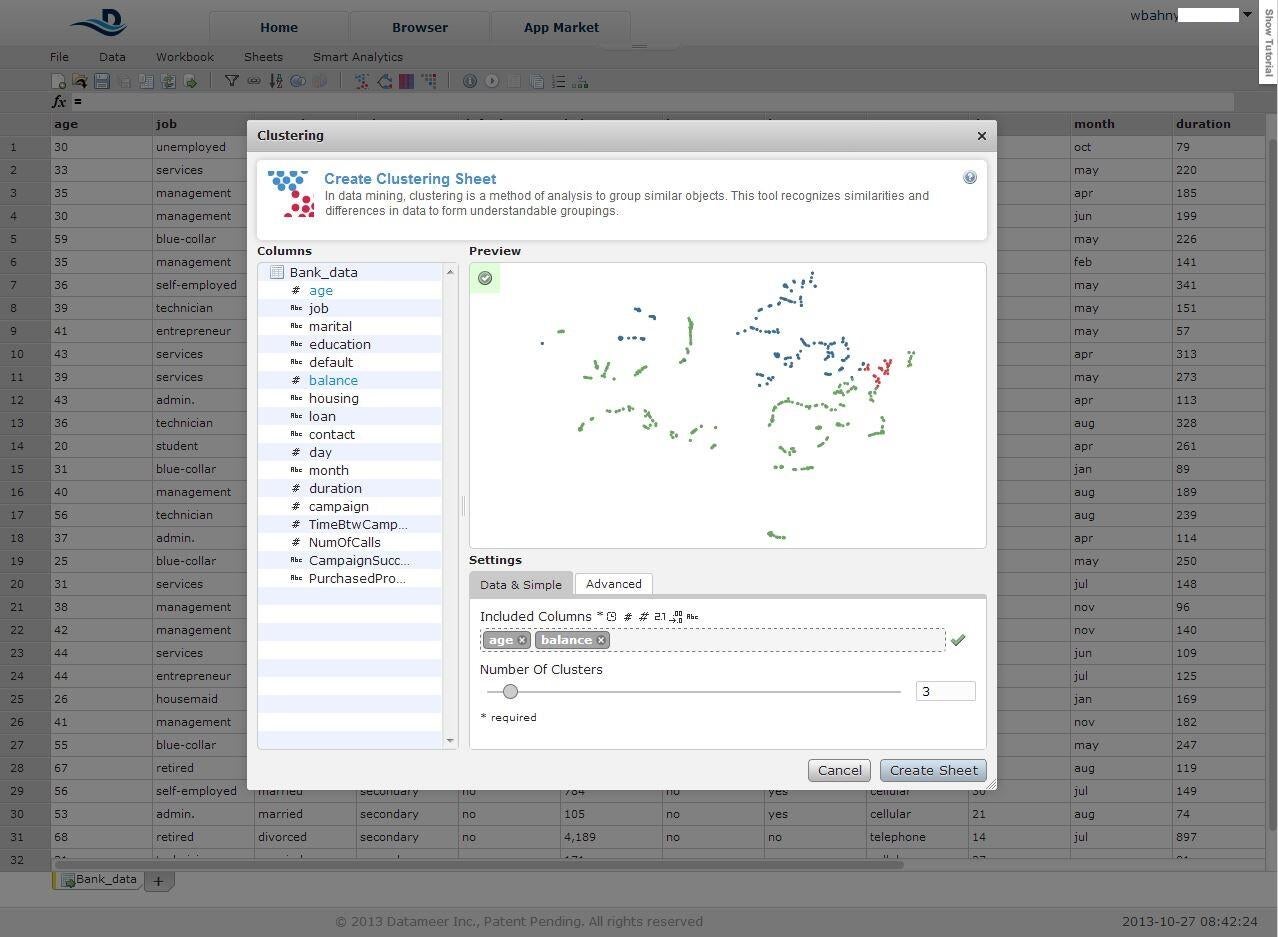
    Datameer is, on its\r\nsurface, a basic analysis tool. It has a spreadsheet-like interface and\r\ncontains many of the same charts and graphs. However, it surpasses Excel and\r\nother spreadsheet programs by allowing the user link to active data sources as\r\nwell as import flat files as well as joining two tabs together into a third, much\r\nlike you join tables in a database.

    \r\n\r\n

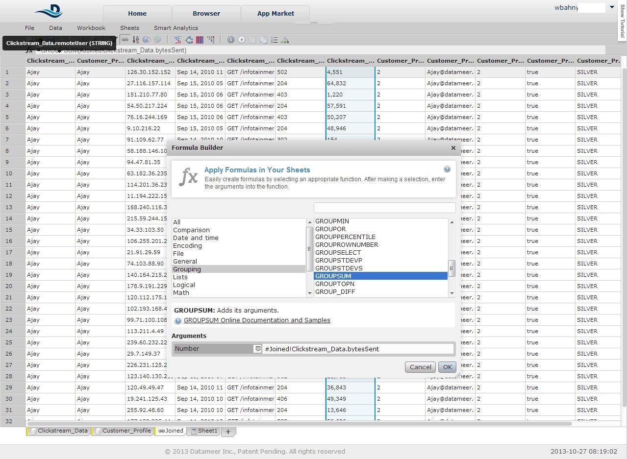
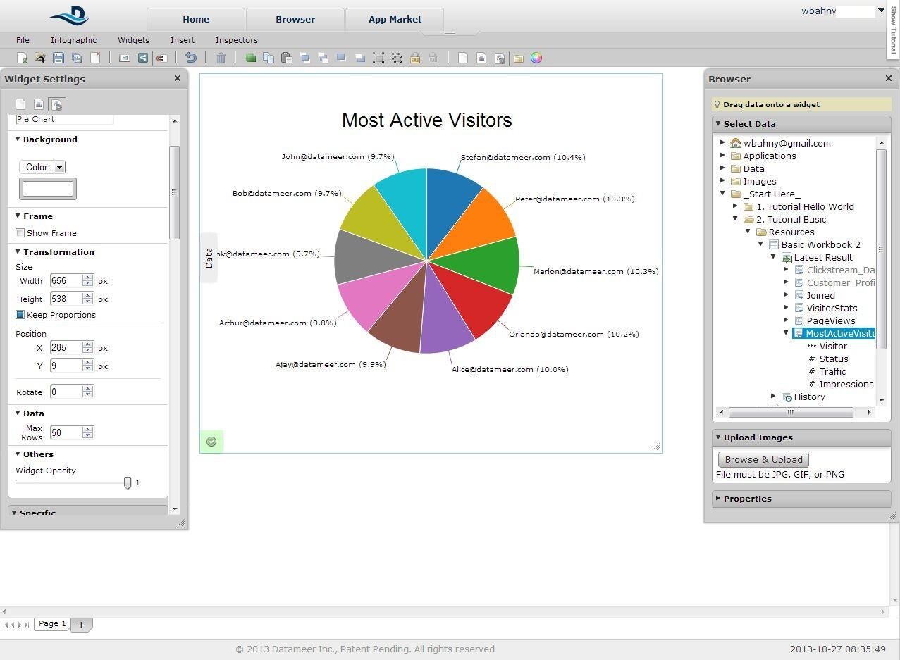
    It also is much more column-focused than a spreadsheet – the\r\ntasks you perform, such as Group Bys, are all done with reference to a column\r\nand occupy a column of their own on the destination sheet. Since it is so columnar,\r\nyou can also drag-and-drop columns into charts and graphs easily instead of\r\nhaving to specify ranges like in Excel. Charts and graphs come with many\r\nconfiguration options including manual colors, font sizes, layout, and\r\npositioning.

    \r\n\r\n

    The final feature of Datameer is Smart Analytics which\r\nincludes Clustering, Decision Trees, Recommendations (Heat Charts), and Column\r\nDependencies tools. Datameer starts at $299/year for a single user and has\r\nWorkgroup and Enterprise licensing available.

    \r\n\r\n

    Credit: Image by Wally\r\nBahny for TechRepublic

  • a2_datameer.JPG

    Datameer 2

    Credit: Image by Wally\r\nBahny for TechRepublic

  • a3_datameer.JPG

    Datameer 3

    Credit: Image by Wally\r\nBahny for TechRepublic

    Wally
  • a4_datameer.JPG

    Datameer 4

    Credit: Image by Wally\r\nBahny for TechRepublic

  • a5_datameer.JPG

    Datameer 5

    Credit: Image by Wally\r\nBahny for TechRepublic

  • b1_jaspersoft.JPG

    Jaspersoft 1

    2. Jaspersoft

    \r\n\r\n

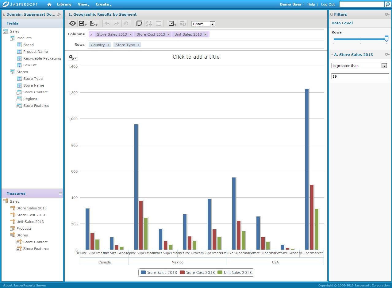
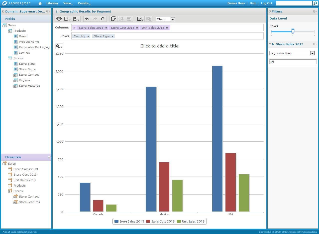
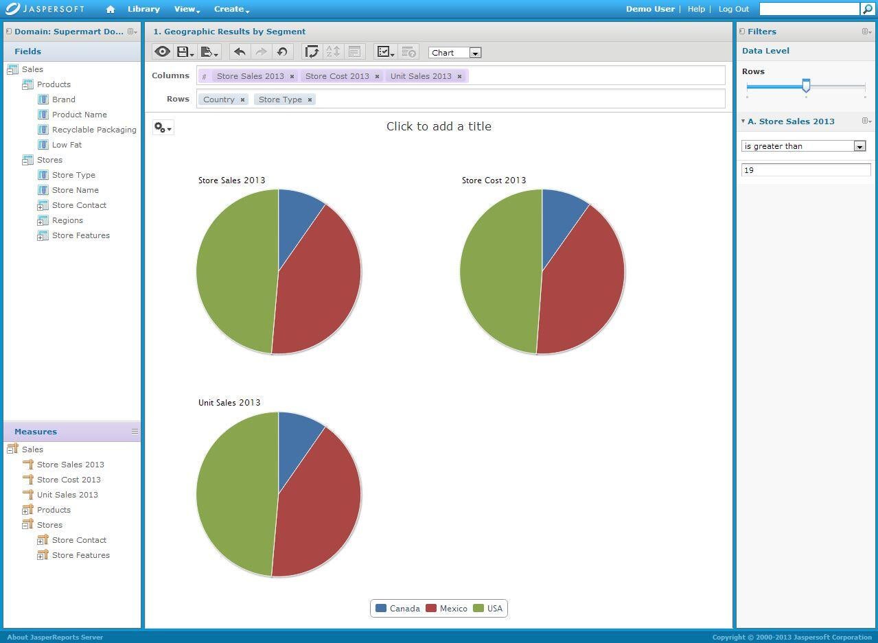
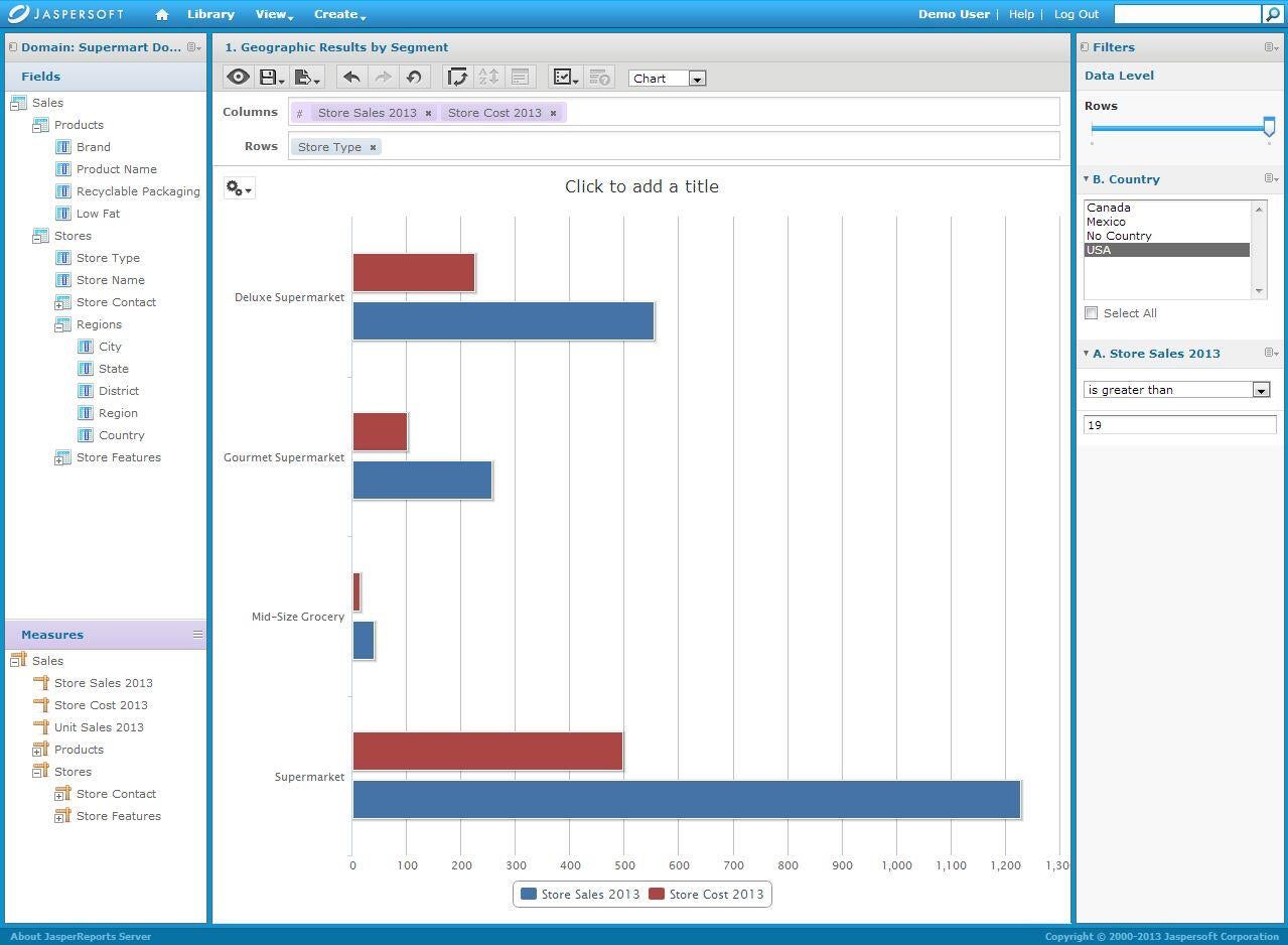
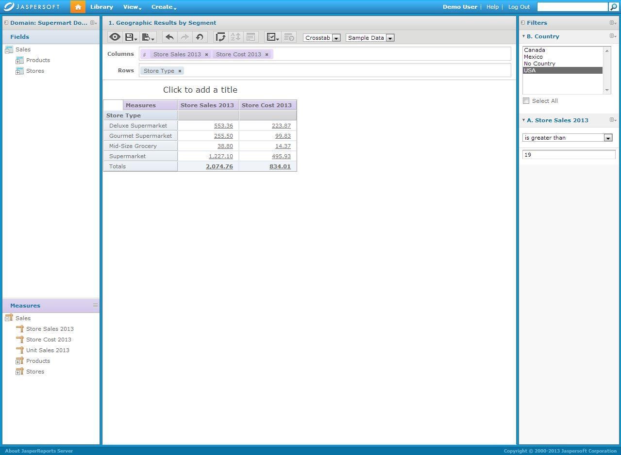
    Jaspersoft is a\r\ndrag-and-drop GUI that allows you to combine your data in various ways using\r\nthe built-in charts, graphs, and crosstab views. You can see various types of\r\ndata side-by-side by dropping those as Columns and break it down by various\r\ncategories as Rows. One of the nicest features of Jaspersoft is the Data Level\r\nfilter at the top right. It allows you to scale back your Rows or Columns to a\r\nlower level of detail (such as viewing sales by Country instead of by Country\r\nand then by Store Type) without having to remove those data points from the\r\ngraph altogether. Jaspersoft offers several different editions of their\r\nsoftware from the free Community Edition to various on-site versions licensed\r\nby server processor to an AWS-based version licensed per-hour. Pricing info is\r\navailable from the sales team.

    \r\n\r\n

    Credit: Image by Wally\r\nBahny for TechRepublic

  • b2_jaspersoft.JPG

    Jaspersoft 2

    Credit: Image by Wally\r\nBahny for TechRepublic

  • b3_jaspersoft.JPG

    Jaspersoft 3

    Credit: Image by Wally\r\nBahny for TechRepublic

    Wally
  • b4_jaspersoft.JPG

    Jaspersoft 4

    Credit: Image by Wally\r\nBahny for TechRepublic

  • b5_jaspersoft.JPG

    Jaspersoft 5

    Credit: Image by Wally\r\nBahny for TechRepublic

  • c1_penthallo.JPG

    Pentaho 1

    3. Pentaho

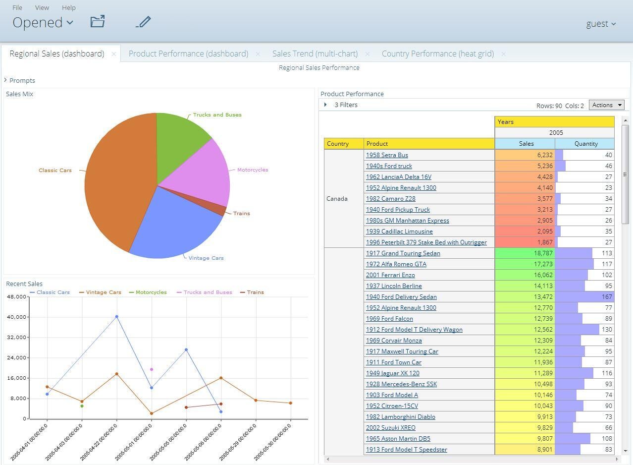
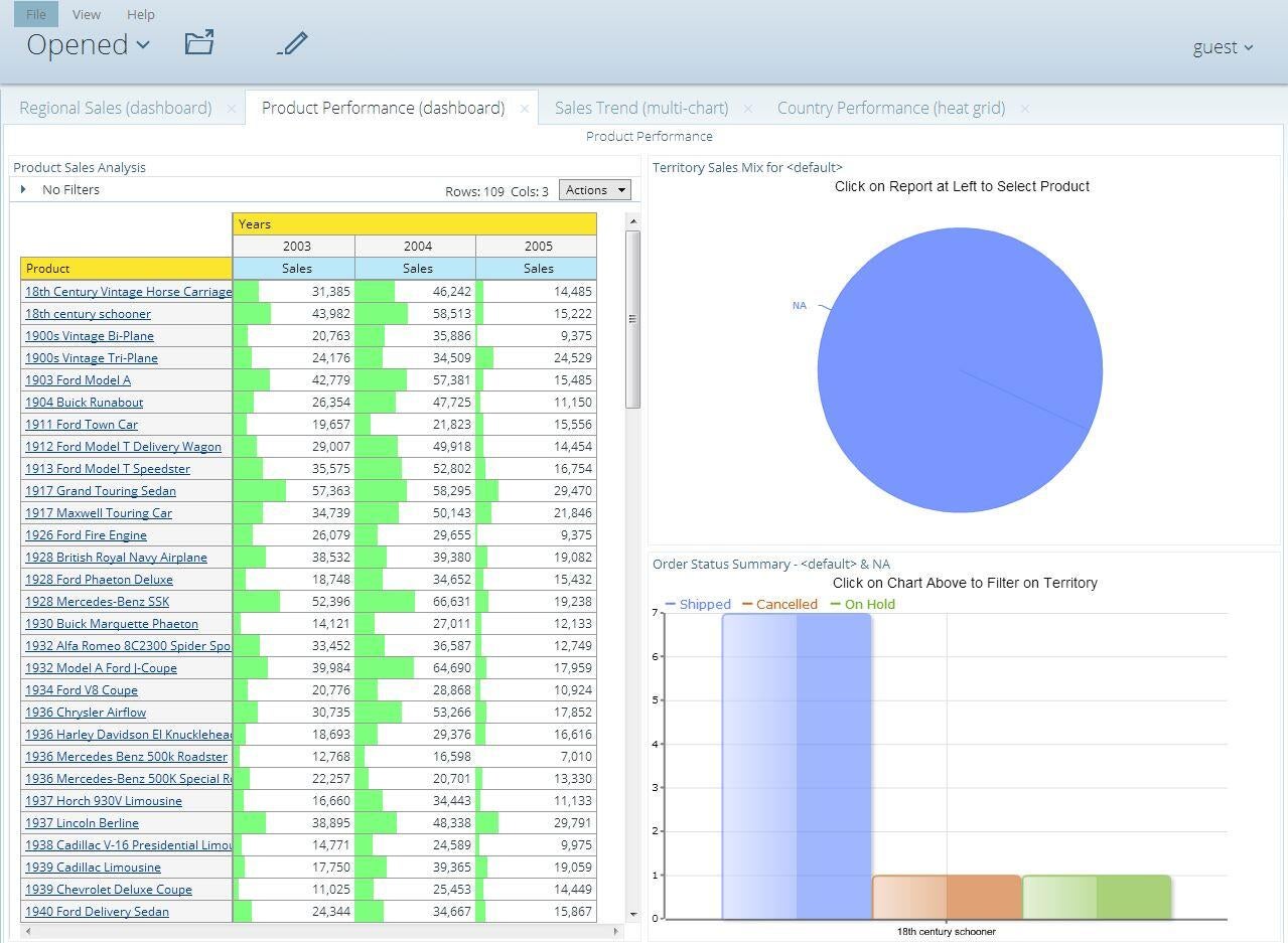
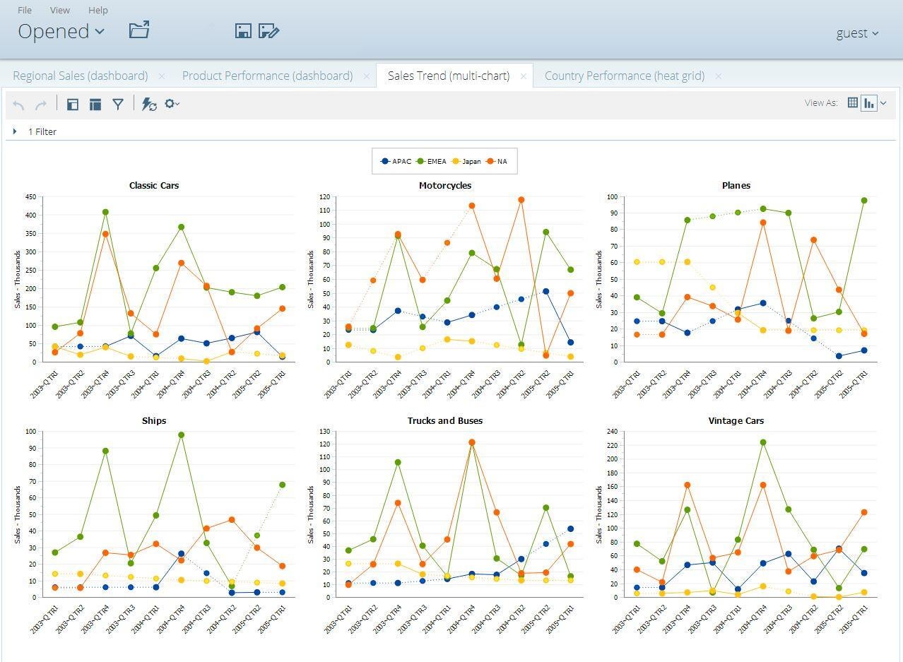
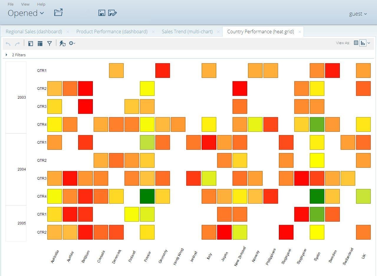
    \r\n\r\nInstead of being a dynamic\r\nreporting tool, Pentaho allows you to\r\ncreate fixed structure reports and dashboards which are then tied to a dynamic\r\ndata source. This is great for companies whose users do not have the skill or\r\nare unwilling to take the time to create their own visualizations. Pentaho has\r\nthe typical charts and graphs, such as pie, bar, line, etc., as well as\r\ncrosstab views. It also has heat grid reports to compare performance among\r\nvarious measures. Like the other systems on this list, Pentaho can link up with\r\nvarious source databases. Pricing is available from the sales team.

    \r\n\r\n

    Credit: Image by Wally\r\nBahny for TechRepublic

  • c2_penthallo.JPG

    Pentaho 2

    Credit: Image by Wally\r\nBahny for TechRepublic

  • c3_penthallo.JPG

    Pentaho 3

    Credit: Image by Wally\r\nBahny for TechRepublic

  • c4_penthallo.JPG

    Pentaho 4

    Going Deep on Big Data

    \r\n\r\n

    Big data is\r\ntransitioning from one of the most hyped and anticipated tech trends of recent\r\nyears into one of the biggest challenges that IT is now trying to wrestle and\r\nharness. We\r\nexamine the technologies and best practices for taking advantage of big data\r\nand provide a look at organizations that are putting it to good use.

    \r\n\r\n

    Credit: Image by Wally\r\nBahny for TechRepublic

    Wally
  • d1_SAS_Vis.JPG

    SAS Visual Analytics 1

    4. SAS Visual Analytics

    \r\n\r\n

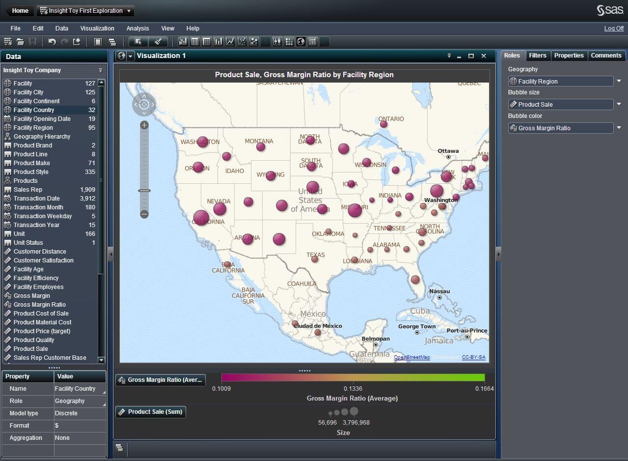
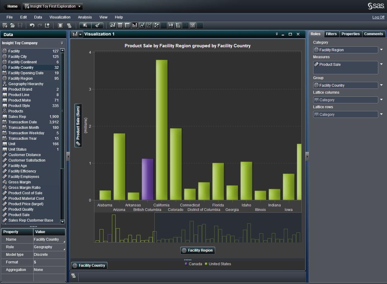
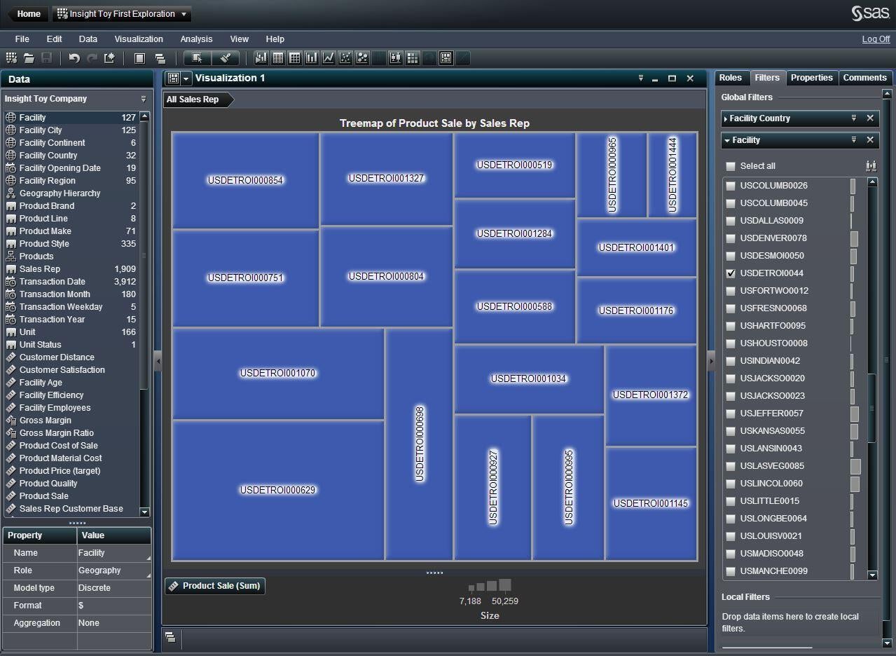
    Easily recognized as the biggest name on this list, SAS has\r\nentered the big data fray with their Visual Analytics\r\nsoftware. However, it is, for the most part, roughly equal to the other\r\nproducts here. Data is brought into the system either by flat file or database\r\nlinks, and various charts, graphs, and visualizations are easily created.

    \r\n\r\n

    It stands out, however, in the way that it displays that\r\ninformation. Where the other products were somewhat vague as to what the data\r\nvalues were, SAS Visual Analytics always seems to provide a legend, especially\r\nin geographical visualizations, heat maps, and the like. One visualization I\r\ndid not see present in their set was the pie chart, however they seem to have\r\nreplaced it with a treemap, which can have the same effect, although may be\r\nharder for some to understand.

    \r\n\r\n

    The other standout feature, to me was the quick glance\r\nfeature when selecting data filters. You can easily see the relative size of\r\nthe data in each data point so you know somewhat what you’re getting into. SAS\r\nVisual Analytics pricing is available from the sales team.

    \r\n\r\n

    Credit: Image by Wally\r\nBahny for TechRepublic

    Wally
  • d2_SAS_Vis.JPG

    SAS Visual Analytics 2

    Credit: Image by Wally\r\nBahny for TechRepublic

  • d3_SAS_Vis.JPG

    SAS Visual Analytics 3

    Credit: Image by Wally\r\nBahny for TechRepublic

  • e1_splunk.JPG

    Splunk 1

    5. Splunk

    \r\n\r\n

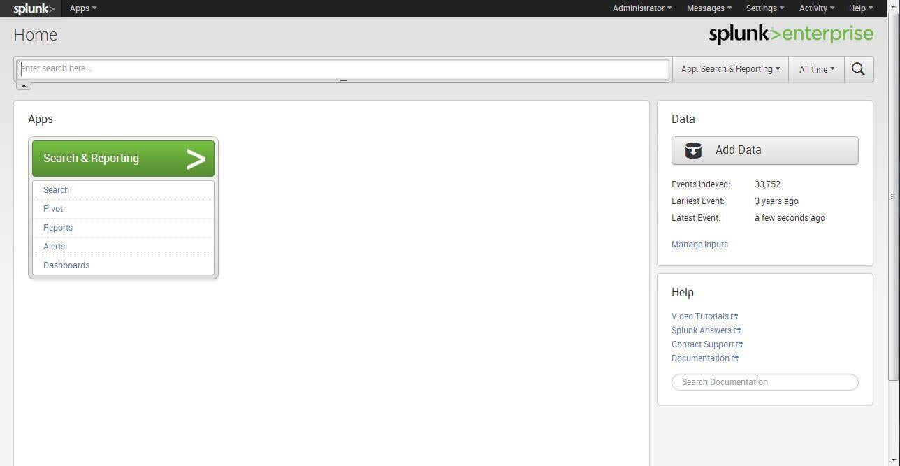
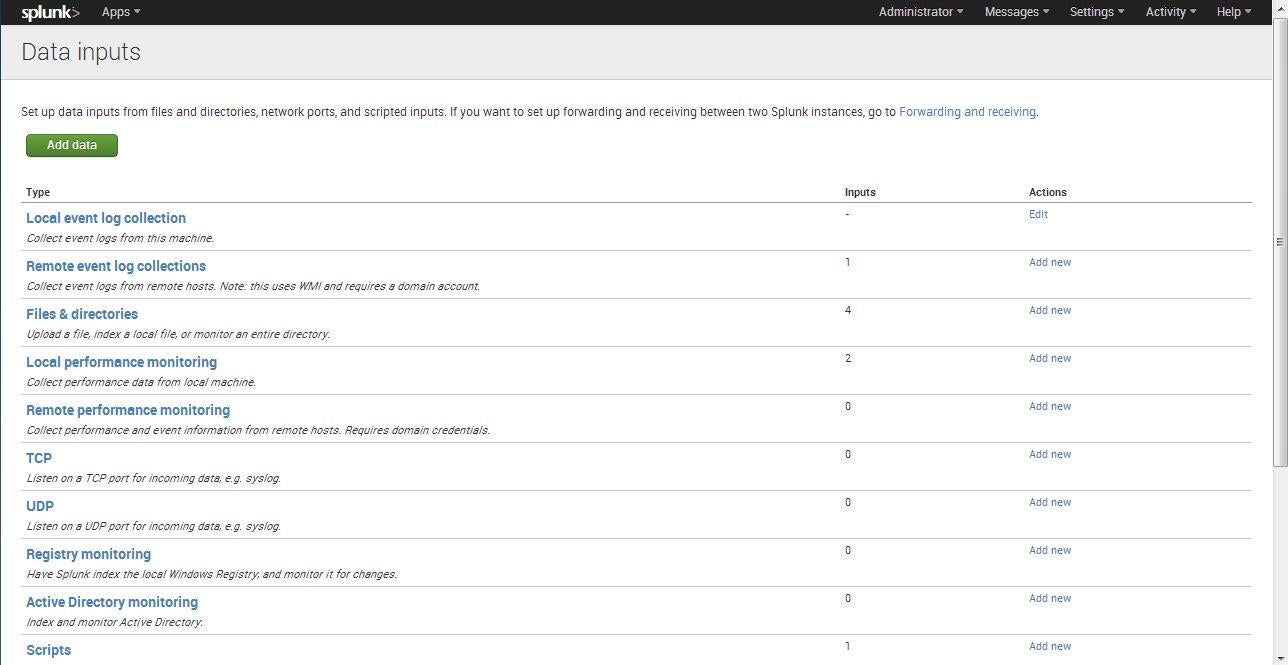
    While it connects to traditional data sources like the other\r\nsystems on the list, Splunk is the only\r\nproduct that can connect to system event logs, system performance monitors,\r\ndirectory trees, TCP/UDP connections, and Active Directory systems. Given that\r\nvast array of non-traditional data sources, Splunk is a great solution for\r\nmonitoring big data that, on the surface, doesn’t seem like big data. However,\r\nevent log monitoring alone can generate as much raw data as enterprise EHR and\r\nCRM systems.

    \r\n\r\n

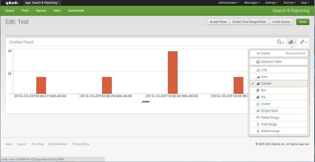
    While it provides the common charts and graphs, Splunk also\r\nhas its own query language that makes it difficult to jump right in to. Anything\r\nbeyond basic charts requires knowledge of the query language. Pricing is\r\nsimple: you pay by the gigabyte indexed per day by the system whether that is\r\non-site or cloud-based.

    \r\n\r\n

    Credit: Image by Wally\r\nBahny for TechRepublic

  • e2_splunk.JPG

    Splunk 2

    Credit: Image by Wally\r\nBahny for TechRepublic

  • e3_splunk.JPG

    Splunk 3

    Bottom line

    \r\n\r\n

    There are many more products available for analyzing your\r\nown big data; these are just a handful offering necessary features. Has your\r\norganization delved into analyzing their big data? If so, have you used any of\r\nthe tools above or different tools? Share your thoughts in the comments below.

    \r\n\r\n

    Going Deep on Big Data

    \r\n\r\n

    Big data is\r\ntransitioning from one of the most hyped and anticipated tech trends of recent\r\nyears into one of the biggest challenges that IT is now trying to wrestle and\r\nharness. We\r\nexamine the technologies and best practices for taking advantage of big data\r\nand provide a look at organizations that are putting it to good use.

    \r\n\r\n

    Credit: Image by Wally\r\nBahny for TechRepublic

    Wally

1 of 21