
Excel 2010 introduced Slicers, which you can use to filter PivotTable and PivotChart objects. A Slicer displays a set of buttons, instead of a dropdown, that you click to quickly filter the data presented in a PivotTable or PivotChart. In a normal sheet, you probably won’t go to the trouble of adding Slicers, but they’re the perfect visual addition to a dashboard–where you want to simply the filtering process for users.
I’m using Excel 2013 on a Windows 7 system. Slicers first appeared in version 2010, so this article won’t instructions for earlier versions. You can work with your own data or download the demonstration .xlsx file.
The process
This technique is simple but there are a lot of steps, so a quick outline of where we’re going should be beneficial:
- The data is in a Table object, but that isn’t strictly necessary.
- We’ll create two PivotTable objects: one for viewing sales by region and one for viewing sales by quarter.
- We’ll generate a PivotChart for each PivotTable object.
- We’ll add a Slicer for each chart.
- We’ll copy everything to a Dashboard sheet.
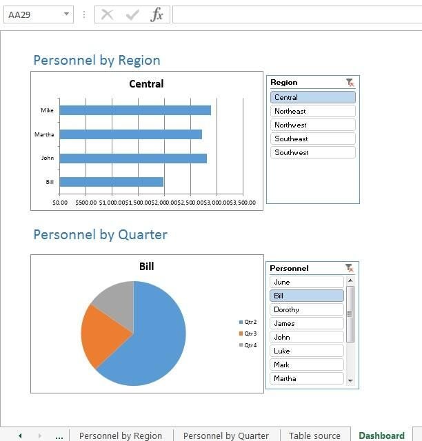
Don’t worry if you don’t know how to create a PivotTable or PivotChart. I’ll provide all the necessary steps to create the simple dashboard shown in Figure A. The data set is simple on purpose, but you can use as many settings as you need to meet more complex requirements.
Figure A: A simple dashboard allows quick filtering of summarized data.
The data
Figure B shows the sample data set converted to a Table object. To convert a data set to a Table, click inside the data set, click the Insert tab, click Table (in the Tables group), specify whether you table has headers, and click OK.
Figure B: A simple data set.
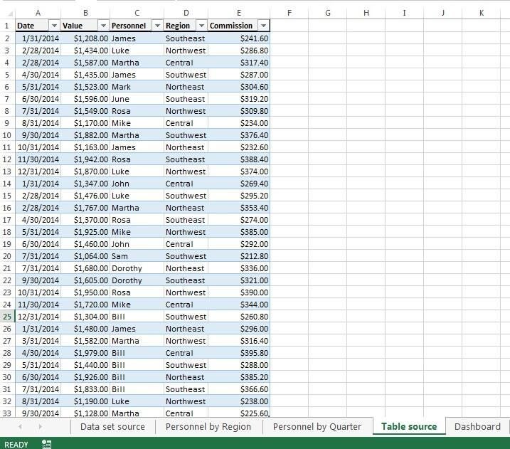
The data is a compilation of sales information by date, personnel, and region. We want to provide an easy-to-use tool that lets users view sales by personnel and quarter in a dashboard setting.
The PivotTables
The first step is to create the two PivotTables. Strictly speaking, you don’t need this step because Excel will create a PivotTable when you create a PivotChart. If you’re unfamiliar with generating either, this step provides a learning opportunity for creating a PivotTable. If you already know how to do this, you can skip this section.
To create the Personnel by Region first, do the following:
- Click inside the data set and then click the Insert tab.
- In the Tables group, click PivotTable and click OK. We’ll rely on the defaults, so you don’t need to change any settings.
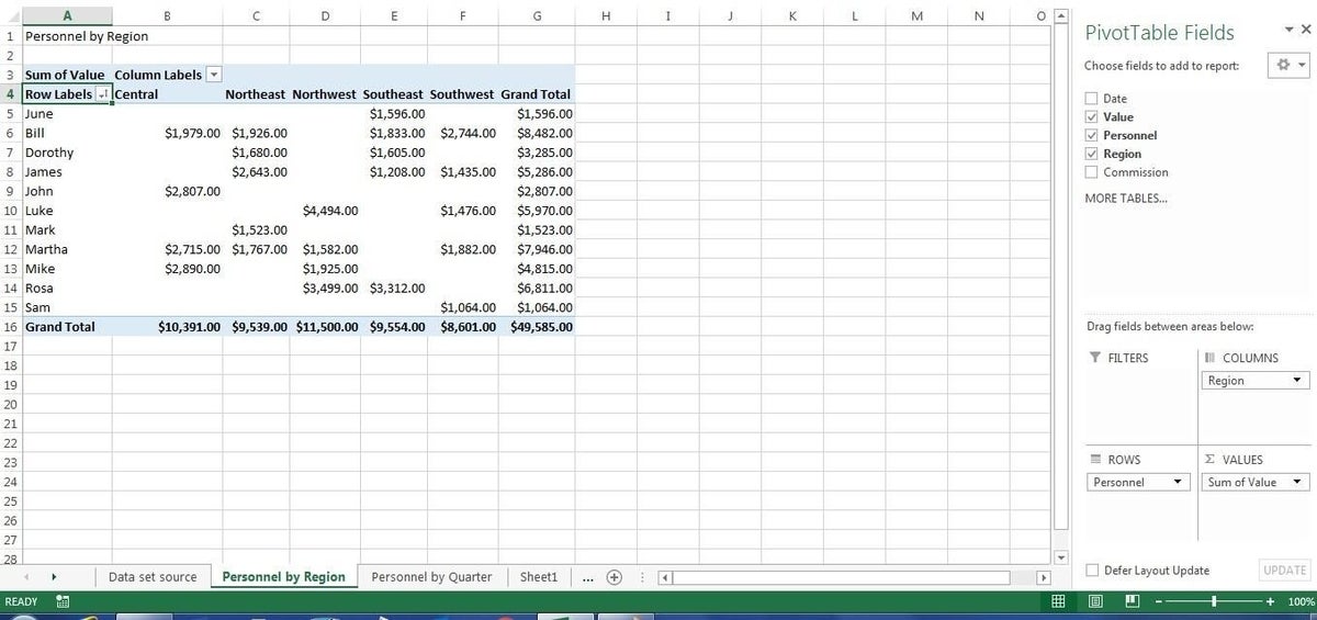
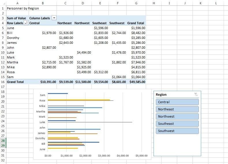
In the PivotTable Fields pane, drag Personnel to the Rows section, Region to the Columns section, and Value to the Values section (Figure C). If the Values function defaults to something other than Sum, change it by clicking the field dropdown (in the Values section), choosing Value Field Settings, selecting Sum on the Summarize Values By tab, and clicking OK.
Figure C
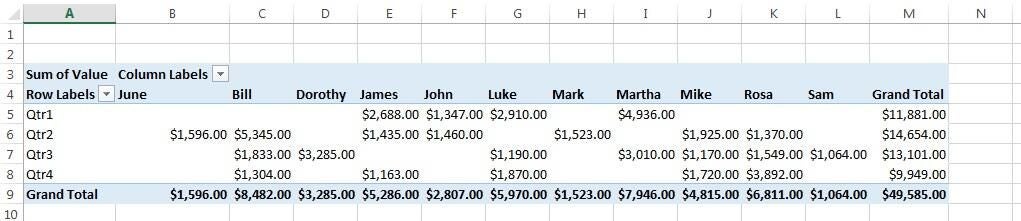
Create the second PivotTable the same way, but drag Date to the Rows section and Personnel to the Columns section. Then, group the resulting PivotTable as follows:
- Right-click any cell in the Row Labels column and choose Group (Figure D).
- In the By list, unselect Months (or the default selection), choose Quarters (Figure E), then click OK (Figure F).
Figure D
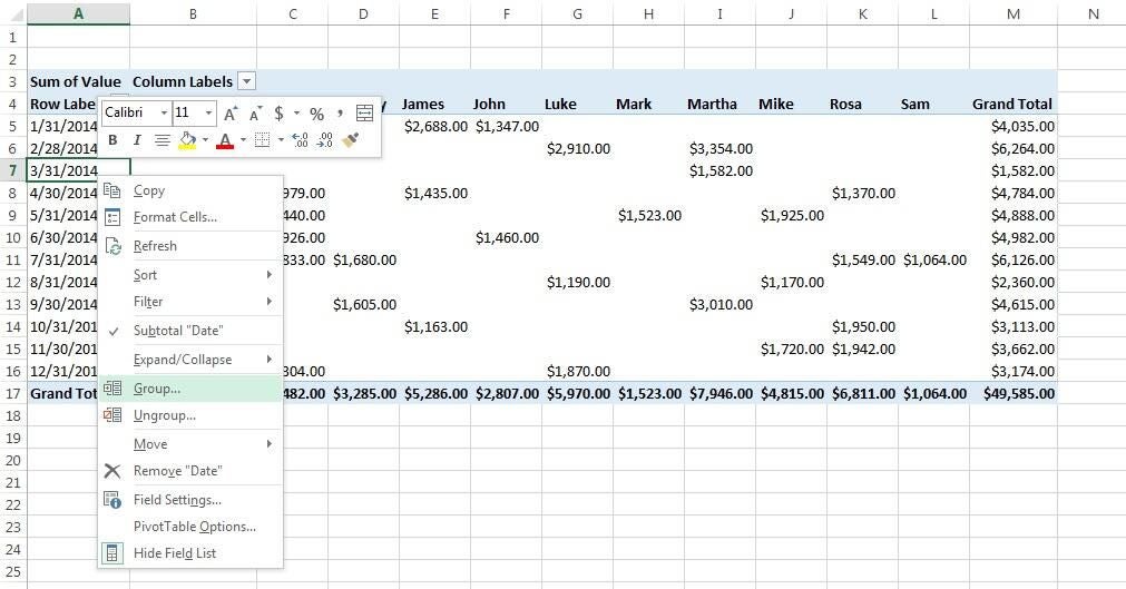
Figure E
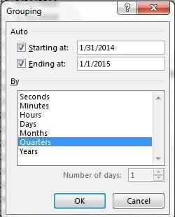
Figure F
The PivotCharts
A PivotTable is a great way to summarize data, but we want a chart. So the next step is to base a PivotChart on each of the PivotTables. Let’s start with the Personnel by Region chart:
- Click inside the PivotTable.
- On the contextual Analyze tab, click PivotChart in the Tools group.
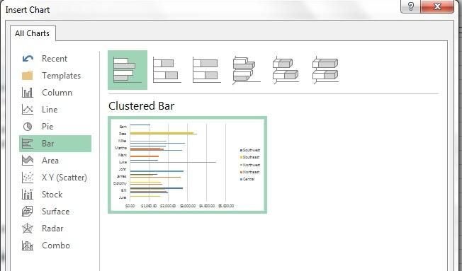
- Select Bar (Figure G) and click OK.
Figure G
If you skipped the last step and want Excel to generate both at the same time, click inside the data set and then click Insert. In the Tables group, choose PivotChart from the PivotTable dropdown. If necessary, change the chart type.
Repeat the process for Personnel by Quarter, but choose a Pie chart. I’m not a huge fan of pie charts, but I chose it here to make the charts distinct. You can choose any chart type you like.
You’ll want to customize the formatting. I removed the legend from both the bar chart and the field buttons, as they’re not required in the dashboard configuration. In Excel 2013, click the Chart Elements icon to the right of the chart to remove unwanted components. In Excel 2010, choose the contextual Layout tab. To remove the field buttons, right-click one and choose Hide All Field Buttons on Chart.
The Slicers
Now you’re ready to add the filtering Slicers for each chart. Let’s start with the Personnel by Region chart:
- Select the PivotChart.
- Click the contextual Analyze tab.
- Click Insert Slicer in the Filter group.
- Check the Region field (Figure H), and click OK (Figure I).
Figure H
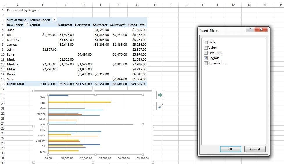
Figure I
Repeat the process to add a slicer for Personnel by Quarter, but select the Personnel field in step 4. Don’t worry if the charts don’t look quite right to you yet.
The dashboard
At this point, you’re almost done. It’s a simple process to copy the objects to a blank sheet to create the dashboard. To do so, select a PivotTable and its Slicer by holding down Ctrl while clicking both. Then, press Ctrl + C. Move to the dashboard sheet and press Ctrl + V to copy both to the blank sheet. Repeat the process to copy the second set. To complete the picture, turn off the gridlines and headers by unchecking those options on the View tab (in the Show group).
Initially, the charts don’t seem effective because they’re not filtered. Figure A (from the beginning of the article) shows the filtered charts. Click Central for the Personnel by Region chart and Bill for the Personnel by Quarter chart. To remove a filter, click the Filter icon in the Slicer’s top-right corner.
Use each Slicer to filter its chart by region and personnel accordingly. Users can quickly see the sales for each region by personnel or by the sales for each quarter by personnel. Admittedly, the charts are simple, but the emphasis is on the technique. When creating your own dashboard using these components, you might need more formatting or initial filtering and grouping at the PivotTable level.
Simple might be best
Although you might be tempted to display complex charts in this manner, I recommend that you start simple and use only as much filtering, grouping, and other summarizing options as you need. The more options you add, the more unpredictable the results can be–and sometimes, you’ll end up with results you didn’t anticipate. If you need more, consider more charts. Each PivotTable and Slicer should have a specific purpose, not several. That’s the essence of a dashboard.
Send me your question about Office
I answer readers’ questions when I can, but there’s no guarantee. When contacting me, be as specific as possible. For example, “Please troubleshoot my workbook and fix what’s wrong” probably won’t get a response, but “Can you tell me why this formula isn’t returning the expected results?” might. Please mention the app and version that you’re using. Don’t send files unless requested; initial requests for help that arrive with attached files will be deleted unread. I’m not reimbursed by TechRepublic for my time or expertise when helping readers, nor do I ask for a fee from readers that I help. You can contact me at susansalesharkins@gmail.com.
-
Also read…
- Make summarizing and reporting easy with Excel PivotTables
- Four Outlook features that will improve your efficiency
- Three advanced tips for Word’s table of contents feature
- Office Q&A: Excel built-ins and helper formulas
Other dashboard techniques?
What approaches have you taken to creating a business-friendly dashboard? Share your suggestions with fellow TechRepublic members.