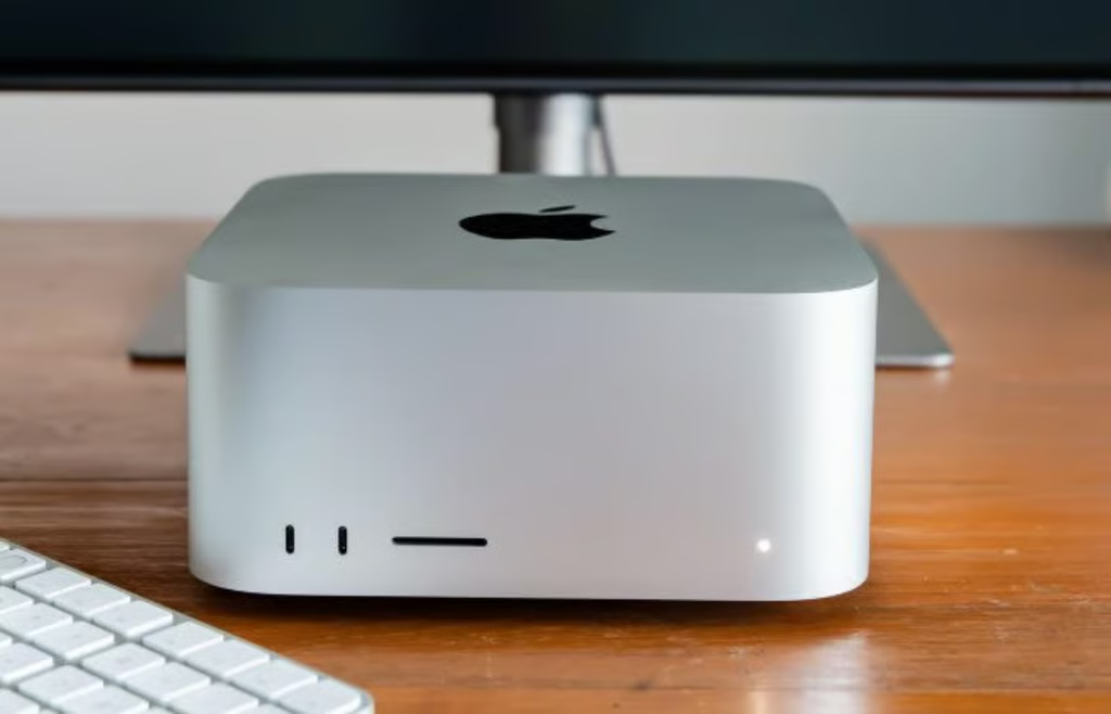
One very popular background effect for web pages is the college-ruled, three-hole-punched paper that students stock up on every year at the start of a new school year. Well, there is a way to recreate that background effect without using images and with just pure CSS3 coding.
In this short demonstration, I will concentrate on the bare bones of getting a background lined-paper effect as well as including a portion of the area as content editable for your users, using the CSS linear-gradient as a background image. There are dozens of resources for emulating the ruled and lined paper effect with pure CSS; however, I have to give credit for my inspiration to the anonymous guest on PasteBin who posted the Editor Bookmarklet code just a few months back.
The HTML
Just five lines of HTML code make up the essentials which include the section element with a class equals paper, and within the section are two article elements. The first article includes the paper header and the second article is a content editable space:
<section class="paper">
<article class="head"></article>
<p> </p>
<article contenteditable="true">Start typing your content editable content here!</article>
</section>
The CSS
I start with giving the <body> a background style using liner-gradient, and I’ve listed all the vendor prefixes as well:
body {
background: -webkit-linear-gradient(top, rgb(136,199,201) 58%, rgb(202,232,235) 100%);
background: -moz-linear-gradient(top, rgb(136,199,201) 58%, rgb(202,232,235) 100%);
background: -ms-linear-gradient(top, rgb(136,199,201) 58%, rgb(202,232,235) 100%);
background: -o-linear-gradient(top, rgb(136,199,201) 58%, rgb(202,232,235) 100%);
background: linear-gradient(top, rgb(136,199,201) 58%, rgb(202,232,235) 100%);
padding: 3%;
height: 94%;
}
The background linear-gradient gives us this nice top-down gradient as shown in Figure B:
Next is the paper style which includes font, width, and height, margin set to zero, auto, padding, and a relative position. We also set the line-height, border, and another background linear gradient is utilized to create the light blue horizontal lines. The paper style also includes a background-size, and a border-radius for the three pixel rounded corners of the page.
.paper {
font: normal 12px/1.5 "Lucida Grande", arial, sans-serif;
width: 50%;
height: 80%;
margin: 0 auto;
padding: 6px 5px 4px 42px;
position: relative;
color: #444;
line-height: 20px;
border: 1px solid #d2d2d2;
background: #fff;
background: -webkit-gradient(linear, 0 0, 0 100%, from(#d9eaf3), color-stop(4%, #fff)) 0 4px;
background: -webkit-linear-gradient(top, #d9eaf3 0%, #fff 8%) 0 4px;
background: -moz-linear-gradient(top, #d9eaf3 0%, #fff 8%) 0 4px;
background: -ms-linear-gradient(top, #d9eaf3 0%, #fff 8%) 0 4px;
background: -o-linear-gradient(top, #d9eaf3 0%, #fff 8%) 0 4px;
background: linear-gradient(top, #d9eaf3 0%, #fff 8%) 0 4px;
-webkit-background-size: 100% 20px;
-moz-background-size: 100% 20px;
-ms-background-size: 100% 20px;
-o-background-size: 100% 20px;
background-size: 100% 20px;
-webkit-border-radius: 3px;
-moz-border-radius: 3px;
border-radius: 3px;
-webkit-box-shadow: 0 1px 2px rgba(0,0,0,0.07);
-moz-box-shadow: 0 1px 2px rgba(0,0,0,0.07);
box-shadow: 0 1px 2px rgba(0,0,0,0.07);
width: 816px;
height: 1056px;
}
The ruled paper effect is displayed in Figure C below:
Next, we have the paper before, which sets the left margin and double vertical line on the left side with the content and an absolute position with a pixel width of 4. The top is set to zero, left to 30 pixels, solid border to 1 pixel, and the line is set to transparent with a color of #efe4w4, as shown below.
.paper::before {
content: '';
position: absolute;
width: 4px;
top: 0;
left: 30px;
bottom: 0;
border: 1px solid;
border-color: transparent #efe4e4;
}
The vertical double lined left margin is displayed in Figure D below:
The text area styles set the display to block with a width of 94 percent, the margin 0 and auto, which effectively centers the defined area; other properties include padding, height, and a transparent background.
textarea {
display: block;
width: 94%;
margin: 0 auto;
padding: 3.8% 3%;
border: none;
outline: none;
height: 94%;
background: transparent;
line-height: 20px;
}
Next is the code that places the header section of the paper at the top, and is set to a minimum height of 124 pixels, background color of #FFF, a margin left of negative 42 pixels, and a margin top of negative 4 pixels as shown below.
.head {
background-color: #FFF;
min-height: 124px;
margin-left: -42px;
margin-top: -4px;
}
The completed ruled paper with all the components including the header section showing the top left side of the paper effect is displayed in Figure E below.
The HTML and CSS files which are utilized in this demonstration are available for download. Have you utilized this effect? I would be curious to see how this effect has been implemented in live websites and applications. Share your examples below.


