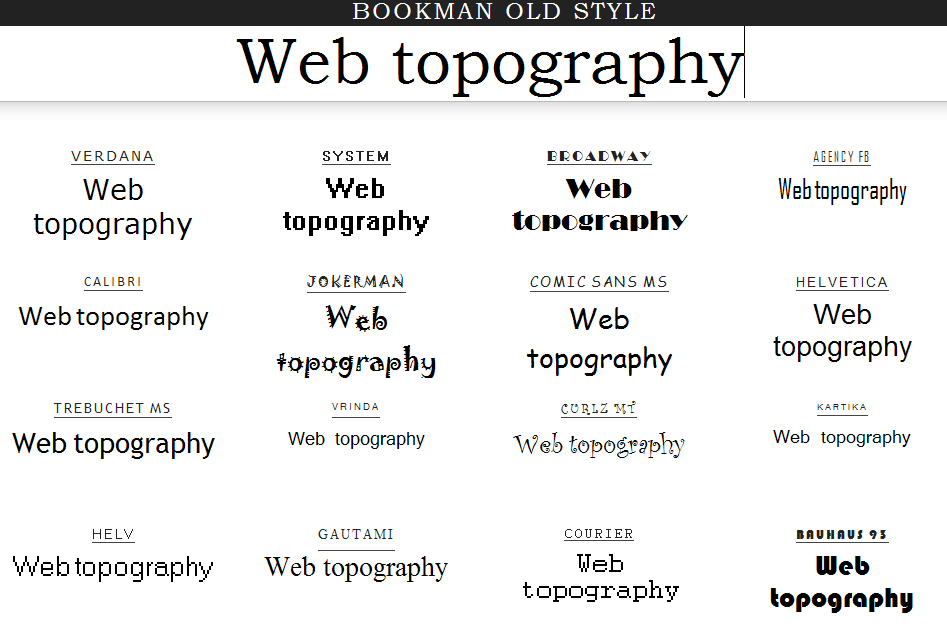
\n\tI first want to make the image a bit lighter and the simple way to do this is with the Hue/Saturation options: With the file open in Photoshop, I add a new layer with the menu path Layer | New Adjustment Layer | Hue/Saturation and then click OK. The Hue/Saturation dialog box opens and the settings are modified as shown.
\n\tBe sure that Colorize is checked, the settings are Hue: 43, Saturation: 28, and Lightness: +16. Of course, you can adjust these settings as you see fit for your application. Now the old paper image looks a bit lighter than the original, and not quite as aged; I also toggle the Hue/saturation layer off and on to compare the difference.
\n
\n\tNext, I am going to add a new layer with some drop shadow to the image, following the menu path Layer | Layer Style | Drop Shadow with the following settings — Blend Mode: Multiply, Opacity: 65%, Angle: 120\u00b0, Distance: 5px, Spread: 2%, and Size: 5px, as shown.
\n\tNothing too ornamental, just fine details that produce better results. The resulting image is shown.
\n\tNext, I am going to create some button backgrounds from the same background texture. With the background layer active and using Polygon Lasso tool, I am going to make a selection from the bottom of the image similar to the one shown.
\n\tThen we will make a new Layer via Copy (Ctrl+J), creating a new layer of the selected piece. I will rename the new layer \u201cButton\u201d, as shown.
\n\tSelect this button layer then modify the positions and orientation by adjusting from the menu bar Edit | Transform | Rotate 180\u00b0. Then using the Move Tool, position the button layer at the top of the background layer and on the far left side as seen here.
\n\tNow, move the button layer below the background layer so that it is positioned behind as displayed here.
\n\tContinue with these steps to create as many different buttons as you desire for your particular layout. I also used the Edit | Transform | Rotate and Skew options to manipulate several of the button placements; have fun with the settings to create your own button layout. Once all the buttons are in place I also go to each button layer individually and add a drop shadow as I had done with the background layer previously. I have added five all together as shown here.
\n\tNow I am going to adjust each button’s hue and saturation the same as I did with the main background layer so that they can be distinguished from each other a bit more than the current settings. Select the button layer you need to adjust, then CTRL+U to make the Hue/Saturation adjustments.My results are displayed here.
\n\tNow, I’ll merge the Background Layer with the original Hue/Saturation layer by highlighting the two layers and then right-clicking over the selection. Click Merge Layers as shown so that color replacements for the buttons will be visible.
\n\tWith the first button layer Button 1 selected, I will use the Replace Color options from the menu path Image | Adjustments | Replace Color, resulting in the Replace Color dialogue box highlighting the settings for Button 2.
\n\tI continue with all the other buttons with these results.
\n\tNow that the button colors are individually replaced, we can add text layers for each. (This is a PSD example only; in part two of the series, we’ll get to the coding in HTML and the CSS will handle the button text.) Here, I am using the font Viner Hand ITC, Regular, 48px, and strong black. Make sure the button layer is selected and active, then select the text tool, and enter your desired text. I’ve added \u201cHome\u201d on the first button.
\n\tI continue with adding other text elements throughout the remaining buttons and the main content background, creating content based on a restaurant website for example purposes. Then I added in some images onto the layout as well.
\n\tI need to add another background layer behind the content body to fill the rest of the page. I think some wood grain or quarry tile type of texture would be appropriate, any grainy surface to add some contrasting effect to the overall appearance, as shown here. Any texture with dissimilarity that helps to draw a distinction to the main content will do; you can pick online from many available textures.
\n\tI’ve added a new layer at the very bottom of the layer pallet order and added the 1600px x 1600px wood texture. Now, what if that particular texture does not have the real divergent quality that I had hoped? Making a few adjustments with the Shadows and Highlights, I can achieve a darker richer contrasting body background; the settings are displayed here. Stepping through from the menu path: Image | Adjustments | Shadow/Highlight… you can adjust the dialog box settings.
\n\tI made just a few more minor adjustments with the food images at the top left to spread them out a little more and overlapped them into the body background; the final layout is seen here.

Selena Frye is a former Senior Editor for TechRepublic. Her background is in technical writing, editing, and research. I edit the Data Center, Linux and Open Source, Apple in the Enterprise, and IT Security blogs.


