
This gallery is also available as a TechRepublic article.
Big Data is here to help you define, re-define, guide, or\r\nbuild a better, more flexible and powerful business. The limits are beyond the\r\nimagination when you have enough data collected. The problem is; what do you do\r\nwith that data once it’s collected? You have to have the means to visualize the\r\ndata in order for it to aid your journey to success.
\r\n\r\n
That doesn’t mean you have to pay a huge cost for a piece of\r\nproprietary software you may use once or twice during the lifetime of your\r\nbusiness. Fortunately, there are plenty of web-based applications that can\r\ndisplay your data, in various fashions, so your company can benefit from the time\r\nspent in designing and collecting the data.
\r\n\r\n
I have found five such applications. Each of them falls into\r\na range of feature sets and complexity; but all of them will get you where you\r\nneed to go. Let’s take a look at these web-based apps and see which one will\r\nbest fit your needs.
\r\n\r\nCredit: Images by Jack\r\nWallen for TechRepublic
\r\n\r\n
\r\n\r\n
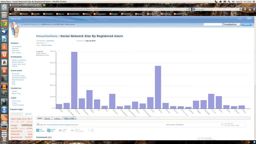
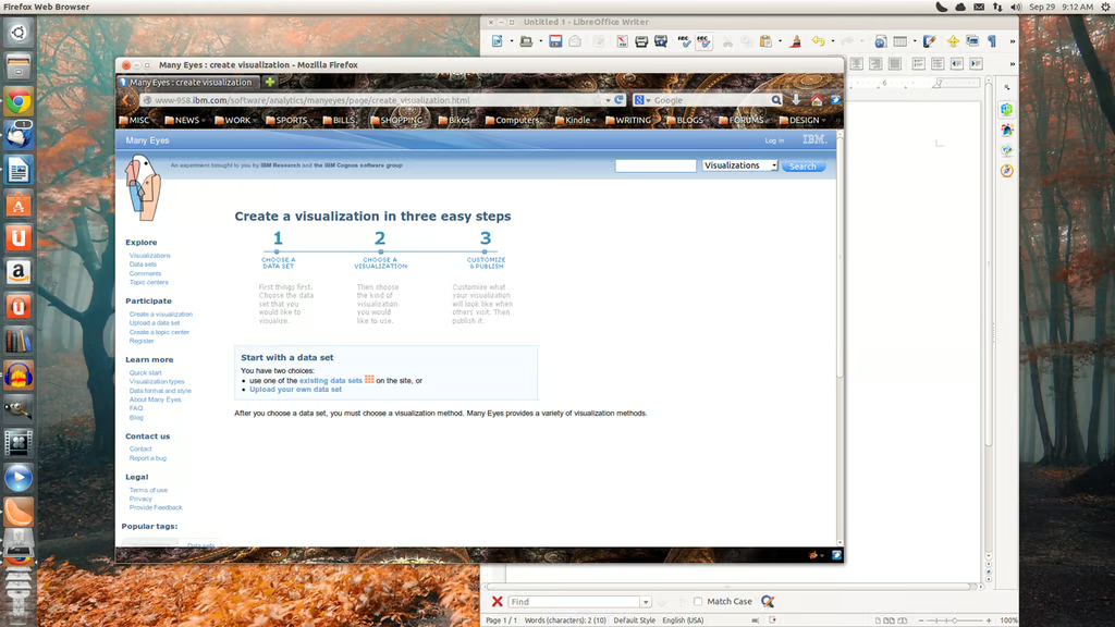
Many\r\nEyes is an experiment, by IBM, that allows you to easily visualize your\r\ndata set. With Many Eyes you can either upload your own data set or make use of\r\nthe many data sets already within the framework. Many Eyes offers multiple\r\nvisualization types, such as: Scatterplot, Matrix Chart, Network Diagram, Bar\r\nChart, Block Histogram, Bubble Chart, Line Graph, Stack Graph, Pie Chart,\r\nTreemap, Word Tree, Tag Clouds, and much more. In order to upload your own data\r\nset, you must be registered (which is free). The one caveat to using Many Eyes\r\nis that your data sets will be made available to the public. Make sure\r\nthe data you are uploading is not sensitive or proprietary. Also, the size\r\nlimit of any given data set is 5MB; so if you’re looking to upload very large\r\ndata sets, you’ll have to turn elsewhere.
\r\n\r\nCredit: Images by Jack\r\nWallen for TechRepublic
Credit: Images by Jack\r\nWallen for TechRepublic
\r\n\r\n
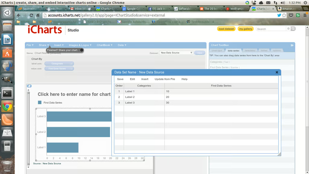
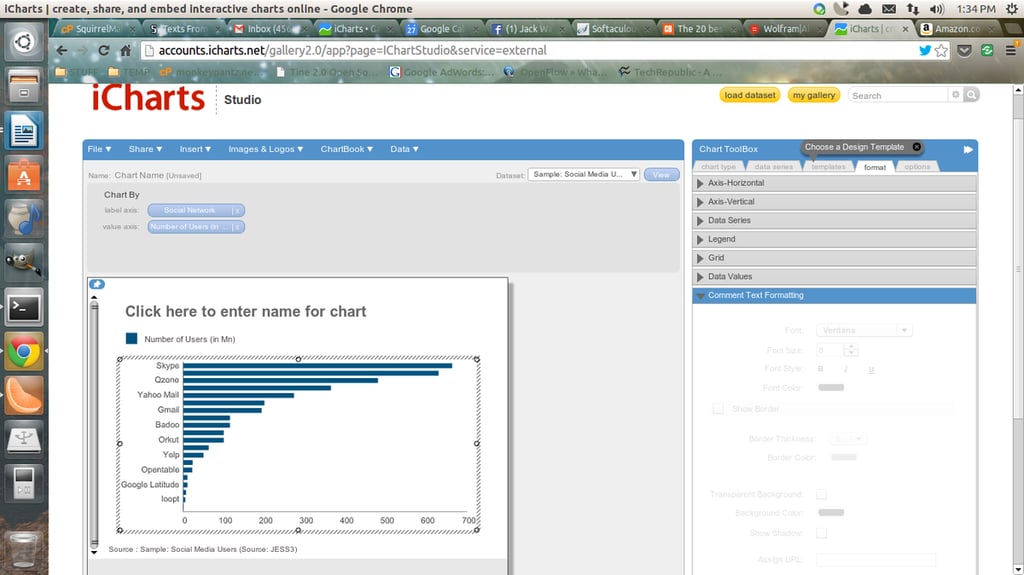
iCharts has two options -\r\na free option and an option for business. The business plans start at $25.00\r\nper month and goes up to an Enterprise plan (contact for details).\r\nThe free plan allows for data interactivity, public sharing, and unlimited\r\nstandard data sets. When you jump up to the paid versions, you get features\r\nlike: Private charts, custom templates, upload images and logos, download\r\nhigh-res images, unlimited live database connections, survey data sets, large\r\ndata sets, chartbooks, capture leads, branded chartchannels, mass report\r\ncustomization, and much more. With iCharts you can load just about any kind of\r\ndata including spreadsheets, Google Drive documents, and more. Interactive\r\ncharts are a unique feature that allows you to integrate data pop-ups, zoom\r\n& pan, or rich comments. If you’re looking for a data visualization tool\r\nthat will not only help you internally, but help brand your company, iCharts\r\nmight be what you’re looking for.
\r\n\r\nCredit: Images by Jack\r\nWallen for TechRepublic
Credit: Images by Jack\r\nWallen for TechRepublic
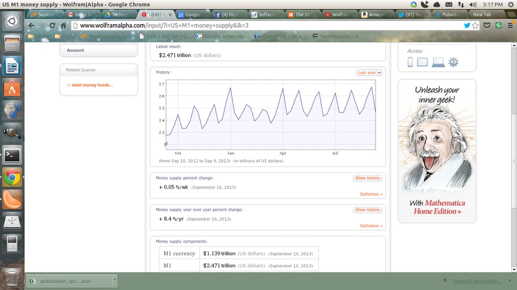
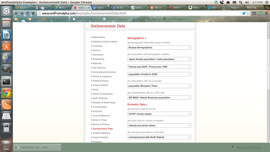
\r\n\r\nWolfram Alpha\r\nis a computational knowledge engine which attempts to rival Google. What is\r\nunique to WolframAlpha is that you can enter a string and have the tool\r\nimmediately compute the string and display the results. For example, I can\r\nenter “American Demographics”, click compute, and instantly have\r\ndisplayed various pieces of information regarding that string. Or, with the Pro\r\nsubscription, you can input your own data and have it quickly computed into\r\nvarious dynamic and interactive charts. The Pro account is limited to twenty\r\nuploads per month (images, tiles, tabular data, and more), and is $4.99 per\r\nmonth. The Pro account also offers much richer data results (unlimited\r\nstep-by-step solutions, longer computations, etc.).
\r\n\r\nCredit: Images by Jack\r\nWallen for TechRepublic
Credit: Images by Jack\r\nWallen for TechRepublic
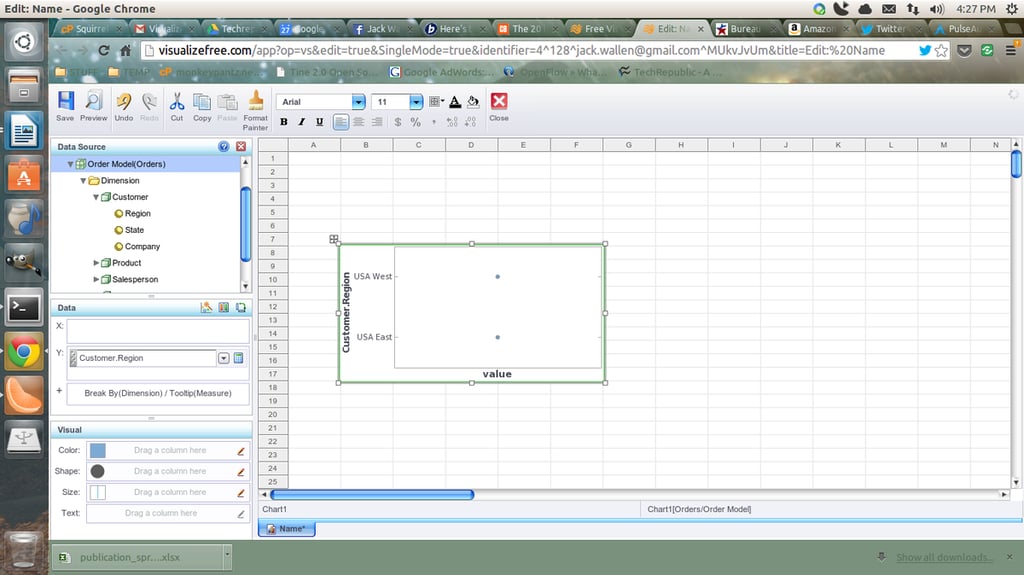
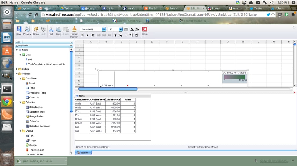
\r\n\r\nVisualize Free is\r\na hosted tool that gets you to upload your own data sets as well as gives you\r\naccess to publicly available datasets. With this data you can build your own\r\ninteractive visualizations to help illustrate your data. Visualizations\r\ninclude: Charts, maps, diagrams, dashboards, and much more. Creating a\r\ndashboard for your data is simple with the drag and drop designer. You can\r\neither upload a data set (spreadsheet or tab-delimited text) or you can cut and\r\npaste tab-delimited data into the cut and paste area (in the upload data page).\r\nYou must register for an account (it’s free) in order to get to the upload\r\nportion of the tool. You can also gain access to numerous public-available data\r\n(such as data.gov). As the\r\nname implies, Visualize Free is free to use. Any dataset you upload will be\r\nprivate only to you – so you don’t have to worry about other users gaining\r\naccess to your data.
\r\n\r\nCredit: Images by Jack\r\nWallen for TechRepublic
Credit: Images by Jack\r\nWallen for TechRepublic
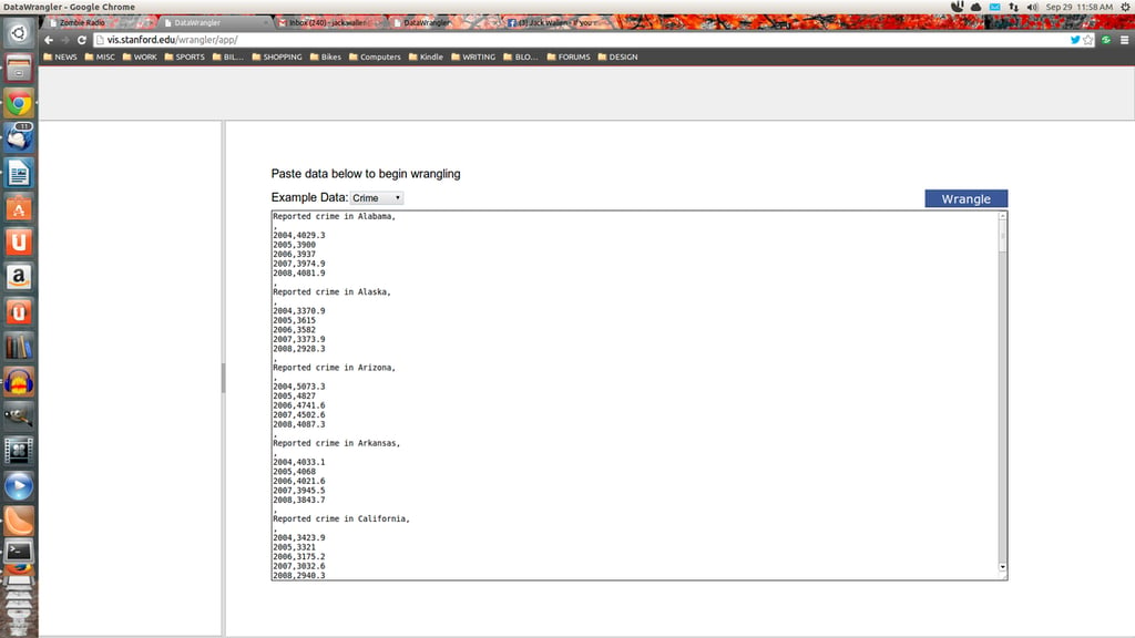
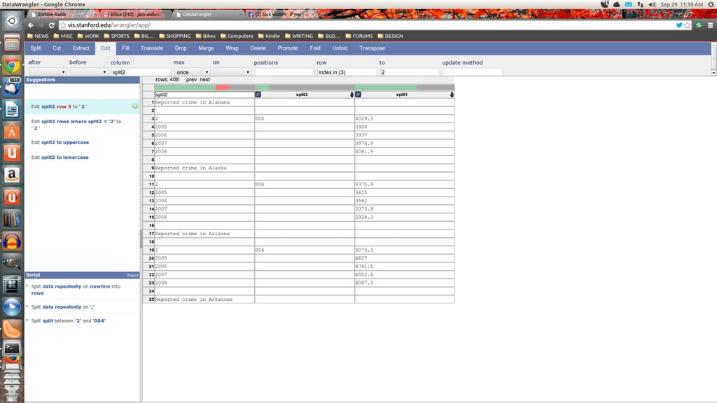
\r\n\r\nData Wrangler\r\nis a web-based service from Stanford University’s Visualization Group. This\r\ntool is used for cleaning and rearranging data into a form that other tools can\r\nuse (such as a spreadsheet). Although this tool will not actually visualize\r\nyour data, it will clean it up so that visualization tools can actually make\r\nuse of the data. What this means is you will spend less time formatting your\r\ndata and more time analyzing it. With this tool you can split, but, extract,\r\nfill, translate, drop, merge, wrap, delete, promote, fold, unfold, and\r\ntranspose various data points. Be warned, there is a bit of a learning curve to\r\nusing Data Wrangler; but once you’re used to the interface and the available\r\ntools, you’ll be getting your collected data ready to be visualized in no time.\r\nData Wrangler is free, but also in beta.
\r\n\r\nCredit: Images by Jack\r\nWallen for TechRepublic
\r\n\r\nThe larger your company grows, the more dependent upon\r\ndata it will be. In order to keep up with the competition you must be able to\r\nget all of that collected into a visualized, interactive form in order to best\r\nuse the results. Each of these tools will help you, in various ways (and at\r\nvarious price points) to achieve that very goal.
\r\n\r\nCredit: Images by Jack\r\nWallen for TechRepublic

Jack Wallen is an award-winning writer for TechRepublic, The New Stack, and Linux New Media. He's covered a variety of topics for over twenty years and is an avid promoter of open source. For more news about Jack Wallen, visit his website jackwallen.com.


