


Key takeaways:
- A burn up chart shows how much work has been done and how the total amount of work changes, providing visibility into both progress and shifting requirements.
- Burn up charts reveal a project’s progress and scope changes, while burndown charts only show remaining work.
- For accurate interpretation, a burn up chart should consist of four components: x-axis (time), y-axis (work quantity), scope line, and progress line.
Agile teams use burn up charts to see not just how much work is done, but also how shifting scope affects delivery. Building one involves a simple line graph with an X-axis for time, a Y-axis for work units, and two lines that represent scope and completed work. In this article, we’ll walk through how burn up charts work, how to create one, and the benefits they bring to project management.
- What is a burn up chart?
- Burn up chart vs. burn down chart: Key differences
- Why use a burn up chart in agile project management?
- Essential components of a burn up chart
- Step-by-step guide on how to create a burn up chart
- Project management tools for making burn up charts
- How to read and interpret a burn up chart
- Common mistakes to avoid with burn up charts
- FAQs
What is a burn up chart?
A burn up chart shows how much work on a project has been completed compared to the overall amount of work planned. It is represented by a line graph with two lines: one that tracks progress and another that shows the total amount of work, so it’s easy to see how close a team is to finishing. Burn up charts can also track budget or spend on a project, since the format helps teams compare actual progress against planned totals.
Burn up charts are especially useful in agile projects where requirements may shift. By looking at the chart, teams and stakeholders can quickly understand if the project is on track or at risk of delays.
Burn up chart vs. burn down chart: Key differences
Alongside burn up charts, teams also use burn down charts to visualize progress in agile projects. The difference is that a burn up chart highlights progress alongside changes in scope, while a burn down chart tracks team effort over time by showing the amount of work finished and how much still remains.
Burn up charts are more effective in projects where requirements evolve, but burn down charts are best suited for fixed workloads. Here’s a comparison table to break down their key differences:
| Purpose | Shows work completed against the total planned workload | Shows remaining work until the planned sprint/workload period is complete |
| Visualization | Two lines: one for completed work and one for total work | Two lines: one for the time required to complete the work and one for remaining work |
| Scope changes | Easy to see when the scope increases or decreases because the total work line shifts | Scope changes are harder to track since the focus is only on the remaining work |
| Ease of use | Offers a complete view of progress and scope, making it easier to spot risks early | Simpler to read than a burn up chart,, but may hide scope changes or shifts in workload |
| Best use case | Agile projects where requirements often evolve | Projects with stable requirements and a fixed workload |
Why use a burn up chart in agile project management?
Burn up charts give teams and stakeholders a more accurate view of progress, particularly in projects that encounter frequent adjustments to workload. The following points highlight the main reasons to use them in agile workflows:
- Visibility into scope changes: A burn up chart separates total work from completed work, so any changes to the workload are easily tracked. This prevents surprises later in the project and makes it easier to explain shifting timelines.
- Better progress tracking: Because the chart shows both planned and completed work, teams can measure actual progress more accurately. This dual view helps avoid confusion that can occur when only tracking remaining tasks.
- Improved stakeholder communication: Burn up charts simplify reporting by providing a visual that can be shared with clients and executives. Instead of digging into detailed task lists, stakeholders can see at a glance if the project is on track.
- Supports agile adaptability: In projects where priorities change frequently, burn up charts help teams adjust without losing sight of their goals. By balancing scope and progress in one view, they make it easier to plan the next sprint with confidence.
Essential components of a burn up chart
A burn up chart may look simple at first glance, but each element plays a specific role in showing both progress and scope. Understanding these components ensures you know exactly how to read the chart and use it to monitor project performance.
- Horizontal axis (X-axis): The X-axis represents time, usually divided into sprints, weeks, or days. It provides the timeline for tracking progress so you can see how work accumulates as the project moves forward.
- Vertical axis (Y-axis): The Y-axis shows the amount of work, typically measured in story points, tasks, or hours. This scale makes it possible to compare the team’s progress against the total workload at any point in the project.
- Scope line (total work line): The scope line indicates the total amount of work planned for the project. If requirements change, this line shifts to reflect the new workload, making scope changes visible over time.
- Progress line (completed work line): The progress line tracks the cumulative work completed across the timeline. As the line rises toward the scope line, it shows how close the team is to finishing the project and highlights what still needs to be done.
Step-by-step guide on how to create a burn up chart
Building a burn up chart is straightforward once you understand the data it requires and the order in which to set it up. Follow these steps to create a chart that clearly represents progress and scope in your agile projects.
Step 1: Define the total workload
Start by identifying the total amount of work to be completed, measured in story points, tasks, hours, or work item counts. This number represents the overall workload that will remain constant unless requirements change. Recording this upfront ensures the chart accurately reflects both progress and scope adjustments.

Smartsheet’s burn up chart template combines a detailed table of sprints, points completed, and cumulative progress with a color-coded visual graph. This setup makes it easy to see how actual progress aligns with the total workload and projected trajectory, giving teams both granular data and a high-level view in one place.
Step 2: Collect progress data
Track the amount of work your team completes during each sprint or time interval. This should be measured using the same unit you used to define the workload, such as story points completed per sprint. Keep in mind that consistent data collection is critical to making the chart reliable over time.
Step 3: Plot the chart axes
Draw the horizontal axis to represent time (sprints, weeks, or days) and the vertical axis to represent the amount of work. This gives you a framework to plot both progress and workload over the project’s duration. Use labels and legends to guide stakeholders on what each line represents.
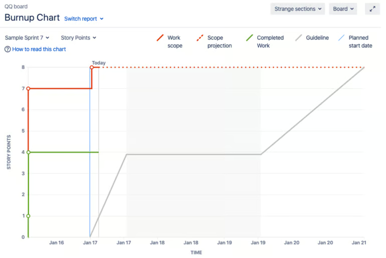
In Jira, the burn up chart automatically maps story points against time, with the horizontal axis showing sprints and the vertical axis showing workload. The tool also adds useful details like completed work, total scope, and projected trends, giving teams a clear and dynamic view of progress.
Step 4: Add the scope line
Plot a line across the chart that represents the total workload you defined in Step 1. If scope changes occur, adjust this line upward or downward to show the increase or reduction in work. This line acts as a reference point for tracking how progress relates to the overall project size.
Step 5: Add the progress line
Plot a second line that tracks the cumulative amount of work completed at the end of each sprint or interval. Over time, this line should rise toward the workload line, which indicates how much has been accomplished. The gap between the two lines gives a clear picture of what remains to be done.
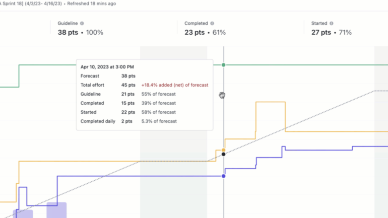
ClickUp’s burn up chart makes the progress line highly interactive, where you can hover over data points to see detailed metrics like forecast, total effort, and percentage completed. This level of visibility helps teams not only track how much work has been done but also spot scope changes or effort overruns in real time.
Step 6: Review and update regularly
Update the chart at the end of each sprint or reporting cycle with the latest progress data. Regular updates keep the chart accurate and useful for planning upcoming work. By reviewing it often, teams and stakeholders can quickly identify risks and adjust priorities.
Project management tools for making burn up charts
Several project management platforms include built-in burn up chart features and templates, so it’s easier to track progress without relying on manual spreadsheets. The table below compares popular tools and highlights how each one supports teams in creating and using burn up charts effectively.
 Visit Jira |
|
|
 Visit ClickUp |
|
|
 Visit Smartsheet |
|
How to read and interpret a burn up chart
Now you know what a burn up chart is, it’s also important to understand how to read it effectively. The following tips explain how to interpret the graph so you can track progress and respond to changes with confidence.
Tip #1
Look at the progress line against the scope line: The two lines together reveal how effort matches expectations over time. When the progress line consistently climbs toward the scope line, it indicates steady advancement toward completion.
TIp #2
Check for changes in the scope line: If the scope line moves upward, new work has been added. A downward shift means tasks or requirements were removed.
Tip #3
Pay attention to the slope of the progress line: A steep slope indicates rapid progress, while a flatter slope signals that work is slowing down. This helps you judge if the team’s pace matches the project’s timeline.
Tip #4
Watch the gap between the two lines: A narrowing gap shows the team is catching up to the workload, while a widening gap may signal delays or added scope. This gap is one of the most direct indicators of overall project health.
Common mistakes to avoid with burn up charts
Even though burn up charts are straightforward, small mistakes can make them misleading or less useful. The table below highlights common problems and quick fixes to help you keep your charts accurate and actionable.
| Stale data makes the chart outdated and unreliable | Update the chart at the end of every sprint or reporting cycle to keep it current |
| Mixing measures such as tasks and story points in the same chart | Choose a single unit of measurement and apply it consistently |
| Ignoring rework or reopened tasks, which skews progress | Record rework separately and adjust the progress line so it reflects actual effort |
| Overlooking scope changes that shift the workload line | Review the scope line regularly and adjust it to reflect new requirements |
A well-built burn up chart does more than visualize progress, as it also creates transparency in agile project management by showing both the pace of delivery and the effect of scope changes. Defining the workload and tracking completed effort over time ensures the chart becomes a decision-making tool rather than just a report. With this approach, teams can anticipate risks early and adjust priorities while keeping a realistic view of what can be achieved.
FAQs
What does a burn up chart show?
A burn up chart shows how much work has been completed compared to the total workload. It helps teams track progress over time while also making scope changes visible, giving a clear view of how close the project is to completion.
What is the difference between burndown and burn up charts?
A burndown chart tracks how much work remains until completion, while a burn up chart shows completed work against the total workload. The key difference is visibility: burn up charts highlight scope changes, whereas burndown charts are best suited for fixed workloads.
How do I calculate burn up chart?
To calculate a burn up chart, track cumulative work completed at the end of each sprint or time period using a consistent unit such as story points or tasks. Plot this data over time against the total workload line, updating regularly to reflect both progress and any scope changes.