


Unlocking the full potential of Google Sheets can transform how you manage projects, thanks to its timeline feature. Individuals and teams can use this tool to create, display, and share dynamic timelines that bring projects to life. A timeline view helps you quickly understand key milestones and dependencies, providing clarity that a simple list of dates cannot match.
Visualizing your project’s flow and organizing events can help you concentrate on the tasks that matter most to you and your team, making collaboration easier than ever. Therefore, this guide will walk you through the timeline view in Google Sheets step by step, ensuring that you can improve your project planning and elevate your task management.
Why use a timeline view in Google Sheets?
While many people turn to popular project management tools like Asana or ClickUp to keep their projects on track, Google Sheets offers an effective alternative with its versatile planning and visualization features. The Google timeline view lets you effortlessly transform a selected set of text and dates into a visually captivating horizontal timeline in a new spreadsheet tab.
Each task in this timeline is presented as its own distinct card, making it an excellent tool for visualizing project plans, roadmaps, or goal-setting templates. Especially for Google Workspace teams, this timeline can also help you reflect on past events, serving as a valuable resource for after-action analyses. Just remember, to create and showcase these timelines, you’ll need to access Google Sheets through a desktop browser like Chrome.
Step-by-step guide to create a Google Sheets timeline in 2025
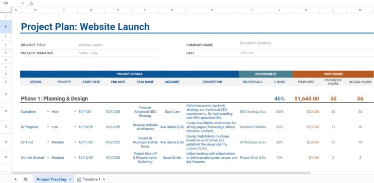
For this guide, we will use a sample project plan for a “Website Launch.” This project is broken into two phases and includes columns for Task Name, Start Date, End Date, Assignee, and Description, among others
Step 1: Structure and populate your project data
First, you need a structured set of data. For each task you want on the timeline, you must have at least:
- A Start Date
- An End Date or a Duration
- A Task Name (e.g., “Develop Website Wireframes”)
For richer timelines, I highly recommend that you include additional details, such as an Assignee column (to designate who is responsible) and a Description column for each task.
Expert tip: If you’re starting from scratch, Gemini in Google Sheets can build the foundation for you. Open the Gemini side panel and use a prompt like:”Create a detailed project plan for a new company website launch. Include columns for Task Name, Start Date, End Date, and Assignee. Break the project into a planning phase and a development phase.”In seconds, Gemini will generate a structured table that you can insert directly into your sheet.
Step 2: Create the timeline view
Once your data is in the sheet, select the range of cells that contains your project tasks. Be sure to include the header row. In our “Website Launch” example, you would choose the data from the “STATUS” column to the “ACTUAL HOURS” column for all tasks.
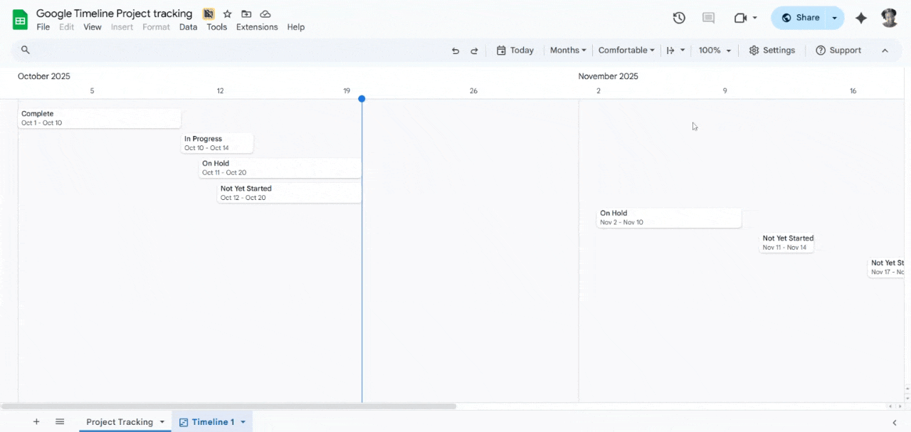
Next, navigate to the menu bar and select Insert > Timeline. A dialog box will appear confirming your data range. Click OK.
Google Sheets will automatically generate a new tab at the bottom of your spreadsheet, presenting your data as a clean, interactive timeline.
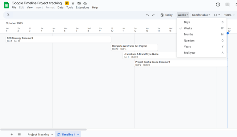
Step 3: Adjust the timescale
If the default view is too zoomed in or too far out, use the timescale dropdown menu at the top right corner of the timeline view to adjust it. You can select from Days, Weeks, Months, Quarters, or Years to find the perspective that best suits your project’s length. For our website launch project, viewing by “Weeks” or “Months” would likely be most effective.
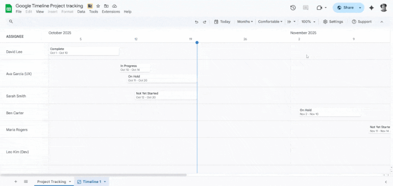
Step 4: Group tasks by assignee
To see at a glance who is responsible for what, you can group timeline cards using one of your data columns. View the GIF below for a visualization of the following steps:
- Click the Settings button in the timeline view’s toolbar.
- In the side panel that appears, find the Card group dropdown menu.
- Select the column header for Assignee.
The timeline will instantly reorganize, stacking tasks under the name of the person they are assigned to (e.g., all of David Lee’s tasks will be grouped together). This is invaluable for resource management and team check-ins.
Step 5: Customize card colors and details
You can customize card colors to represent different priorities, statuses, or teams using two different methods.
To color by status or priority: In your source data sheet, you can use Conditional Formatting to automatically color rows. For example, set a rule that any row with “High” in the Priority column turns light red. These colors will carry over to the timeline cards, but I find this method is too complex if you just want to change colors for aesthetic reasons.
To manually change colors: In the timeline view, click on any task card. A Card details panel will appear on the right. From here, you can select a new card color and view all the associated information from that row, such as the full Description.
You can also click the Edit data button to jump directly back to that task’s row in the source sheet to make changes. This method works best if you want to change colors to differentiate between tasks or assignees after the timeline is generated.
SEE: Google Sheets: Tips and tricks (free PDF)
Best business software
- Blackpoint Cyber vs. Arctic Wolf: Which MDR Solution is Right for You?
- SS&C Intralinks DealCentre AI vs. Datasite: Which platform is built for the future of dealmaking?
- Unified by Design: The Smart Stack Advantage of NinjaOne and Microsoft Intune
- Still Not Backing Up Microsoft 365 Data? Here’s Why That’s a Risky Move
- Verito vs. Rightworks: Which IT Provider Is Best for Your Firm?
Chart vs view: When to use Google templates or timelines
If you’re familiar with traditional project management software, you know that many platforms offer diverse methods for displaying a sequential list of events. From Kanban boards to Gantt charts, this functionality is essential for efficiently organizing tasks, deadlines, and milestones with visualizations that are easy to understand.
Within Google Sheets, the timeline view offers a dynamic, interactive visualization of your data. Google also provides timeline templates using standard charts (such as a Gantt chart) that are less interactive but can be beneficial for static reports. By selecting from various charts and views, you can choose the option that best suits your needs for visualization and tracking progress.
Frequently asked questions (FAQs)
Can all Google users create a timeline in Google Sheets?
Whether you can create a timeline depends on your Google Workspace edition. Specifically, personal (@gmail.com) accounts and some basic Google Workspace plans do not include access to the timeline view. It is typically available in Business and Enterprise editions.
How does Gemini AI integrate with the timeline view?
For teams with Google Workspace plans, Gemini is integrated directly into the Google Sheets side panel. Its primary role in this process is to accelerate the data creation and structuring phase. You can use it to brainstorm tasks, generate a full project plan from a simple prompt, write task descriptions, and format it all into a table, which you can then instantly turn into a timeline view.
Does Google have timeline templates?
Yes. Google offers a diverse selection of timeline templates available in both Google Sheets and Google Slides. These include templates designed for event marketing strategy and project timelines, which can easily be accessed through the template gallery.
Can I customize the timeline in Google Sheets?
Yes. You can customize the timeline view by changing the timescale (days, weeks, months), grouping cards by any data column (like Assignee or Status), and customizing card colors to visually represent key information. You can also control who has view or edit access through standard Google Sheets sharing settings.