10 web design tragedies
Image 1 of 10
Number 10: http://www.arngren.net
ntWe start our tour with a few oldies but goodies. The shocking thing about this site isn’t its explosion of digital debris on the screen or the mosaic of madness assaulting your eyes, but the fact that it’s actually still around.
Number 9: http://www.lingscars.com
ntIgnore for a moment the horrible design, the hodgepodge assortment of content, ads, and general insanity. Give this site a casual scroll. Go ahead. Scroll down. I dare you. Scroll like your life depended on it. Faster, I say, faster! Quite the journey, wasn’t it? At the bottom we finally reach Mr. Ling’s personal assurance that, “The rest can be a little confusing although in a few (business) cases can be appropriate.” Trying to understand this in context has actually hurt my brain.
Number 8: http://www.zombo.com
ntAn existentialist journey to nowhere, zombo. Hypnotic, minimalist, intoxicating in its mystery, zombo awaits you. It sits there, proudly announcing itself, but what does it mean? You stare at it. You stare at it some more, play with it a little, hoping to find some rhyme or reason for its existence. You look for hidden meanings as a feeling creeps into your head that maybe, just maybe, the answers to all of life’s mysteries are hidden somewhere in the site if only you look at it long enough. They must be there. They have to be. Like a bug zapper glowing brightly on your screen, it urges you closer, ever closer, to go into the light….
Number 7: http://www.pearlbrite.biz
ntA quick web search for teeth brightening has brought me to Pearl Brite. Surely I’m just a click or two from my goal of exploring the amazing world of shining tooth options and … whoa! It’s a flash-heavy interface. Okay. I can deal with that. Here we go and whoa! What’s up with this? Floating blue balls? Where’s the navigation links? How do I navigate the site? Oh, wait, the balls do something when I mouse over them. I see, there’s the navigation, hidden inside the balls. All I have to do is play with the blue balls to navigate around. Okay, that goes there. This one does that. This one is– hey! Stop moving around! Which ball was the Contact Us again? The hidden links keep moving around! What is this, a hide the pea game? Stop moving around! Where’s that link again? Arrgggh!
Number 6: http://www.rentistoodamnhigh.org
ntThe rent may be too damned high but so was the web designer. What was he smoking? What’s the point of this site? Where does the scrolling end? What am I doing here? Where am I going? Can I have some of whatever they were smoking when “designing” this site? Please?
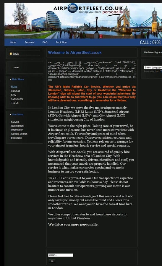
Number 5: http://www.airportfleet.co.uk
ntYou’d think “London’s most reliable car service” would have a decent website reflecting their status. You’d think at the very least the site might have some solid code behind it. You’d be wrong. Check out the visible code garbage cluttering the home page and a few of the secondary pages. Check out the smooth functionality and intuitive navigation.
Number 4: http://www.georgehutchins.com
ntI’m of mixed opinions on this website. I think it obvious that the site is meant as a satire. A weird mu00e9lange of over-the-top neocon rantings, videos, and brightly colored text, this site does its very best to offend everyone. But does that excuse it’s horrible design? Does the insanely bad layout and aesthetics serve the satire? Well, yes, but how long can your eyes and brain handle viewing this site in one sitting? It repulses the viewer like a six-day old road-kill. It scrolls on and on like that relative who never, ever shuts up. And worst of all, if the traffic counter at the bottom of the page is to believed, this site has had 1,486,959 visitors (+1 counting my most recent viewing).
Number 3: http://www.enterprisemission.com
ntRichard Hoagland is best known as a conspiracy theorist and fringe thinker. He has several published books to his credit and is a frequent guest on Coast to Coast AM with George Noory. He single-handedly created the “Face on Mars” controversy with his book, “The Monuments of Mars”. As a successful author he should be capable of having a decent website constructed. As someone concerned with public image and technology, you’d think he’d want his website to be easy to navigate and well-designed. But no. Welcome to the rambling, scrolling, self-indulgent train-wreck known as the Enterprise Mission. Upon second thought, maybe the website isn’t a failure after all. It does seem to perfectly reflect his personality.
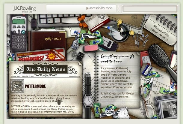
Number 2: http://www.jkrowling.com/en/index.cfm
ntYes, THAT J. K. Rowling. Is it a website about the author, or books, or an interactive game? Why, it’s all three! Explore the magical world as you try to guess which object links to what! Fall under the spell of the fluttering butterfly as you search for the navigation links. Hear the dog barking in the distance. Attempt to read the links that appear cut off and half-hidden by the top of the screen. I rank the Game Play as a zero on a scale of one to five magic wands. The web design itself gets a zero score for navigation and pretentious clutter. Maybe one day she’ll make enough money to hire someone who knows the basics about web design.
Number 1: http://www.georgerrmartin.com
ntThe esteemed place of number 1 web tragedy must go to George R. R. Martin. He’s the man behind the HBO series Game of Thrones. In addition to his Song of Ice and Fire series the man has written a ton of novels and is a NYT #1 Bestselling Author. So why does his website look as if it was designed by a high school kid in the 1990’s? Animated GIFs, bland graphics, and amateurish layout conspire to make this website a cartography of basic “web design don’ts”.
n
ntIt was “designed” by a “company” (and I use both terms in the broadest possible sense) named Mandala. A quick glance at their sites only strengthens my suspicion that they stay in business only by sub-contracting their web to teen LARPER’s working from an old Sanyo using Paint Shop version 3.
-
Account Information
Contact Todd Fluhr
- |
- See all of Todd's content


