-(locbarsearch).jpg?w=640)
Mozilla released Firefox 4.0 mockups for its fans to review. The debates are over where to put the tabs and whether to add color codes to the right of the address bar.\r\n
In this mockup the tabs are on top of the location bar. CNET’s Stephen Shankland says it looks a lot like Chrome.\r\n\r\n
Screenshot: Mozilla (Click on any image to enlarge.)
.jpg?w=640)
Tabs below the location bar.\r\n
According to Mozilla – tabs on the top:\r\n
\r\nBut the negatives are:\r\n\r\n
\r\n\r\n
Screenshot: Mozilla (Click on any image to enlarge.)
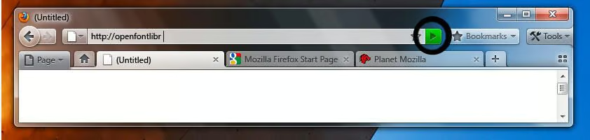
Green – typing in the location bar\r\n
Screenshot: Mozilla (Click on any image to enlarge.)
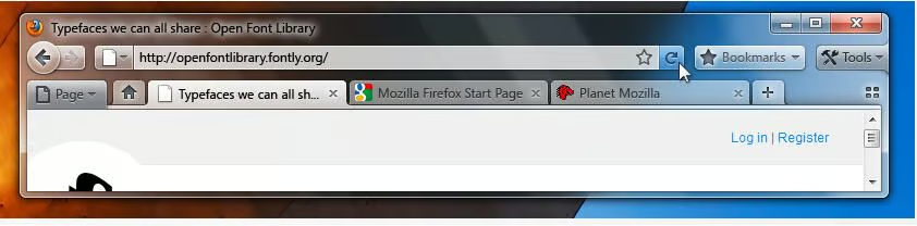
Neutral – default rest state\r\n\r\n
Screenshot: Mozilla (Click on any image to enlarge.)
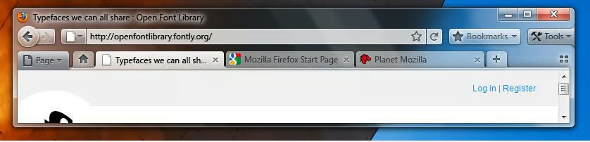
Blue – refresh button hover state
Screenshot: Mozilla (Click on any image to enlarge.)
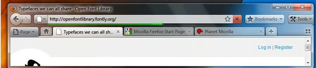
Red – page loading is in progress\r\n\r\n
Screenshot: Mozilla (Click on any image to enlarge.)


