This is my list of what I consider the best examples of web designs,\r\nweb user interaction, parallax scrolling design, and responsive web design in\r\n2013. I viewed and tested all of the sites in several desktop\r\nbrowsers, including Chrome and Firefox, as well as on an iPhone 4 in Chrome and\r\nSafari for iOS. The featured websites are presented in no particular order.
All screenshots in this gallery were taken by Ryan Boudreaux for TechRepublic.
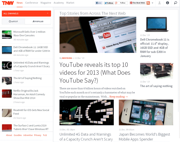
\r\nThe Next Web (TNW) is\r\na media company that promotes international technology news, business, and\r\nculture, and their website is a great example of responsive web design in\r\naction.

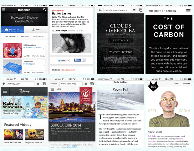
TNW’s mobile version is easy to navigate and is a nice way to read its articles. This is a shot of TNW displayed in Chrome for iPhone.
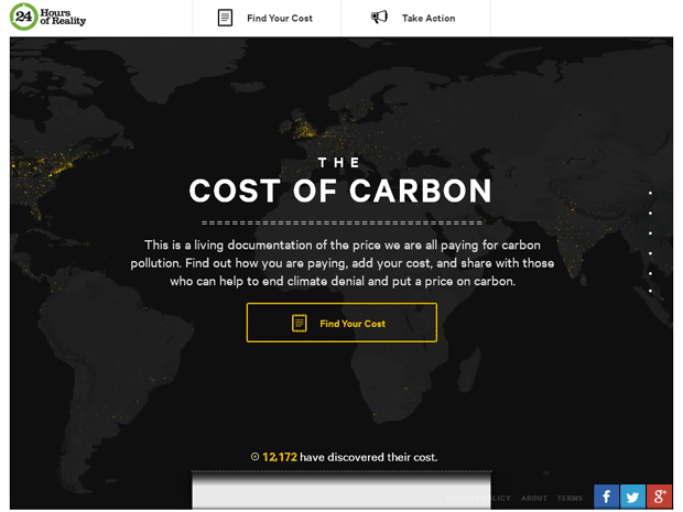
The Cost of Carbon website by The Climate Reality Project allows users to determine their carbon footprint and carbon cost based on\r\nwhere they live by connecting with either their Facebook or Google+ account.
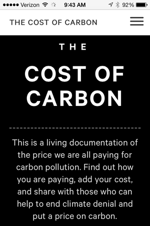
The Cost of Carbon site viewed in Chrome for iPhone.
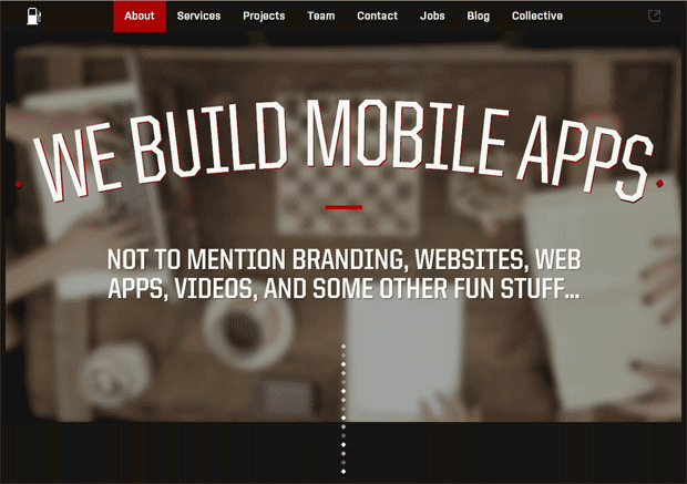
Fueled is a mobile design and development firm out of NYC that creates applications,\r\nservices, and projects for iPhone, iPad, Android, and the web.
In addition to a smooth flowing and\r\ncreative use of the parallax scrolling technique throughout the site, Fueled also utilizes HTML5, the normalize css, and the @font-face rule for several Google\r\nfonts. It uses a TypeKit font license, along with its CSS file\r\nloading JS. Other scripts include conversion.js, JQuery, and Modernizr 2.6.2.
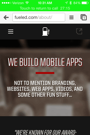
This is a shot of Fueled viewed in Chrome for iPhone.
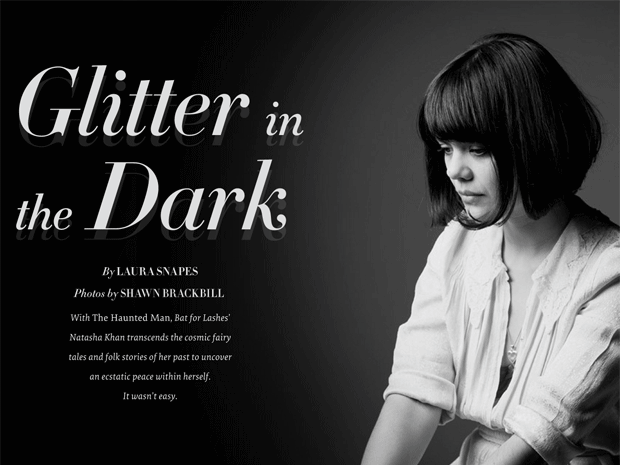
Pitchfork’s “Glitter in the Dark” article by Laura Snapes about Bat for Lashes singer Natasha Kahn has won several\r\nawards, including the Best Visual Design and Function Webby Award. It’s one of the best\r\nexamples of the parallax scrolling technique that I have seen for online\r\nstorytelling.
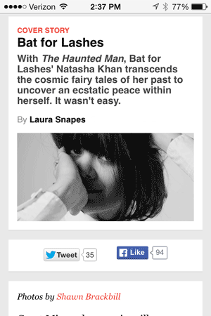
This screen capture shows Pitchfork’s Glitter in the Dark article in Chrome for iPhone.
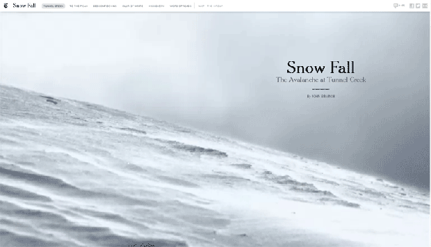
The New York Times (NYT) “Snow\r\nFall” article by John Branch is one of this year’s best\r\nexamples of web design and storytelling. The website utilizes several instances of the HTML5 video element along with a creative use of the parallax scrolling effect. In addition, the website incorporates the HTML5 presentational and organizational elements for article, aside, canvas, details, figcaption, figure, footer, header, nav, section, and summary.
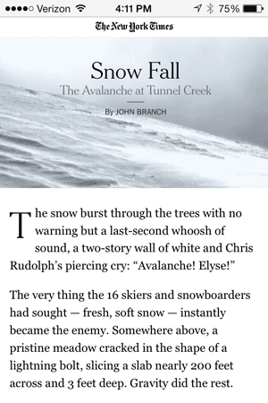
This is a screen capture of the NYT site displaying its “Snow Fall” article in Chrome for iPhone.

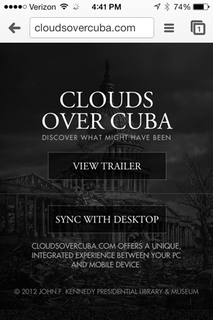
This is a screenshot of the Clouds Over Cuba site viewed in Chrome for iPhone.
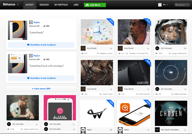
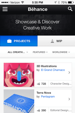
\r\nThe self-promotion and portfolio website Behance by Adobe provides a marvelous\r\nplatform for creative folks from many disciplines to share their work and projects and display their best stuff to prospective clients. Creatives can also follow or connect with people who have similar interests and/or whose work they admire.
Winner\r\nof the Webby Award for Self-Promotion/Portfolio, Behance is built on HTML5 technology and uses its\r\nown font be.woff, includes several JS files including for activity, network,\r\nand navigation, and includes several stylesheets for comments, responsive, footer,\r\nand text box lists.
This is a screen\r\ncapture of Behance in Chrome desktop.
This is a screen capture of Behance as seen in Chrome for iPhone.
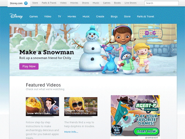
Another fun website with a responsive UX is Disney.com,\r\nwhich views wonderfully on all devices. It’s no surprise that Disney is keeping up with creative expression\r\non the web, as the top of its web page has this unique code snippet quote\r\nfrom the master of “Imagineering” himself, Walt Disney, which is commented out just\r\nunder the doctype declaration as shown below:
\r\n\r\n
\r\n\r\n
\r\nThe website utilizes JQuery and several stylesheets, including ones called application, fixins, responsive-desktop, and responsive.
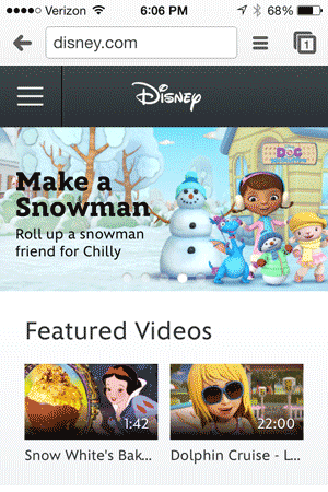
This is a screen capture of Disney.com’s site as seen in Chrome for iPhone.
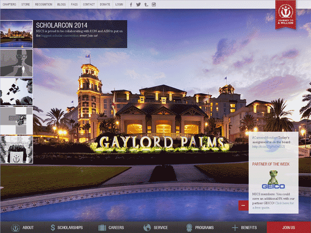
The National Society of Collegiate Scholars is a 501(c) nonprofit organization that recognizes college students who are high achievers. Its website utilizes\r\nDrupal along with a series of CSS sprites to deliver an exceptional responsive\r\nwebsite experience with easy to use drop-down navigation, along with social\r\nmedia connections that are popular with the organization’s member base.
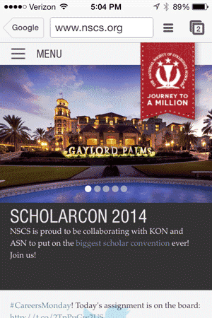
This is a screen capture of the National Society of Collegiate Scholars site as seen in Chrome for iPhone.
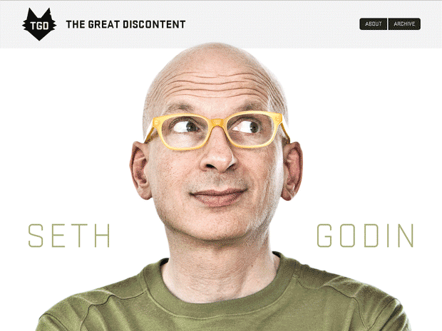
The Great Discontent (TGD) is a website that offers not only a wonderful user\r\nexperience but also plenty of inspiration for web developers, web designers,\r\nand graphic artists. Its introduction says the site “… is a journal of interviews focusing on creativity, risk, and what connects us as artists.”
Originally created by Ryan and Tina Essmaker, TGD has grown\r\nto include Josh Long as part of the creative team. The archive of interviews\r\nincludes folks with backgrounds ranging from business, comedy, arts, design,\r\nmotion graphics, illustration, music, writing, development, photography,\r\neditorial, and more.
The website\r\nutilizes WOFF fonts including ss-social-regular, script files, which include jquery.fittext,js, jquery.letterning.min.js, jquery.min.js, jquery.unveil.min.js, and modernizr.custom.js, and a responsive images script (responsiveimgs.min.js), and several other script files. Stylesheets include a\r\nseparate typekit fonts CSS file, a screen.css, and an ss-social-regular CSS\r\nfile. I also see a custom stylesheet for each interview page (e.g., seth-godin.css for the interview highlighted here).
\r\n\r\nThe TGD interview with Seth Godin is displayed in this screen capture as seen in Chrome desktop.
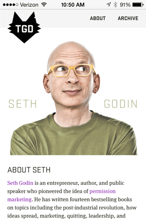
This is a screen capture of the TGD’s site as seen in Chrome for iPhone.

Thirteen years of web and graphic developer experience.


