In our current connected world, users have high expectations for digital experiences. And on a high-end laptop or desktop, it is fairly straight-forward to meet those expectations. Nice big screens, fast internet, lots of storage and even additional input devices like a keyboard or a mouse all provide designers and developers plenty of resources to build a first-class user experience.
Mobile devices however don’t have all these bells and whistles. So, when starting with a less restrictive medium and then trying to scale down, as organizations have traditionally done, often users end up with a sub-optimal experience on mobile. In the application landscape of yesterday, that was probably okay. There were desktop apps, and then there were mobile apps—the former being where work got done and the latter more focused on convenience use cases.
What is a mobile-first approach?
When mobile apps and websites first arrived on the scene, designers pushed hard for what was called “graceful degradation.” It meant that as the experience moved from the desktop down to tablets and phones, features and functionality were stripped away.
The world has changed significantly over the last decade though—particularly when it comes to where, when and how we work. To meet these changing needs, mobile-first advocates have latched onto “progressive advancement.”
Progressive advancement is the reverse of graceful degradation. By starting with the smallest screen and making sure it can deliver the core application experience, designers can then layer on additional functionality and features with each next bigger class of device.
That way, wherever the users and the application intersect, they can still expect a first-rate user experience and the core functions needed to get work done.
SEE: Build custom mobile apps without having to code with this simple app (TechRepublic Academy)
Why mobile first makes sense in today’s digital landscape
Today more than 2 billion people access the internet from their smartphone. Some analysts predict by 2025 this may be how more than 70% of internet users operate.
Since 2012, smartphone sales have drastically outpaced desktop computer sales. The mobile game market is outselling PC and consoles combined. There is no shortage of stats you can find on the internet to drive home just how important capturing and captivating mobile users are. But, there is more to the story than just the sheer volume of devices in consumer hands.
Google’s algorithms favor mobile-friendly websites. In fact it is so important to the search giant they have even created a site that can test your website’s mobile friendliness for you.
For a majority of applications, organic traffic via search engines is a key ingredient to long-term success. Paying attention to Google’s algorithms is one of the best ways to ensure discoverability. And since mobility is high on that list, by extension a mobile-first strategy gives you a competitive advantage.
Content is the undisputed king
When going mobile first, it’s important to remember that content is king. Designers should focus on surfacing exactly the content a user needs and nothing more. Extra elements tend to distract from the user’s focus on the current task, and productivity suffers when screen real estate is limited.
So, while it is typical to show all the options on a desktop view, well-designed mobile applications use context to decide what to show when and just as importantly, what not to show.
It doesn’t mean mobile users can’t get to all those fine-grained options, it just means those options that don’t generally support the main use case are hidden behind low-profile UI constructs like collapsible menus and accordions.
Mobile-first design best practices
Start with your users in mind
Your application is solving a problem, and if your mobile design does not allow the user to solve that problem quickly and efficiently, it’s a missed opportunity.
Hierarchy matters
It should be clear from how your application is presented to the user what’s most important at that particular moment. If you are on a mobile banking site to transfer funds, you expect to see how much money you have front and center.
Simple is better
Reduce the number of links in your navigation when possible, and use fewer pages that take advantage of vertical scrolling. For portrait apps, don’t divide the screen into more than two columns. And consider larger fonts and wide, clean borders.
Clear call to action
Each screen should have a clear call to action (CTA). It should be bright, bold and consistent. Google’s Material Design has a great construct for this called a FAB, or floating action button, if you’d like some guidelines.
Don’t make users wait
Check your load times. One study suggests 79% of shoppers are unlikely to use a site again if the performance is poor. Compress images where you can, and utilize techniques like “lazy loading” to improve your time-to-glass.
SEE: Load testing vs. stress testing: What are the main differences? (TechRepublic)
Mobile-first application inspiration
If you’re looking for some inspiration, consider checking out these exemplary mobile sites. Hopefully, these examples will have you considering whether a mobile-first approach might be the right approach for your next digital endeavor.
Pollen
It should come as no surprise that Pollen has a slick mobile experience when you take a look at what they do. Pollen is a design and UX digital studio. The site loads quickly, makes great use of white space and does an excellent job of adapting the navigation menu based on whether the site is running on desktop or mobile (Figure A).
Figure A

TurboTax
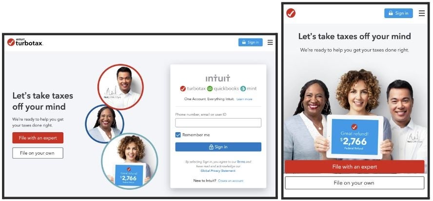
Who says taxes are boring? The TurboTax application makes heavy use of CTAs and enables a complicated workflow in a context-aware, mobile-first approach (Figure B).
Figure B

Shopify
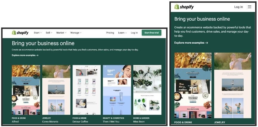
As a leader in e-commerce, Shopify needs a first-rate user experience regardless of where customers run across them. Here, we see a great example of how Shopify chose to simplify grid layouts on mobile (Figure C).
Figure C

Mobile-first design prioritizes user experience
While more common in B2C apps, in recent years many B2B organizations are also taking advantage of mobile-first strategies. Because mobile-first development prioritizes the smallest screen, it effectively shifts focus and tough conversations around core functionality left.
By starting with deciding how an app will look and operate on a smartphone before moving on to larger screens and devices, developers, designers and product owners quickly get alignment on what matters to users and customers.
Learn more about mobile app development with these resources from TechRepublic Academy:
- The Complete Mobile & App Development Bundle
- The Complete Guide to Designing a Mobile App
- The 2022 Mobile App Developers Bundle

