


Viewing the distribution of related values from one entity to another is a frequent request, and that’s where Microsoft Excel floating bar charts can help. Instead of starting from the X axis, the low and high values seem to float above the X axis. They’re easy to create in Excel, but the route isn’t intuitive. In fact, I think the floating bar option is practically hidden. Once you find it, the placement makes sense: You create a line chart and then add the Up/Down Bars element.
SEE: Software Installation Policy (TechRepublic Premium)
In this article, I’ll show you to first, generate a low and high value for each entity. Then, we’ll represent those values in a floating bar chart. Along the way you’ll learn about the MINIFS() and MAXIFS() functions.
I’m using Microsoft 365 on a Windows 10 64-bit system, but you can also use Excel 2021, Excel 2019 and Excel for the web. For your convenience, you can download the demonstration .xlsx file.
The Excel data
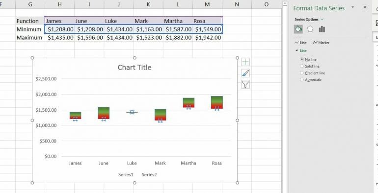
A floating bar chart is a visual comparison of distribution. In other words, not all the charted values begin at the same place on the X axis, which typically represents 0 or some other shared lowest measurement. For instance, the simple data set in Figure A displays a minimum and maximum sales value for a few employees.
Figure A
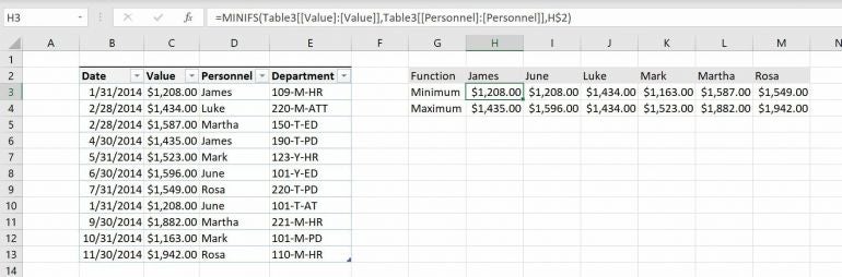
A typical bar chart would start a 0 for each person, but we want to chart both values. By starting each bar at the minimum point on the Y axis, you create what appears to be floating bars. The benefit is the ability to compare high and low values for each series—in this case, each person.
Now that we have an idea of what a floating bar chart is, let’s look at the values we plan to chart.
How to return the minimum and maximum values in Excel
In this scenario, we won’t be charting the Table data. Instead, we’ll be charting the minimum and maximum values for each person. If you’re lucky, your data already contains those values. The demonstration file contains these values, but they warrant a bit of explanation.
In our case, the minimum and maximum values represent the bottom and top of each person’s bar, respectively. The values in H3:M4 are the result of the MINIFS() and MAXIFS() functions, respectively. These two functions use the following syntax:
MINIFS(min_range, criteria_range1, criteria1, [criteria_range 2, criteria2]…
MAXIFS(max_range, criteria_range1, criteria1, [criteria_range 2, criteria2]…
where min/max_range identifies the values you’re checking, criteria_range1 is the conditional range, and criteria1 is the condition.
In our case, the condition is the person (Personnel) the values belong to. Enter the following function into H3:
=MINIFS(Table3[[Value]:[Value]],Table3[[Personnel]:[Personnel]],H$2)
Then enter this function into H4:
=MAXIFS(Table3[[Value]:[Value]],Table3[[Personnel]:[Personnel]],H$2)
Copy both formulas to the remaining columns.
Both of these functions allow a condition. In this case, the condition is the person: The function returns a value from the Value column when the corresponding Personnel value matches the value in the header row about the functions. The absolute references, [Value]:[Value], [Personnel]:[Personnel] and H$2 are necessary. If they don’t work property after copying, check for these references before any further troubleshooting.
Once you have the low and high values for each entity (Personnel in this case), you’re ready to chart them.
How to generate the chart in Excel
Excel doesn’t offer a floating bar chart of its own, and finding the option isn’t intuitive. First, we’ll create a line chart, and that chart type offers floating bars.
To create a floating bar chart from the minimum and maximum values, do the following:
- Select H2:M3, the low and high values that we want to compare across employees.
- Click the Insert tab and click the Charts group’s dialog launcher.
- Click the All Charts tab and then choose Line in the left pane (Figure B).
Figure B
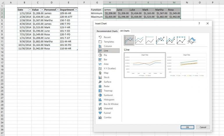
- Select the first chart offering and click OK.
- Once you insert the chart in the sheet, click the Chart Elements icon in the top-right corner (Figure C). At this point, the chart has two elements, lines and bars.
Figure C
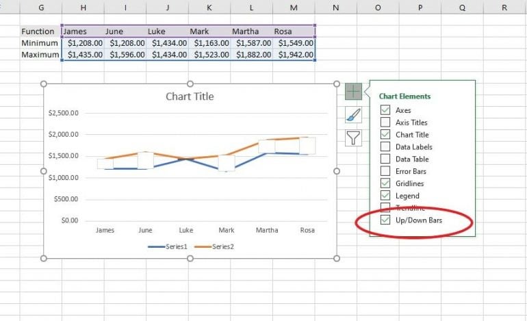
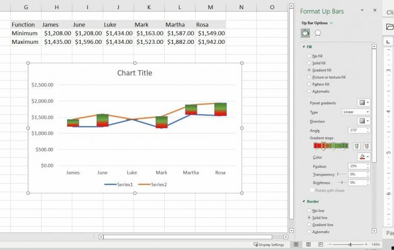
- Right-click one of the floating bars to select them all and open a submenu; choose Format Up Bars, which opens the Format Up Bars pane.
- In the Fill options, click Gradient Fill, and change the Direction to bottom to top. As you can see in the Gradient Stops control that red is on the bottom and switches to green. You don’t have to change the default color of the bars at this time. I also choose a thin blue outline (a Border option).
You could leave the chart as is, as a combo chart, as shown in Figure D, but let’s remove the lines so it’s strictly a floating bar chart.
Figure D
SEE: Why Microsoft Lists is the new Excel (TechRepublic)
Right-click a line and choose Format Data Series, which will open the corresponding pane. Click Fill & Line (at the top). Then, choose No Line in the Line section. Repeat for the other line. The chart in Figure E is nearly done.
Figure E
Click the series legend at the bottom-center of the chart window and press Delete. I added some title text, which isn’t strictly necessary for this example. The finished chart shown in Figure F only has one small bump and that’s the bar that represents Luke. You might need the details to determine that he only had one sale and that’s why there’s no bar.
Figure F
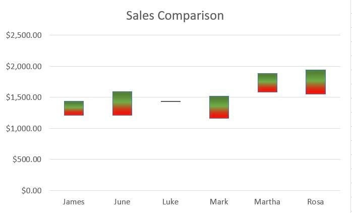
The green and red gradient in the bars is also subjective. In fact, they’re a tad ugly, but I wanted you to see how easy it is to have two colors in a gradient fill. You could use any color, gradient or texture.
The relationship between the people represented is obvious in this chart, and that’s why a floating bar chart is a good choice for this type of comparison. With a glance, you can see that the highest values for James and June are about the same as Marth and Rosa’s lowest sales.