


Excel’s Chart Wizard makes it easy to create and format charts and graphs. By default, however, those charts aren’t too visually exciting. Fortunately, Excel’s Drawing toolbar makes it easy to customize the backgrounds and colors in your charts to make them stand out. Here’s the scoop.
Filling for effect
Let’s start by creating a basic chart, and then we’ll customize it. To create the chart, we entered the raw data shown in Figure A, and with the cursor on one of the cells in that raw data, we clicked the Standard toolbar’s Chart Wizard button and then clicked Finish. The resulting chart contains the information we need, but it isn’t exactly eye-catching.
| Figure A |
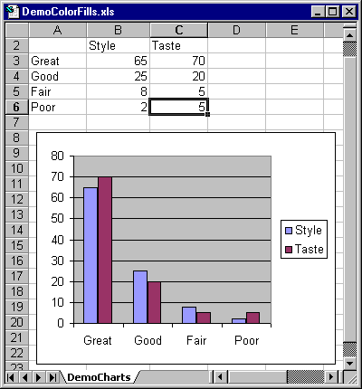 |
| Here’s what the basic chart looked like after we launched the Chart Wizard and clicked the Finish button. |
If the Drawing toolbar isn’t visible, click the Standard toolbar’s Drawing button or go to View | Toolbars and select Drawing. To change the background of your graph, click in the space between the plot area and the edge of your graph. Then, click the Drawing toolbar’s Fill Color tool and select a color from the palette. As soon as you do, Excel changes the background of your chart, filling it with the color you selected.
You can use the same approach to change the colors of any of the components of your chart, such as bars (or other graphic elements) and text boxes. Just click the object and select a color from the Fill Color palette. Figure B shows our sample chart after we changed the color for various sections of our sample chart.
| Figure B |
 |
| With just a few clicks, you can change the colors of any of the components of your chart. |
If you want to do something fancier with your charts than just changing colors, try adding a special effect. Click the Drawing toolbar’s Fill Color tool again, but this time select the Fill Effects option. When the Fill Effects dialog box appears, click the Gradient or Pattern tabs, which allow you to mix and match custom colors and predesigned styles. (The Texture tab lets you select custom backgrounds, but you can’t readily change their colors.)
On the Gradient tab, click the Preset radio button. When you do, as Figure C shows, you’ll get a chance to choose from a number of predefined color combinations and styles. Figure D shows our sample chart after we applied some of those preset styles in our chart.
| Figure C |
 |
| The preset fill styles provide a wide range of formatting options. |
| Figure D |
 |
| Here’s what our sample chart looks like after we incorporated some of Excel’s preset color schemes. |
Get valuable tips for using worksheet functions, VBA code, and much more, all delivered straight to your inbox every Wednesday and Friday. Best of all, it’s absolutely free. Sign up for Microsoft Office Suite—one TechMail that will bring you power tips for working with Excel, Word, and Access.