


A drop to zero in a chart can be abrupt, but sometimes, that’s what you want. On the other hand, there will be times when you won’t want to draw attention to a zero. When you don’t want to display zero values, you have a few choices for hiding or otherwise managing those zeros.
In this tutorial, I’ll review a few methods for handling zero values that offer quick but limited results with minimal effort. Depending on how much charting you do, you might find more than one of these methods helpful.
Following along
For this demonstration, I’m using Microsoft 365 Desktop on a Windows 11 64-bit system, but you can also use earlier versions of Excel. Excel for the web supports most of these techniques.
SEE: Google Workspace vs. Microsoft 365: A side-by-side analysis w/checklist (TechRepublic Premium)
You can follow along more closely by downloading our demonstration file. If you work through the instructions using our demonstration workbook file, undo each solution before you start the next. You can do this by simply closing the file and reopening it without saving it.
Exploring the sample dataset
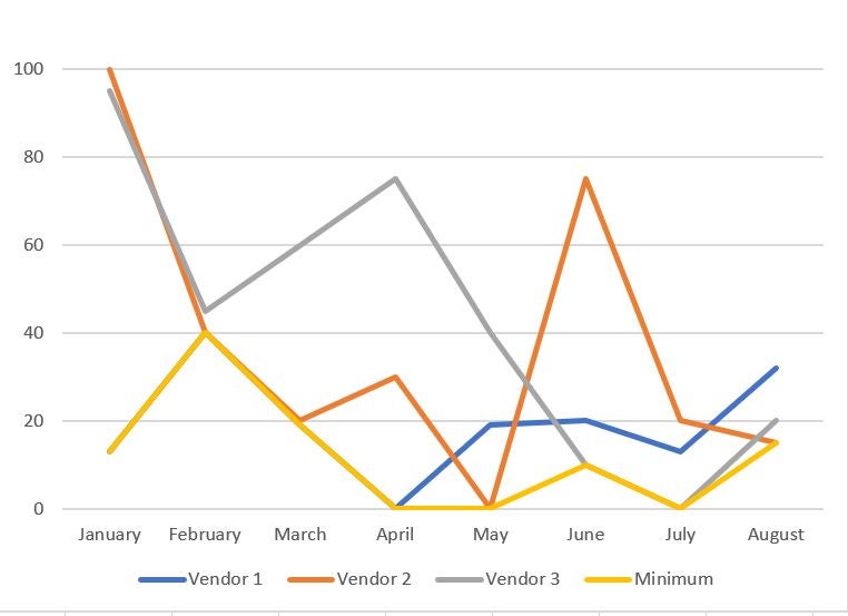
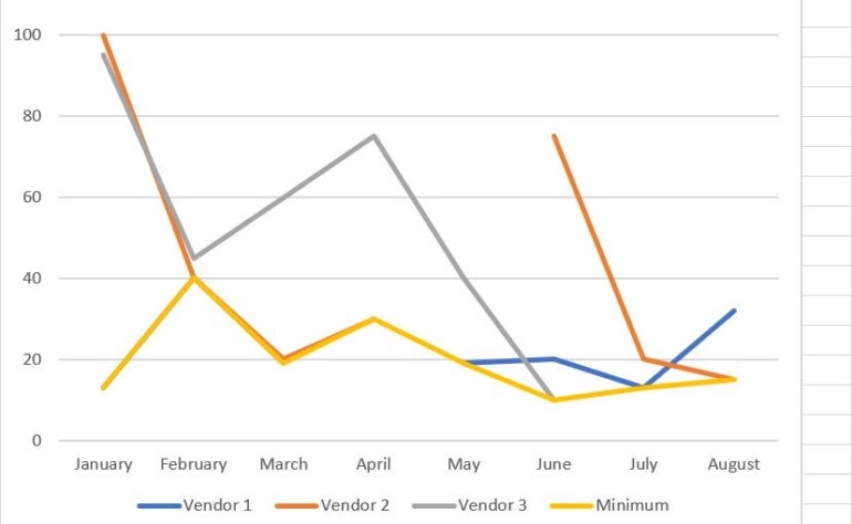
The example below shows the data and initial charts that we’ll update throughout this article. The pie and single-line charts reflect the data in column B for Vendor 1. The other two charts have three data series: Vendor 1, Vendor 2, and Vendor 3. The Minimum column returns the minimum value for each month, so April, Ma, and July return zero for the minimum value. This setup simplifies all the examples we’ll be reviewing in this guide.
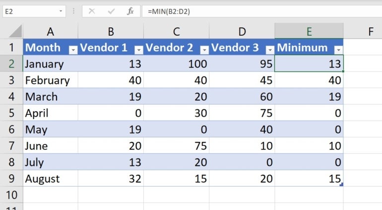
Right now, the charts display zero values by default in each chart type.
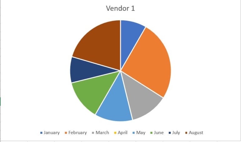
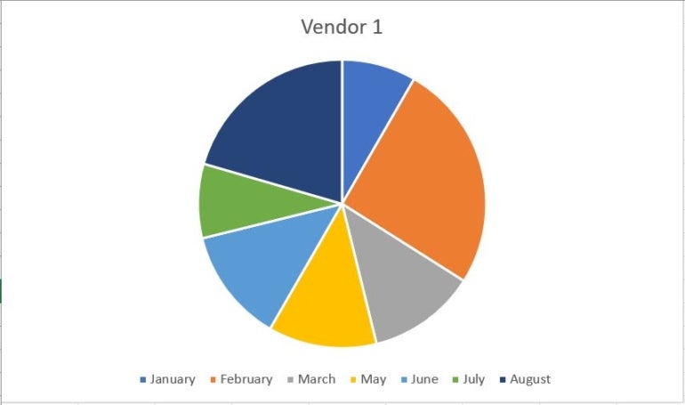
Pie chart
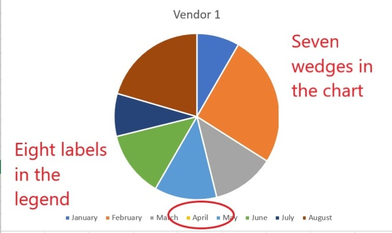
By default, the pie chart, shown below, charts the zero, but you can’t see it. If you turn on data labels, you will see the zero listed. There are seven slices but eight items in the legend.
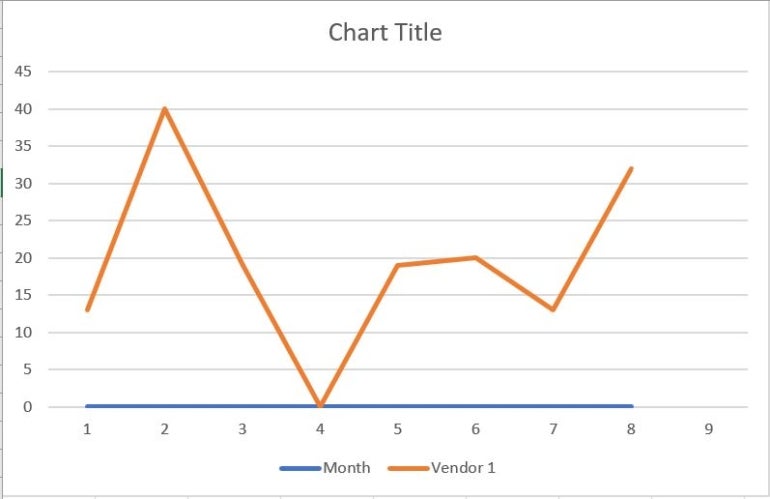
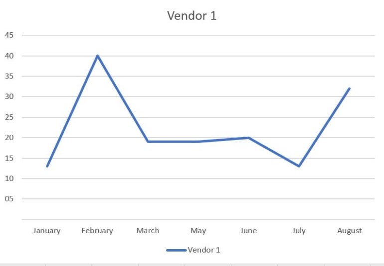
Line chart
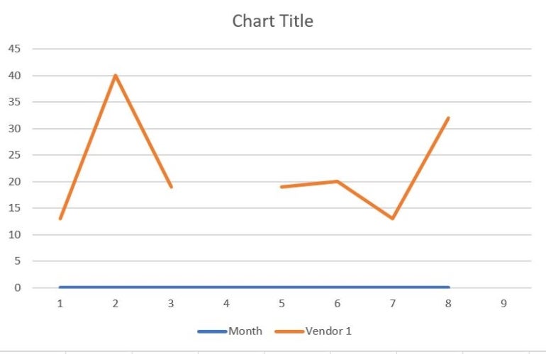
The below example shows the line chart’s default behavior, which drops the one to zero on the X-axis.
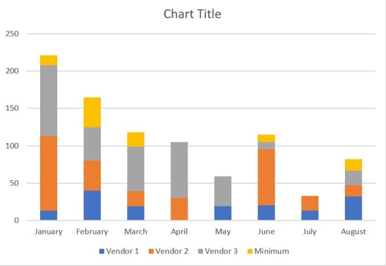
Stacked bar chart
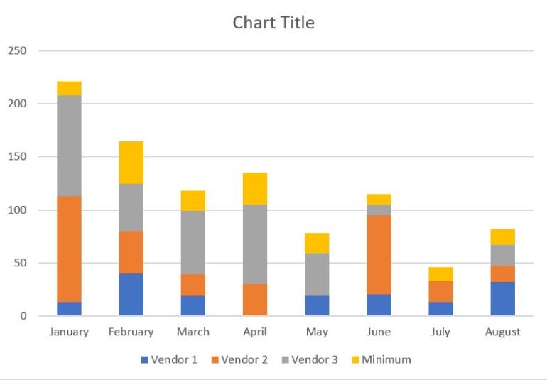
Excel plots four stacks for the months without a zero value in the stacked bar chart shown below. The months with a zero display only two values because the Minimum column also returns zero for those months, so the chart is actually plotting two zeros for each month. Readers might be a bit confused by what they’re seeing.
Multiple-line chart
This multiple-line chart below is messy; enlarging it doesn’t improve its readability. Although you can’t see all of the lines, they’re there. The values are so close that some lines obscure the others, which is misleading.
Your results may vary depending on Excel’s default settings and theme colors. Now that you know the example data, let’s review a few methods for suppressing the zero values in our example charts. Some will work with limited results, and others won’t work at all.
Removing and formatting zero
There’s more than one way to suppress zero values in a chart, but none work the same consistently for all charts.
Manual removals of zero
To begin with, you might try removing zero values altogether if it’s a literal zero and not the result of a formula. By removing, I mean simply deleting all zero values from the dataset. Unfortunately, this simplest approach doesn’t always work as expected.
Pie chart
The pie chart doesn’t chart the blank cell, but the legend still displays the category label, as shown below. Removing the zero values from the dataset changed nothing.
Stacked bar chart
The stacked bar responds interestingly. It doesn’t chart the zero values, but because the zeros are gone, the MIN() functions in the Minimum column are now all non-zero values and chart accordingly.
Line and multiple-line charts
Neither line chart handles the missing zeros well, but the multiple-line chart is hopeless. The line chart has a gap between the two months, which definitely looks odd.
The multiple-line chart is deceptive. The Vendor 1 series appears wrong, but you will see the markers if you click it. It’s there but obscured by other lines; even doubling its size does nothing to improve its readability.
If you removed zero values in the sheet during this phase, re-enter them before continuing to our next example. Or, close the demonstration file without saving your changes and reopen it.
More about Software
- Best Free VPNs
- Best Free CRM Software
- Best Free Accounting Software
- Best Free Project Management Software
Unchecking worksheet display options
You can also hide zeros by unchecking the worksheet display option called Show A Zero In Cells That Have Zero Value. Here’s how:
- Click the File tab and choose Options. You might have to click More first.
- Choose Advanced in the left pane.
- In the Display Options For This Worksheet section, choose the right sheet from the drop-down menu. (This is a sheet-level property.)
- Uncheck the Show A Zero In Cells That Have Zero Value option.
- Click OK.
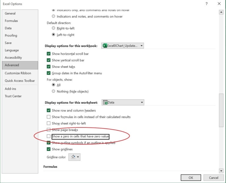
The zero values still exist — you can see them in the Formula bar. However, Excel won’t display them; thus, this method has no impact. The charts treat the zero values as if they’re still there because they are. Excel for the web doesn’t allow access to this setting.
We’ve found that unchecking this setting offers no advantage. I include this step in our tutorial to prevent you from wasting your time on this technique yourself.
Setting a custom format
Before you try this next formatting option, reset the Advanced option that you disabled in our previous step, or close the file without saving and reopen it. Keep in mind this next formatting approach has varied results. Here’s how it works:
- Select the data range B2:D9.
- Click the Number group’s dialog launcher (Home tab).
- In the resulting dialog box, choose Custom from the Category list.
- In the Type control, enter
0,0;;;and click OK.
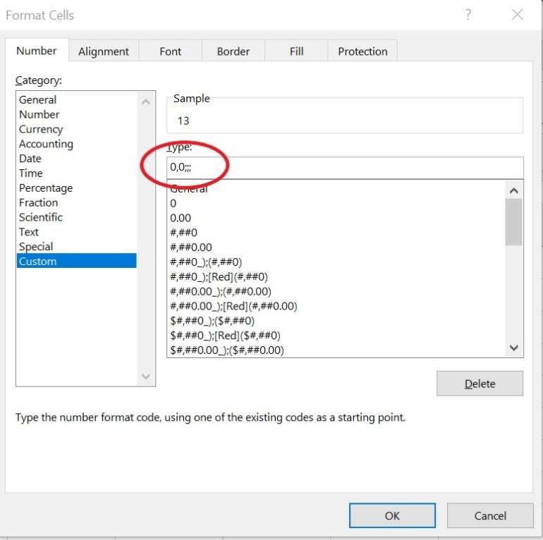
You’ll notice that the results are similar to those seen earlier:
- Pie chart: The pie chart doesn’t chart the zero value, but April is still in the legend.
- Stacked bar chart: The stacked bar chart displays only two stacks for the months with a zero value.
- Line and multiple-line charts: Both line charts include zero values.
Because these methods are so easy to apply, try deleting or formatting the zeros first. However, it’s important to recognize that these methods will not likely update all charts how you want. You might have to find a different solution for each chart!
If you applied this format to the demonstration file, delete it before you continue. Or close the file without saving it and then reopen it.
SEE: Here’s how to enter leading zeros in Excel
Charting a filtered dataset
If you have a single data series, you can filter out the zero values and chart the results. Like the methods discussed above, it’s a limited choice because you can only chart one vendor at a time. Additionally, Excel for the web doesn’t support this technique.
SEE: 10 tips to make your Excel spreadsheets look professional and functional
Let’s demonstrate. Start by adding a filter to the Vendor 1 column with these steps:
- Click inside the data range.
- On the Data tab, click Filter in the Sort & Filter group. If you’re working with a Table object, you can skip this step because the filters are already there.
- Click Vendor 1’s drop-down and uncheck zero.
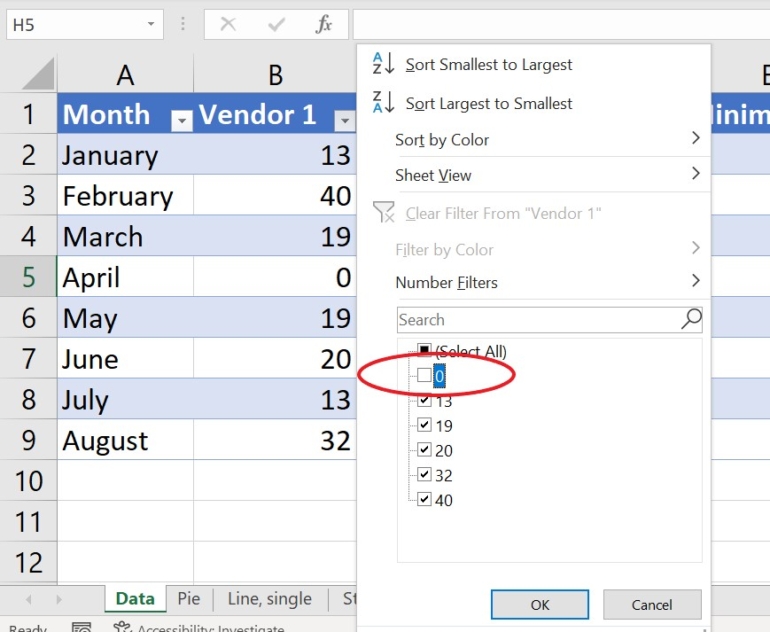
- Click OK to filter the column, which will filter the entire row. Don’t worry about that, but be sure to remove the filter when you’re done.
The below example shows the new pie chart.
Below, you can see the new line chart.
Both charts are based on the filtered data in column B. Neither displays the zero value or the category label on the X-axis. However, the line chart has a serious flaw: The line is solid, and April has the same value as March. Distributing this chart as-is would be a serious mistake because the data for April is incorrect.
Unfortunately, when you remove the filter, the charts update and display the zero values. On the other hand, if your chart is a one-time task, filtering offers a quick fix for a pie chart.
If you tried this with the demo file, undo the change, close it without saving it, and reopen it.
Replace zeros with NA()
The most permanent fix for hiding zeros is to replace literal zero values with the NA() function using Excel’s Find and Replace feature. If you update the data regularly, you might even enter NA() for zeros from the get-go, eliminating the problem altogether. To do so manually, enter =NA(). However, that’s not always practical, so let’s use Excel’s Replace feature to replace the zero values in the example dataset with the NA() function:
- Select the dataset. In this case, it’s B2:D9.
- Click Find & Select in the Editing group on the Home tab and then choose Replace from the dropdown, or press Ctrl + H.
- Enter 0 in the Find What control.
- Enter
=NA()in the Replace control. - If necessary, click Options to display more settings.
- Check the Match Entire Cell Contents option.
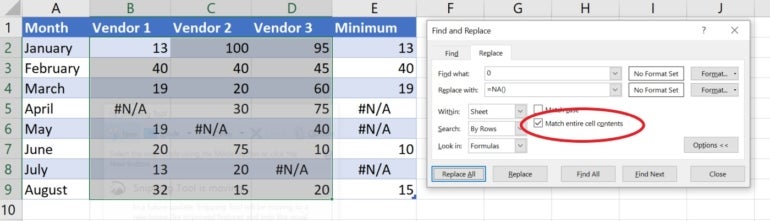
- Click Replace All, and Excel will replace the zero values.
- Click OK to dismiss the confirmation message.
- Click Close.
The figure above shows the settings and the results. If you don’t select the Match Entire Cell Contents option in step six, Excel will change the values 40, 404, and so on. The formulas in column E display the error value because they reference a cell that displays the error message.
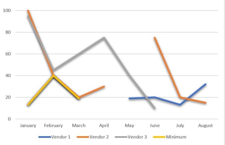
None of the charts display the #N/A error values, but they still display the category label in the axis and the legend. The stacked bar chart displays only two stacks for the months with a #N/A value, so there’s no difference. The one curiosity is the multiple-line chart: The zero values, which are now #N/A error values, are clearly visible.
Suppose you’re working with the results of formulas that might return zero instead of an error value. In that case, you can use an IF() function to return the #N/A error using the following syntax:
=IF(formula=0,NA(),formula)
The MIN() function returns the minimum value for each month. The IF() function returns #N/A if the result is zero:
=IF(MIN(B2:D2)=0,NA(),MIN(B2:D2))
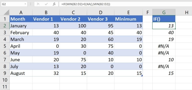
The example’s contrived, but don’t let that bother you. The truth is, you’re unlikely to need this expression because most functions and expressions return the #NA error value if they try to evaluate one.
Choosing from chart settings to chart zero values
Several charts show a gap between one value and another when the zero value is missing. If you’re working with one chart, you can quickly bypass the guesswork by using a chart setting to determine how to chart zero values. Here’s how:
- Select the chart.
- Click the contextual Chart Design tab.
- In the Data group, click Select Data.
- In the resulting dialog, click the Hidden and Empty Cells button in the bottom-left corner.
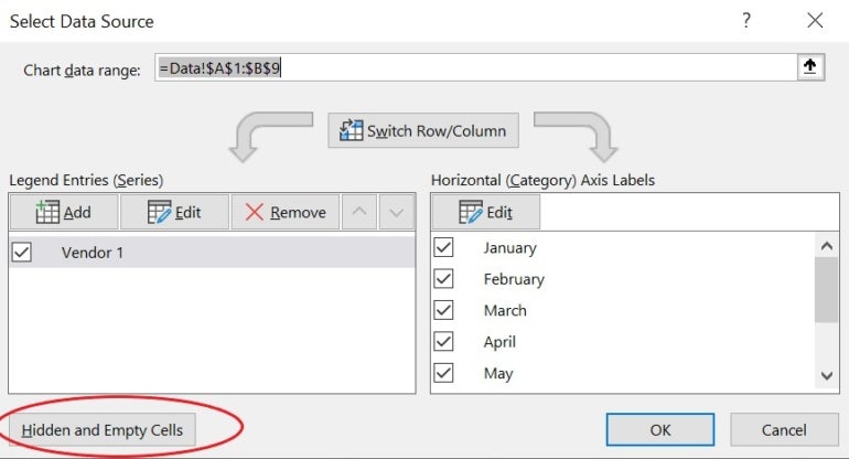
- Choose one of the options.
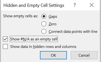
- Click OK twice to return to the chart.
How do you exclude zero in data labels?
There’s no easy way to remove the zero in data labels. If the chart doesn’t chart it, most of the time, it won’t display the value in a data label. After working through all these examples, you can see that the issue comes with no guarantees. You’ll have to explore a bit to find the right settings.
If the chart doesn’t display the zero in the chart or the data label but does display the series in the legend, you can remove it. Simply select that item in the legend and press Delete. If you accidentally delete all of them, press Ctrl + Z to undo the delete and try again, making sure to select only the one label you want to remove.
Final tips
There isn’t an easy one-size-fits-all solution for zeroless charts. If you display zeros for reporting purposes but don’t want to see them in charts and you chart often, consider maintaining two datasets: one for reporting and one for charting. This is the best alternative to toggling back and forth with one dataset.
The real problem is the story the data tells. Zero is a valid value and Excel treats it as such.
Read next: Explore some of the best free alternatives to Microsoft Excel.