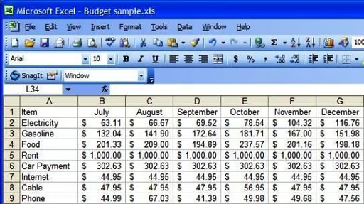
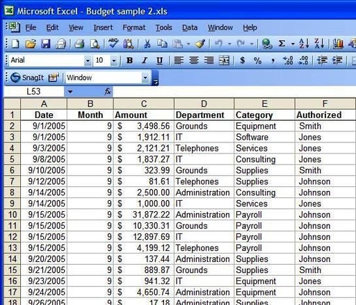
A fairly typical data set provides a good place to demonstrate Excel’s graphing abilities.
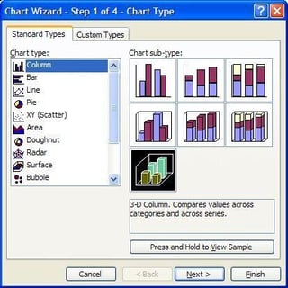
With a graph, the type of diagram you select is critical when it comes to getting your point across. For example, if you wanted to diagrammatically show how much of your monthly payment went toward rent, you would probably not use a line graph. Instead, a pie chart would be more appropriate since it shows you slices of a whole.
\r\nThe 3-D bar is a sub-type of a normal bar chart.
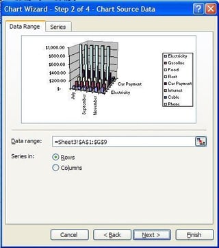
The second step of the wizard asks you to select your data range and to determine whether data is separated by columns or rows. For this example, I didn’t need to select a range. The data range matches my selection, and I want the “Rows” data series.
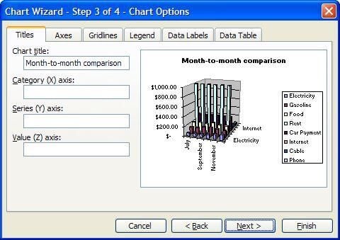
This step provides fields for better explanation of what’s on your graph.
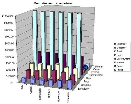
This graph isn’t perfect. It’s the right kind of graph, but the data isn’t really the best for this kind of comparison. This isn’t the best view of the data, but there’s a good reason.
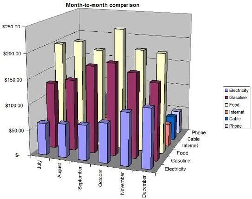
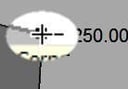
With the removal of two unnecessary series, the graph looks quite a bit different. This still isn’t the best graph, but you’ll quickly notice that the differences from month-to-month are much more pronounced now. This is largely because the scale now tops out at $250 rather than $1,000.
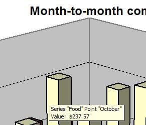
Hold your mouse over one of the bars in the graph. A tool tip appears providing you with information about that data point. The tool tip provides with you all of the information related to the bar.
Excel gives you the ability to rotate a 3-D graph any way you like. To do so, you need to click somewhere on the graph “wall” after which you can manipulate the graph. The corner control is key to graph rotation capability.
It’s a little hard to see in this shot, but that is the plus icon control. Now, while holding down the left mouse button, drag one of the corner controls around the screen. Notice that your graph rotates as you move the controls. While you are dragging it around the screen, your graph appears to be a wire frame instead.
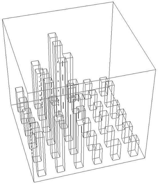
The wire frame helps to conserve computing resources. It takes a lot of processing power to redraw the graph while you move it. When you’re done dragging, your graph looks completely different, and you can get different views on the data.
The budget spreadsheet is a fairly typical layout and provides a good example. Just like with a PivotTable, a PivotChart is started by placing your cursor somewhere inside your data table and choosing Data | PivotTable and PivotChart Report from the menu.
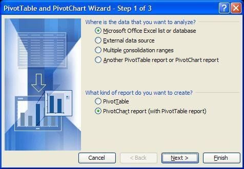
This is where things change a bit. Under “What kind of report do you want to create”, instead of selecting PivotTable, select the “PivotChart report” option. This will give you a blank chart to start with.
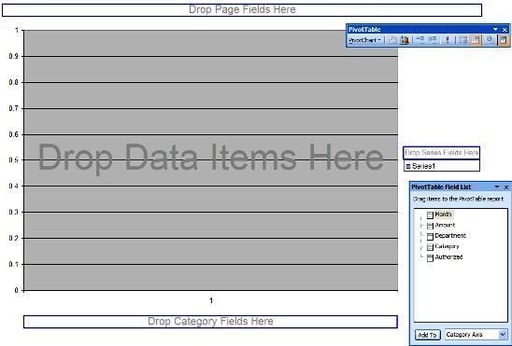
Here’s a look at your drawing board. You might notice that this looks a lot like a blank PivotTable sheet and, like that sheet, this one has various places to which you drag fields to design your report any way you like.
As an example, I’ll do the following:
\r\n
\r\n
\r\n
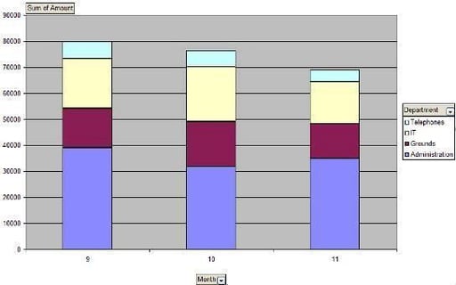
\r\nWith three clicks and drags, I was able to whip up this chart.
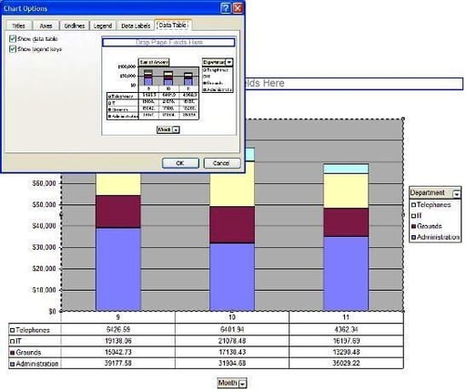
Just like with a normal chart, you can make all kinds of modifications to your PivotChart. Just about everything available with a normal chart is available here. Change any option you like!
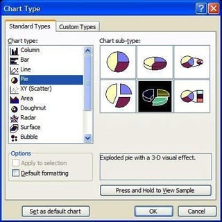
One of the first things you might want to do is use a different type of chart. After all, a bar graph isn’t always the best option. To change your graph type, from either the PivotTable toolbar or the standard toolbar, click the Chart Wizard button. You can change the PivotChart to any kind of chart you like.
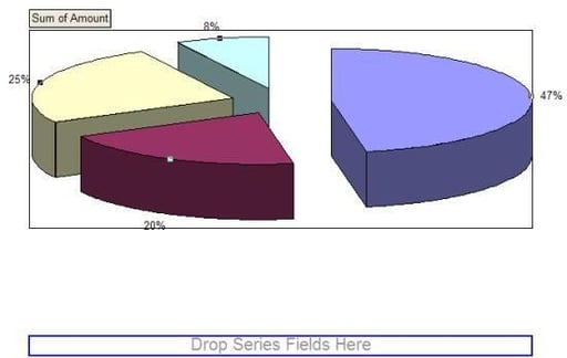
For this example, I’ll change the chart type to a 3-D pie chart. I’ve also moved the Department field to the Category slot, and removed the Month field completely. Why did I remove the month field? A pie chart can’t break down both a category and a series at the same time. By leaving the month field, the pie chart was being based on just the first month’s worth of data. By removing the field, I was able to get a pie chart that accurately reflected the total of each category for all months. Here’s a down-and-dirty pie chart.
Bill Detwiler is the Editor for Technical Content and Ecosystem at Celonis. He is the former Editor in Chief of TechRepublic and previous host of TechRepublic's Dynamic Developer podcast and Cracking Open, CNET and TechRepublic's popular online show. Previously, Bill was an IT manager in the social research and energy industries. He has bachelor's and master's degrees from the University of Louisville, where he has also lectured on computer crime and crime prevention.


