Material Design: 10 apps that show off Google’s new UI language
Image 1 of 7
\N
With Material Design Google is hoping to introduce a tactile feel to apps running on its platforms.
The design guide describes how to build app interfaces from components that behave like physical objects – occupying 3D space, casting shadows, stacking on top of each other and even simulating momentum when moved.
This physicality isn’t just a stylistic choice, but aimed at making interfaces obey a set of rules that mimic real-world behaviour and intuitively make sense to people.
The distinguishing features of Material Design interfaces are bold colours and distinct components separated by clear white space.
Google describes Material Design as an attempt to take hundreds of years of knowledge about typography, graphic design and how to structure information from printed media and encompass it in how apps are constructed.
It’s a design language Google will use in its own apps across computers, phones, tablets, wearables and TVs today, and on whatever new platforms emerge tomorrow. Not only that but Google is encouraging third party app developers to follow suit, providing the fonts, layout templates and colour palettes developers need to get started on building a Material Design app.
Material Design can already be seen in a selection of apps running on Android Lollipop, the latest version of the Google’s operating system for phones, tablets, TVs, wearables and cars. Here are a selection from Google’s Play Store that show off some of Material Design’s key characteristics.
e-Cal
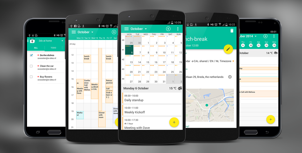
The e-Cal calendar app demonstrates how shadows provide visual cues about the relationship between components of the UI.
Notice how the shadow below the yellow button provides an indication of how fair it sits above the surface below. The elevation of an object determines the appearance of its shadow.

Numix Calculator
Numix Calculator
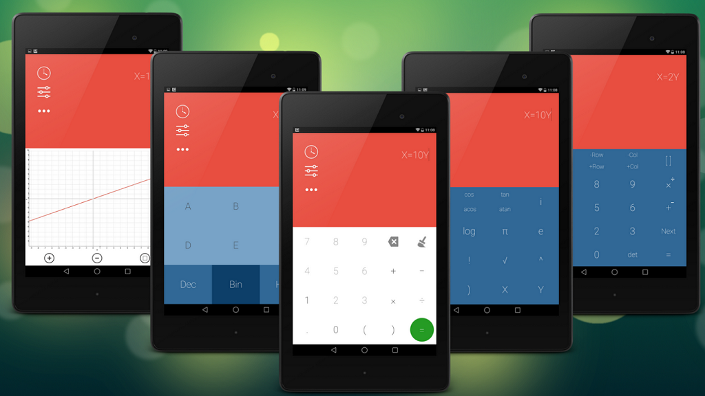
Here you can see the Numix Calculator app showing off a selection of the bold colours that Google suggest using in a Material Design app.
Google recommends choosing from a selection of 500 shades to use as as primary colours.

Reddit News Pro
Reddit News Pro
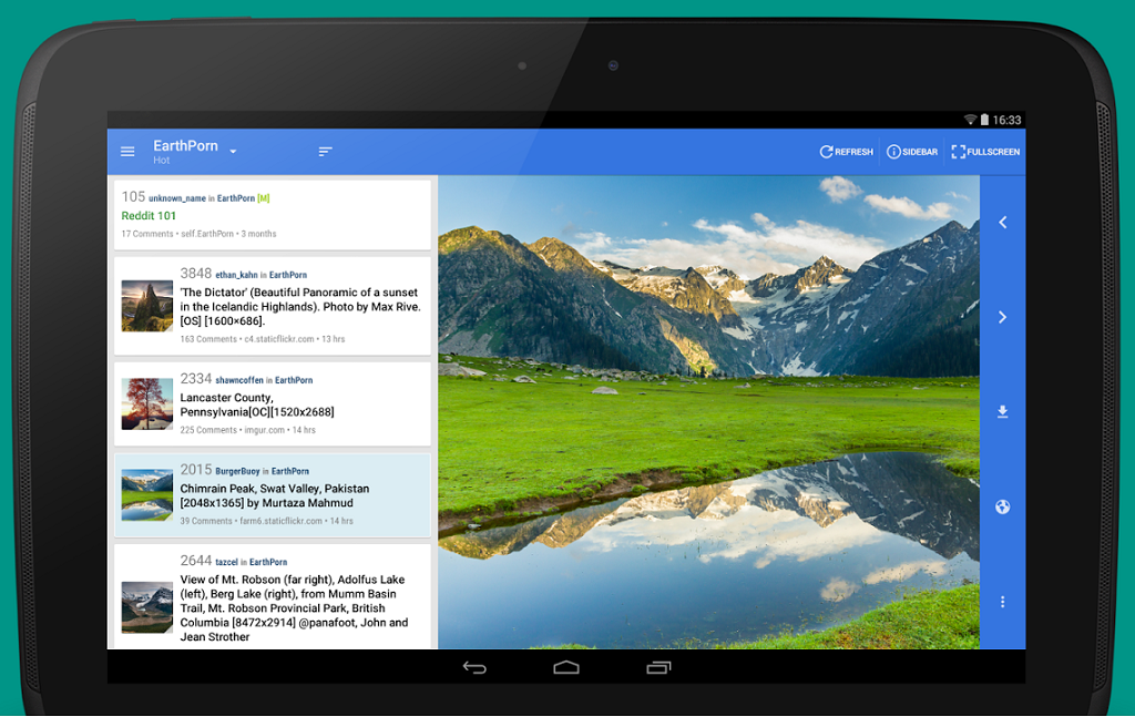
One of the most important components of material design apps are cards, as seen on left in this Reddit News Pro app.
Google describes a card as a piece of paper that contains unique related data: for example, a photo, text, and link about a single subject. Cards are typically an entry point to more complex and detailed information.
As seen here cards have a constant width and variable height.

Flip Currency Converter
Flip Currency Converter
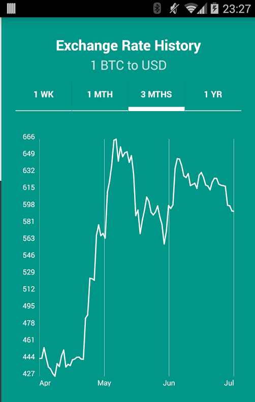
In Material Design apps Google recommends using Tabs to make it easy to switch between different views or functional aspects of an app, or to browse categorised data sets, as seen in this Flip Currency Converter app.
Google says tabs should be used to organise content at a high level, for example, to present different sections of a newspaper.
Inbox
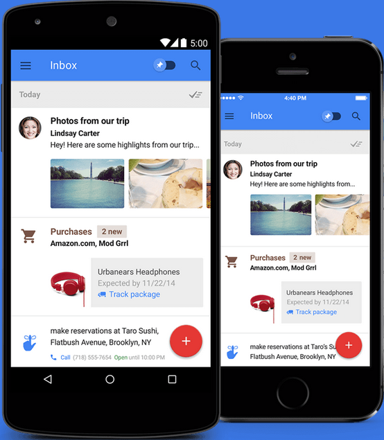
Google’s new email app Inbox demonstrates how Material Design apps avoid slicing up the interface into too many regions, instead using whitespace to delineate secondary areas.

Google Newsstand
Google Newsstand
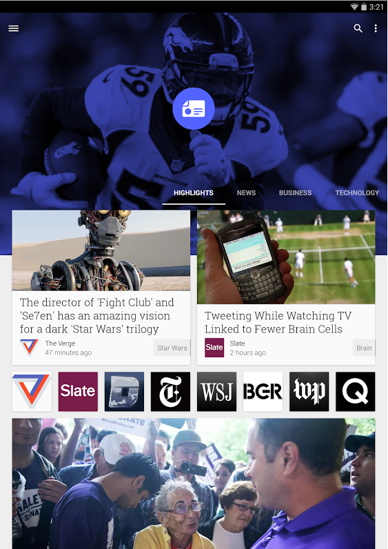
When using images Google recommends staying away from stock photos and instead using imagery specific to the associated content – as seen in this Google Play Newsstand app. Where content is abstract it recommends choosing an interpretive shot.
Topeka
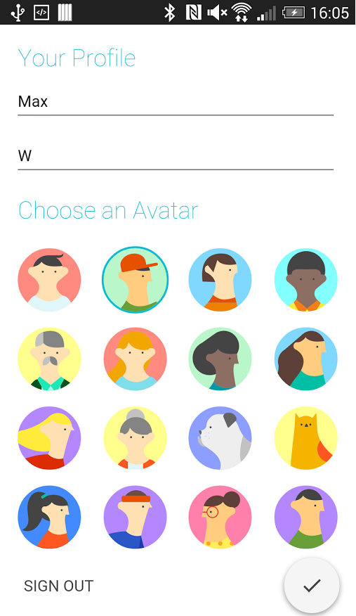
The Material Design guidelines recommend making system icons – those that execute a command – front-facing, graphic and bold and composed of geometric, consistent shapes.
Google provides a selection of about 750 such icons to download in a variety of formats, one of which is the tick seen in this app called Topeka.
-
Account Information
Contact Nick Heath
- |
- See all of Nick's content
