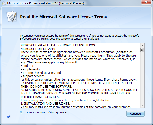
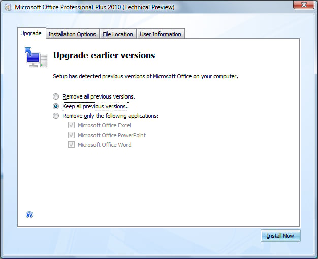
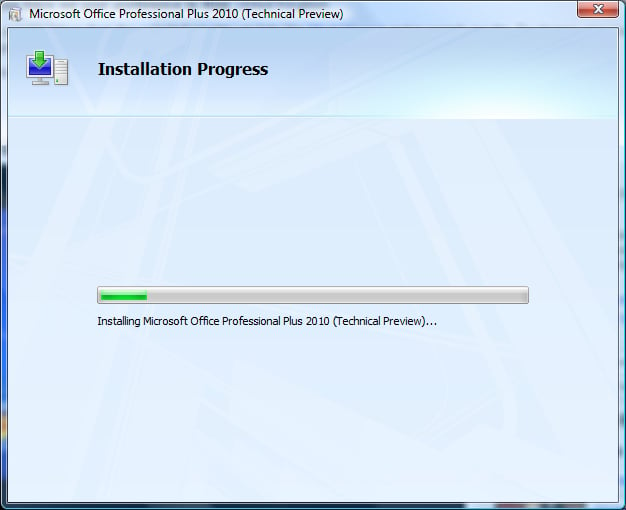
The setup initially appears unchanged, however moving through the process you will notice a few improvements to how Office is installed on your computer.
With this, it allows you to keep two versions of Office, both 2007 and 2010 editions on your machine for backwards compatibility, add-in compliance or IT policy reasons.
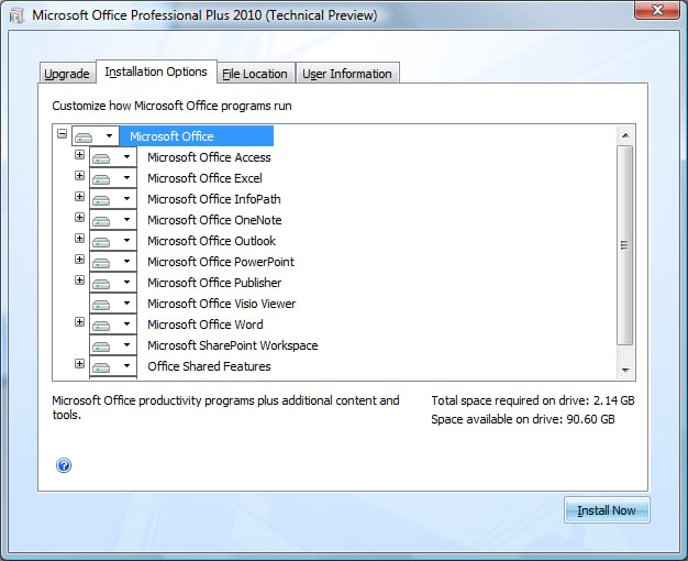
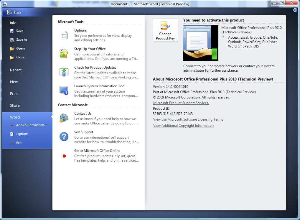
Even though the product editions (SKU’s) have not been finalised yet, in the Professional edition, it seems you may be able to get everything there is.
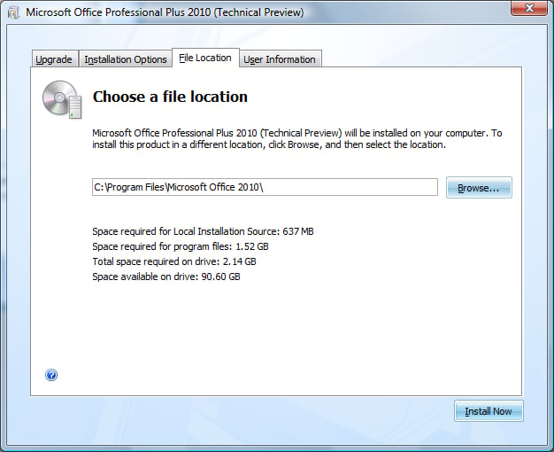
The file location section is the same, but I have opted to change my Office directory to that of \\Microsoft Office 2010, separating my previous Office version to keep everything neat and tidy.
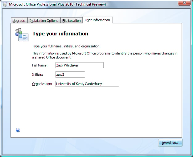
Your information gets embedded on every document you work on to ensure file details and permissions are set for that person.
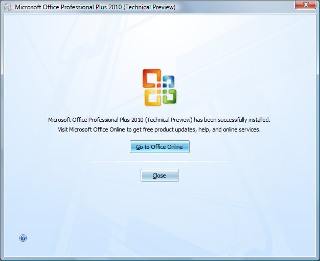
At this stage, everything seems perfectly normal and without change.
We could, however, see a massive overhaul in the setup user interface. This isn’t as important as the actual applications, of course.
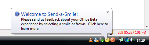
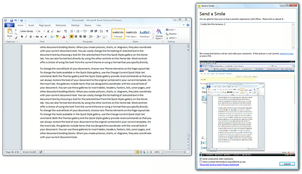
As with previous beta versions of Office, the Send-a-Smile feedback tool is a great way for you to get in touch with the Office team. If you like or dislike something, you can click the corresponding icon and it will attach a screenshot of what you are currently working on along with your comments. This is so they can get an accurate picture of the problem or the feature you like.
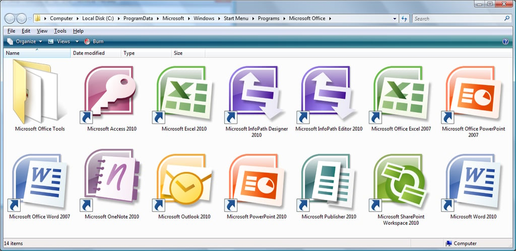
As of yet, the icons seem exactly the same, with the exception of Microsoft SharePoint Workspace 2010 which replaces “Groove”. However, as I have not experimented with Groove in a long while, I am unsure as to whether the icon is different or not.
The aim of the new design is to ensure that the Office applications are clean and easy to read, use and support.
These settings and options are subject to change as due with the ongoing developmental stages.
The user interface has become more refined and easier than before. Now you can load up an application and know exactly where to go, almost with your eyes shut. The entire experience has becomed more streamlined.
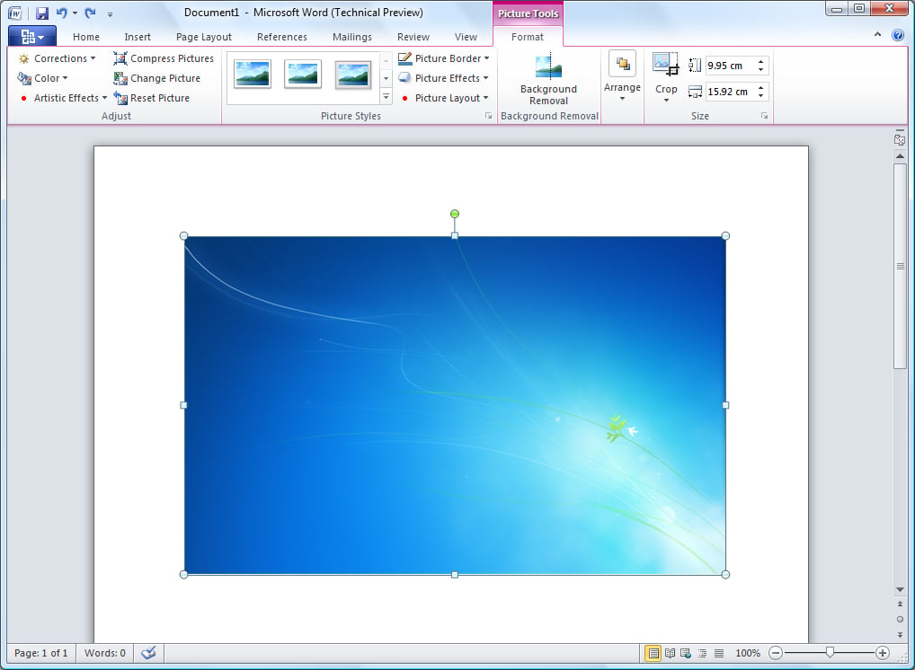
Even though a lot of the user interface has changed, it is still easy to begin when you left off with a previous Office version. Every application now has the Ribbon, but can easily be minimised.
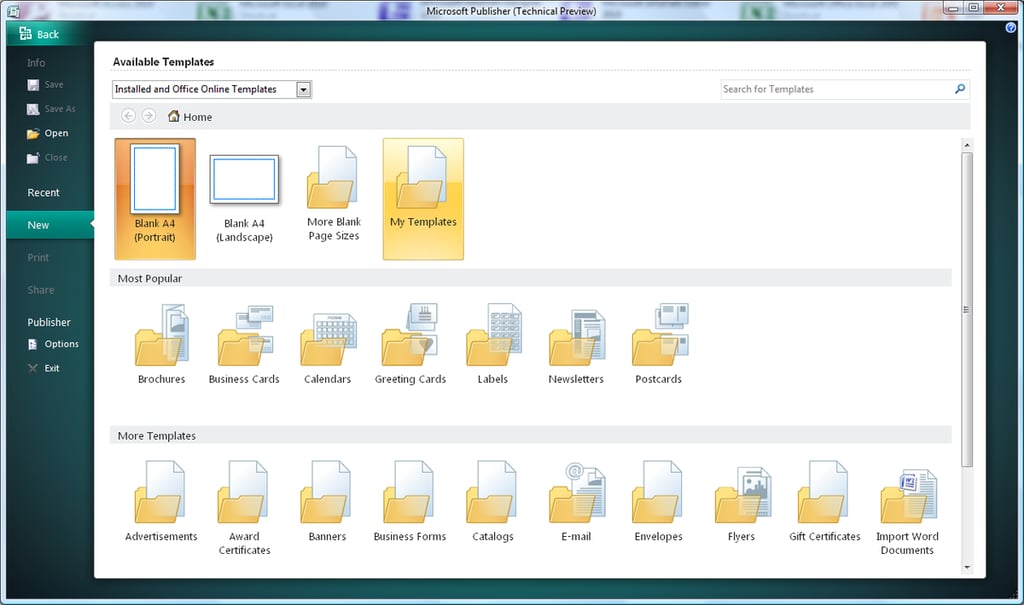
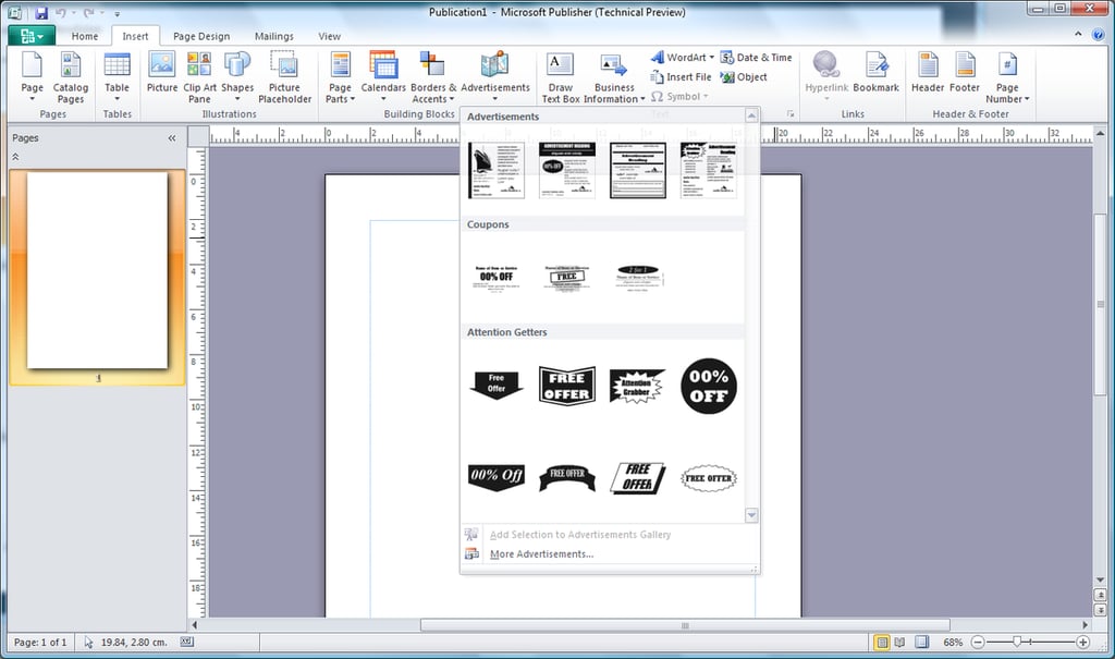
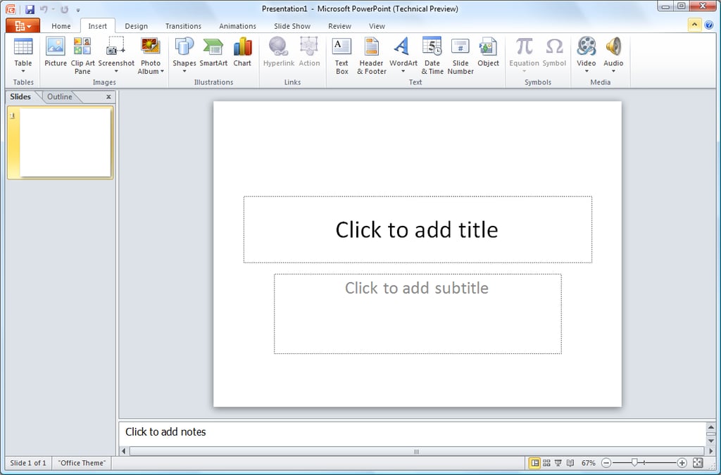
You will also notice that each Office application has its own “theme colour”, so PowerPoint has orange and Publisher has green. This makes it easier to differentiate between applications, even though some differences are quite obvious.
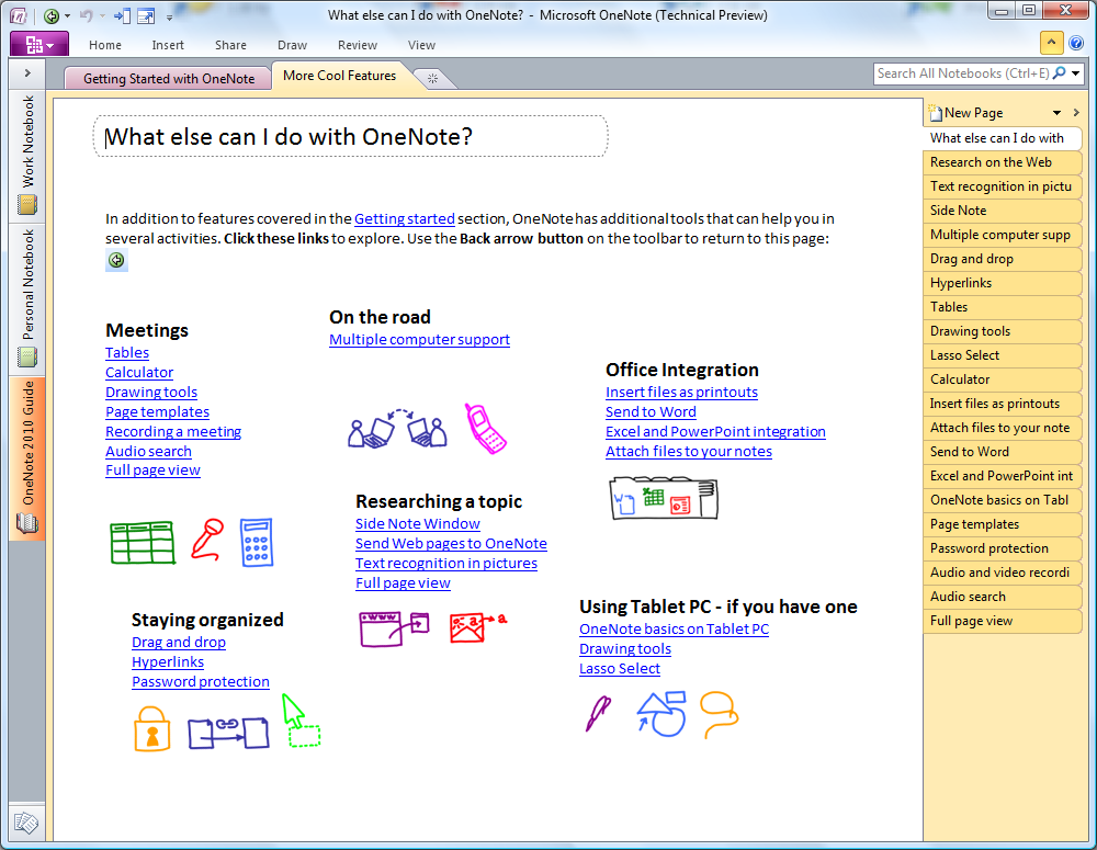
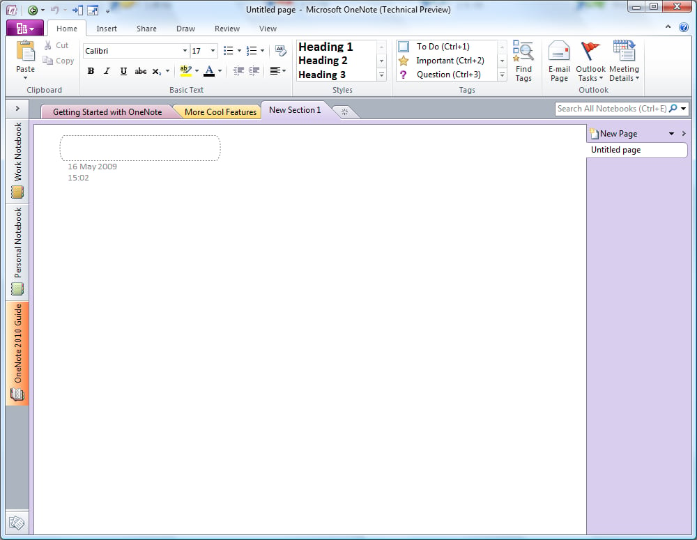
Clearly in some applications, such as OneNote, even though the design and feel of the application has changed, it still feels very much the same. A lot of work is still needed to ensure that each application starts, runs and ends the same way.
Because I do not have a touch-screen device, I cannot test OneNote effectively. What I did notice, however, is the dropping of the “Office” title in the title bar.
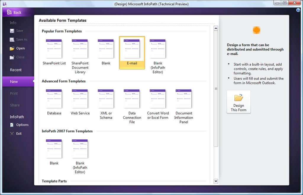
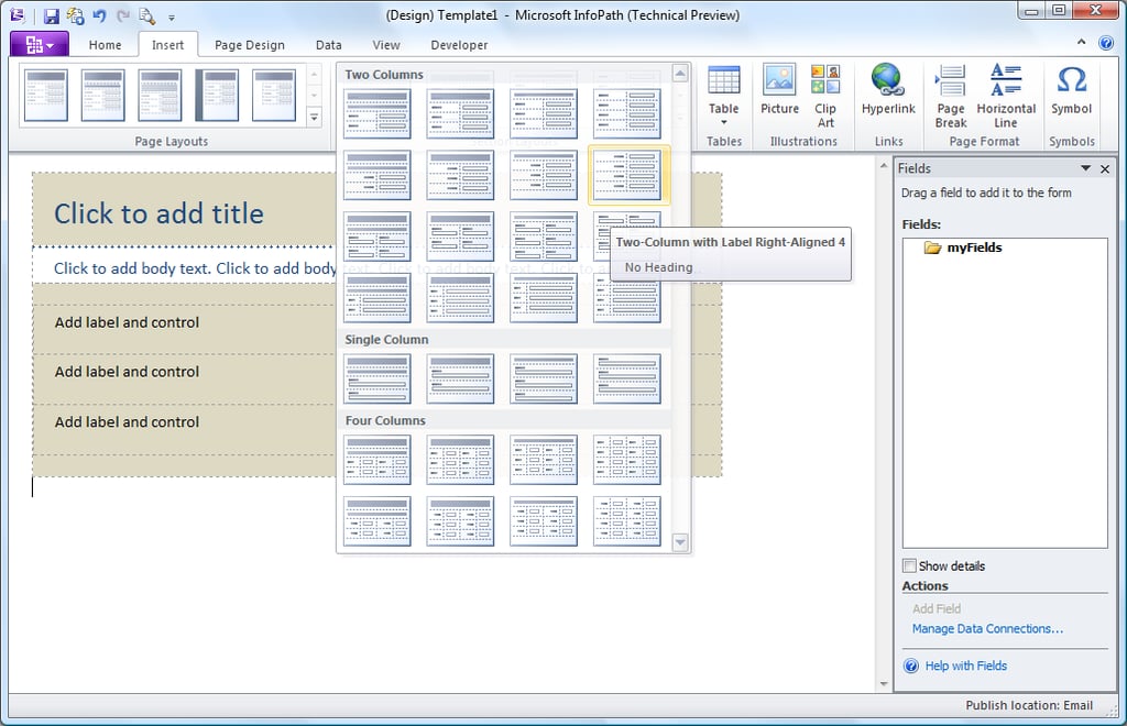
InfoPath is more designed for business and database users, so a lot of consumers will have little need for forms and form templates.
Again, with the Ribbon, it allows each application to have very separate menus but keeping the confluent, simple look.
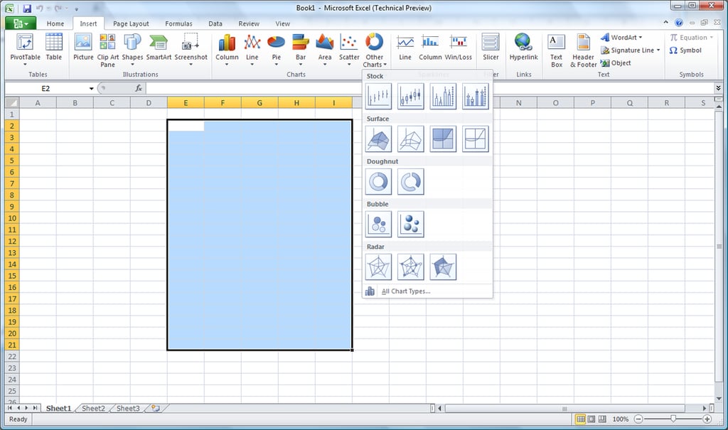
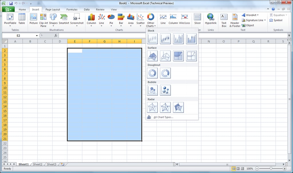
Excel seems to be very much the same as it was before. I cannot see any particularly new features, partly due to backwards compatibility.
I’m sure further on down the development cycle we will see features being added and changes in the way we can use the applications. Some of the icons have been updated, but some clearly have not as of yet.
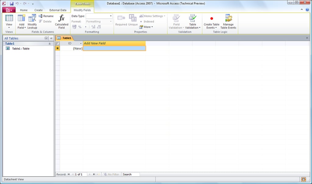
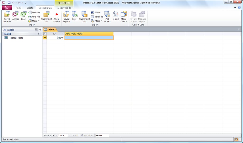
…even though, some people may find Access 2007 and 2010 much easier to use due to the simplicity of the design.
In the title bar, you will notice the main change in the applications of a gradient Aero bar, which slowly and gently fades into the top of the bar.
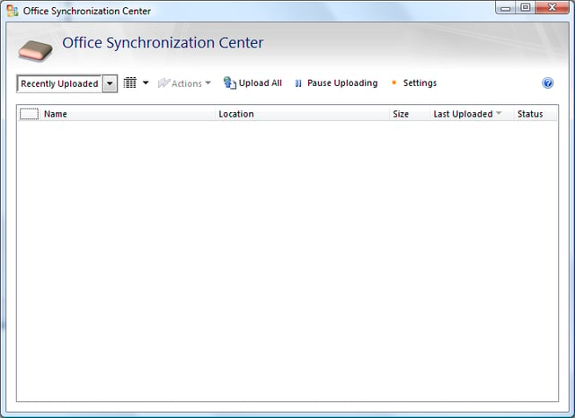
The Synchronization Center is something still to be discovered; possibly an integration tool with Office Live Workspaces or something to do with SharePoint, we have yet to find out.
Again, this is how the Send-a-Smile feedback tool works, allowing the developer to see what works and what doesn’t from the end user’s perspective.