Slideshow: Explore the new Google+ user interface - TechRepublic

Slideshow: Explore the new Google+ user interface

  • Hover over the sidebar

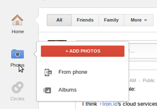
    \n\tOn certain sidebar items, hovering over the item for a half-second or so brings up a sub-menu. On Photos, for example, those menus lead you right to the photos you’ve recently uploaded automatically “From your phone,” to your existing Albums, or to the upload dialog for new photos you have handy on your desktop.

    \n

    \n\tImages created by Kevin Purdy for TechRepublic

  • Big photos

    \n\tThe stream

    \n

    \n\tIn the stream, the main list of posts, there are some subtle but hopefully time-saving, sense-making changes of note.

    \n

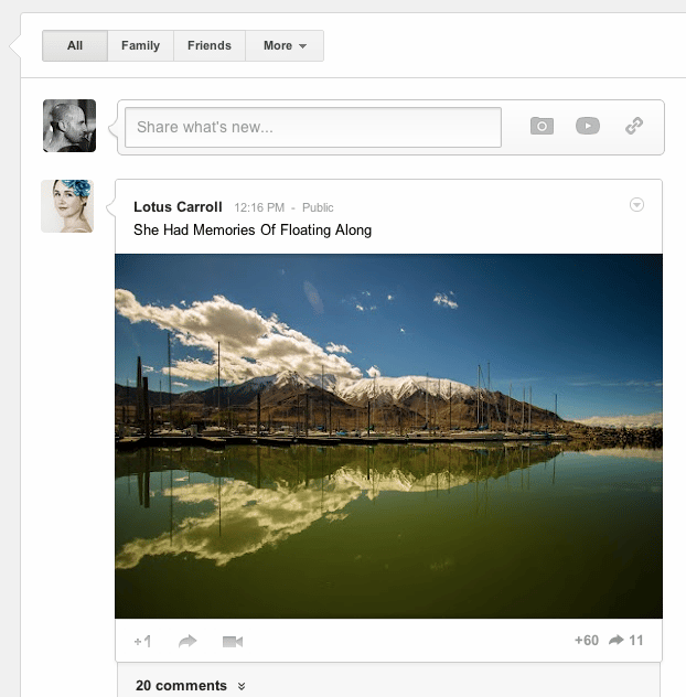
    \n\tFor one thing, everything’s a bit roomier. Photos can be much bigger and recognizable in the stream, and videos are embedded at a size that you could actually watch in the stream, without having to click away into a new tab.

    \n

    \n\tImages created by Kevin Purdy for TechRepublic

  • More clear postings

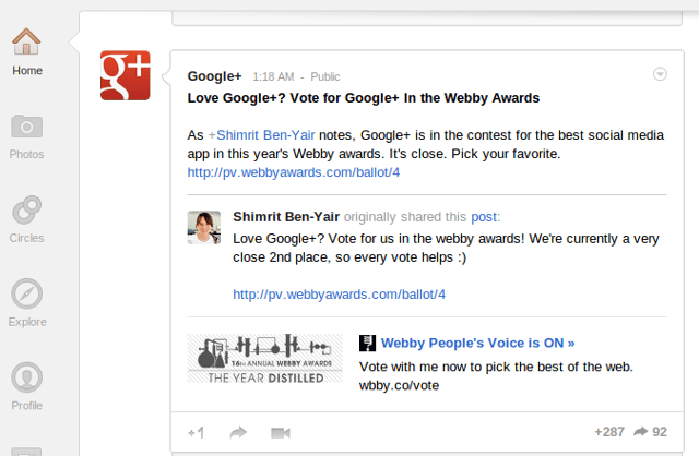
    \n\tThe author of a post is set off to the left, as a kind of bubble pointing to that post, so that when your friend re-shares a post made by a famous person (say, Adam Savage of Mythbusters), that chain of posting is much more clear.

    \n

    \n\tImages created by Kevin Purdy for TechRepublic

  • Clearer post activity

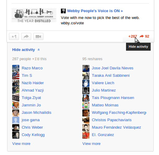
    \n\tAnd the discussion around a post has become easier to understand. It’s fun to follow a mix of both big-time names and your more modest, knowable friends, but the well-followed personalities get hundreds, or thousands, of +1 punches and comments on their posts, and trying to make sense of any of it used to require a lot of mouse scrolling. Now Google+ packs the relevant information into a drop-down box, and sorts out the people you may know who interacted with a post, puts mini scroll bars in the lists, and only shows you the last comment on a post, or your contacts’ comments, until you click for more.

    \n

    \n\tTake note, too, that your main stream now has a few button links at the top to quickly get you to your “Family” and “Friends” circles, and that the “slider” on the top-right corner of the stream is still there to control how often the people in the circle you’re looking at appear in your main stream.

    \n

    \n\tImages created by Kevin Purdy for TechRepublic

  • Profile setup

    \n\tYour Google+ profile

    \n

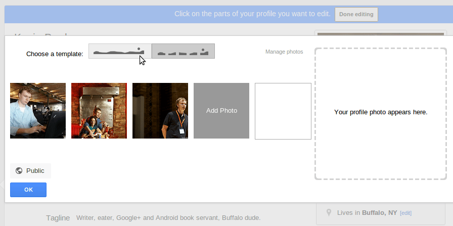
    \n\tYes, yes – it’s anything except subtle, the way Google+ now lets you have a very Facebook-like landscape photo at the top of your profile. But at least with the new profile options, you have more control over what people see when they arrive at your page, rather than having to pick out three or five photos you think make for a nice spread.

    \n

    \n\tImages created by Kevin Purdy for TechRepublic
  • Hangouts

    \n\tHangouts

    \n

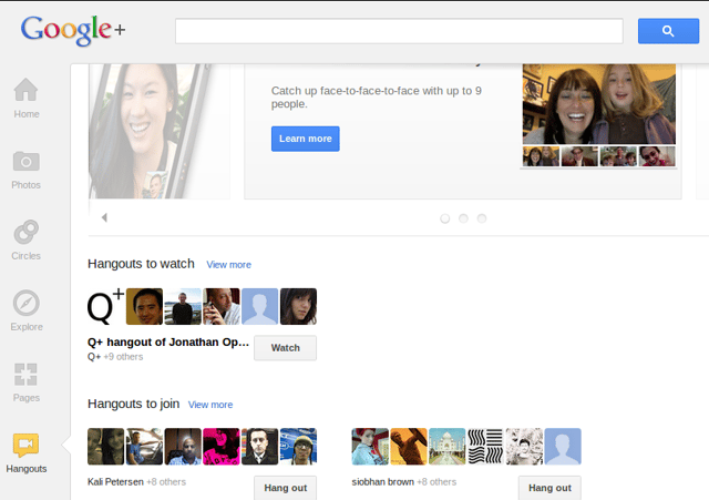
    \n\tGoogle+ Hangouts are really neat, especially given the zero-dollar, zero-cent cost. But getting to those interactive video chats used to require seeing the Hangout as it was happening in your stream, or explicitly inviting people in your circles to a Hangout and hoping they’d see it. The new Google+ has a kind of meta-Hangout page: hang out and see who’s Hanging Out.

    \n

    \n\tImages created by Kevin Purdy for TechRepublic

1 of 6