Skip to content

TechRepublic

  • Top Products Lists
  • Developer
  • 5G
  • Security
  • Cloud
  • Artificial Intelligence
  • Tech & Work
  • Mobility
  • Big Data
  • Innovation
  • Cheat Sheets
  • TechRepublic Academy
  • CES
  • TechRepublic Premium
  • Top Products Lists
  • Developer
  • 5G
  • Security
  • Cloud
  • Artificial Intelligence
  • Tech & Work
  • Mobility
  • Big Data
  • Innovation
  • Cheat Sheets
  • TechRepublic Academy
  • CES
  • See All Topics
  • Sponsored
  • Newsletters
  • Forums
  • Resource Library
TechRepublic Premium
Join / Sign In
Software

Windows 10 then and now: The changing look of Microsoft’s latest OS

By Nick Heath July 19, 2016, 4:10 AM PDT

Image
1
of 20

Windows 10 then and now: The changing look of Microsoft’s latest OS

Desktop - September 2014

Image: Microsoft

Desktop - September 2014

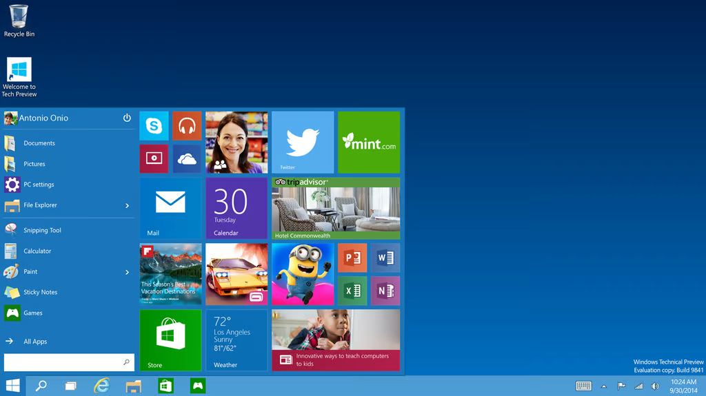
This is the earliest Windows 10 desktop to be shown to the public, and although there are similarities to how the OS looks today, there are also a lot of differences.

At this point there was no built-in Cortana, with the virtual assistant’s place on the Taskbar occupied by a system search box instead.

There are some striking design differences, with a default color scheme of blue instead of black, a bigger Start menu icon, subtly differ File Explorer icon, icons that don’t blend in with the Taskbar and no visible icon for the Action Center. Even the cylindrical Recycle Bin would get a square replacement over time.

Image: Microsoft
Windows 10 then and now: The changing look of Microsoft’s latest OS

Desktop - May 2015

Image: Mark Kaelin / TechRepublic

Desktop - May 2015

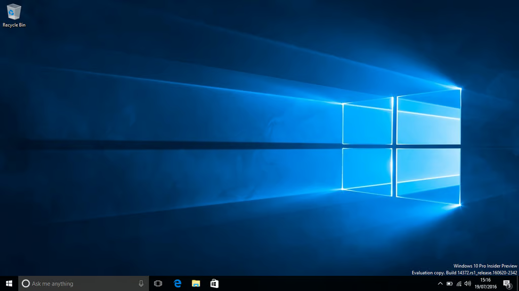
Just over half a year later, and a couple of months before Windows 10’s general release in July 2015, this was how the Windows 10 desktop looked.

Several differences are evident – Cortana is now on the Taskbar requesting that you u2018Ask me anything’, there is a new look for Taskbar and Start menu icons and the Action Center is present in the bottom right-hand corner.

Image: Mark Kaelin / TechRepublic
Windows 10 then and now: The changing look of Microsoft’s latest OS

Desktop - June 2016

Image: Nick Heath / TechRepublic

Desktop - June 2016

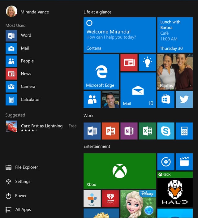
This is the Windows 10 desktop, from a recent test build of the OS available under the Windows Insider program.

It is likely close to the desktop that general users of Windows 10 will see after downloading the Windows 10 Anniversary Update on August 2nd.

You can see the Action Center icon has moved to the far right corner and displays the number of unread notifications.

Image: Nick Heath / TechRepublic
Windows 10 then and now: The changing look of Microsoft’s latest OS

Desktop - A closer look

Image: Microsoft

Desktop - A closer look

Here you can see the changes made to Desktop’s Taskbar, with icons for applications now displaying the number of unread notifications for those apps. Microsoft refers to these notification counters as badges.

Image: Microsoft
Windows 10 then and now: The changing look of Microsoft’s latest OS

Start menu - September 2014

Image: Microsoft

Start menu - September 2014

The default Start menu for the first release of Windows 10 was bolder and brighter than today but shows signs of being an early release.

Some of the placeholder icons look simplistic and jar against their background.

The biggest difference to today’s Start menu is the left hand column, which offers labelled icons linking to the likes of Documents and Pictures. There are also shades of Windows 7’s Start menu in the links to most recently used apps being shown at the bottom of the column.

There also appears to be less dynamically updating information showing on the Live Tiles, for example details of upcoming appointments on the Calendar tile, and overall the tile menu looks a little less busy than it is by default today.

Image: Microsoft
Windows 10 then and now: The changing look of Microsoft’s latest OS

Start menu - July 2015

Image: Microsoft

Start menu - July 2015

By the time of Windows 10’s general release the Start menu has been tidied up.

Icons appear as simpler white outlines and direct links to Documents and similar folders have disappeared.

There’s a good deal more clarity, with the most used apps now labelled appropriately and the Live Tiles grouped under headings.

A less welcome addition were the adverts for Windows Store apps, that snuck into the menu under the Suggested heading, although these can be disabled.

Image: Microsoft
Windows 10 then and now: The changing look of Microsoft’s latest OS

Start menu - June 2016

Image: Nick Heath / TechRepublic

Start menu - June 2016

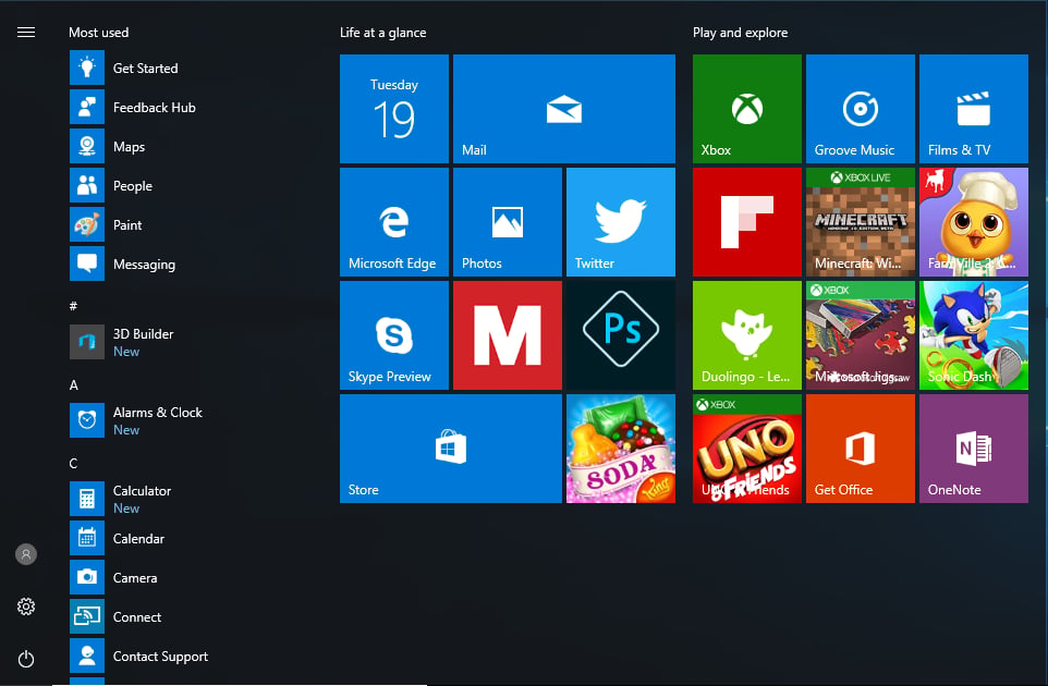
The Start menu has undergone some notable changes over the past year, as will be evident when the Windows 10 Anniversary Update hits on August 2nd.

The ‘All Apps’ list is now visible by default on the left-hand side of the menu, with this list topped by the user’s ‘Most used’ and ‘Recently added’ apps.

The menu’s Power, Settings and User Account links have been squeezed into a rail on the far left of the menu, and by default appear as icons, rather than an icon and a label.

You can also see the Start menu has double the number of promoted apps — tiles that link to the Windows Store or to apps that have been automatically installed on your PC by Microsoft.

Image: Nick Heath / TechRepublic
Windows 10 then and now: The changing look of Microsoft’s latest OS

Cortana - January 2015

Image: Microsoft

Cortana - January 2015

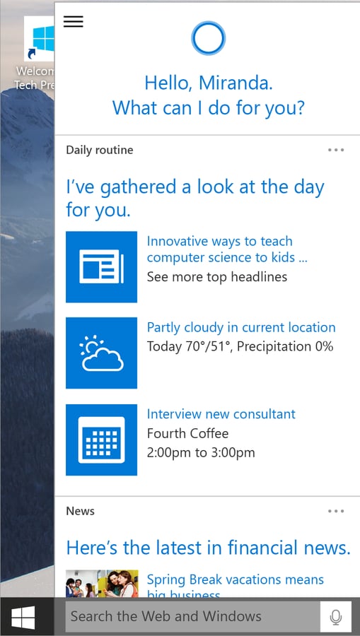
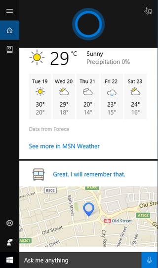
This first glimpse of Cortana early last year gave a decent indication of Microsoft’s plans for the virtual assistant.

The placeholder icons look overly large and the presentation rushed, but the round-up of personalised weather, news and upcoming appointments is the same as is found today.

Cortana’s signature circle graphic, which alters its appearances to reflect different emotions, is also present, although not set against a dark background.

The placeholder text in Cortana’s search box is also less conversational than it is today.

Image: Microsoft
Windows 10 then and now: The changing look of Microsoft’s latest OS

Cortana - July 2015

Image: Microsoft

Cortana - July 2015

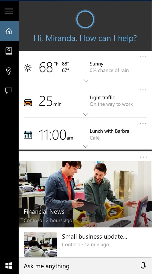
By the launch of Windows 10, Cortana’s interface had been tidied up, with topics separated by dividers and each having their own expandable menus, cleaner looking icons and a clearer distinction between news and personalised information.

Image: Microsoft
Windows 10 then and now: The changing look of Microsoft’s latest OS

Cortana - June 2016

Image: Nick Heath / TechRepublic

Cortana - June 2016

While Cortana has been made a bit smarter since Windows 10’s launch, the design has stayed broadly the same, save for Cortana’s blue circle icon defaulting to sit on a black rather than grey background, and changes to the icons on the side rail.

Image: Nick Heath / TechRepublic
Windows 10 then and now: The changing look of Microsoft’s latest OS

Action Center - January 2015

Image: Microsoft

Action Center - January 2015

The Windows 10 Action Center — which gathers up notification messages from apps — had a very basic appearance early in 2015, with message tiles consisting of a simple icon and text.

Even text wrapping to allow the whole message to be viewed isn’t present.

Image: Microsoft
Windows 10 then and now: The changing look of Microsoft’s latest OS

Action Center - April 2016

Image: Microsoft

Action Center - April 2016

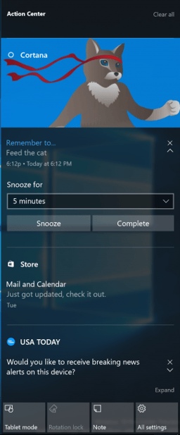
The Action Center looks a lot more attractive and interactive today, with large images, UI elements like buttons and drop-down menus, and formatted text broken into headings and body text.

Image: Microsoft
Windows 10 then and now: The changing look of Microsoft’s latest OS

App menus - January 2015

Image: Microsoft

App menus - January 2015

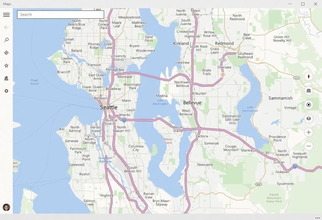
Microsoft has made a lot of tweaks to the look of Windows 10’s official apps, as can be seen in the design changes made to the Maps app.

In this earlier version, options are tucked away in a left-hand rail, showing as a list of icons whose labels can be viewed by clicking the u2018hamburger’ at the top.

Image: Microsoft
Windows 10 then and now: The changing look of Microsoft’s latest OS

App menus - June 2016

Image: Nick Heath / TechRepublic

App menus - June 2016

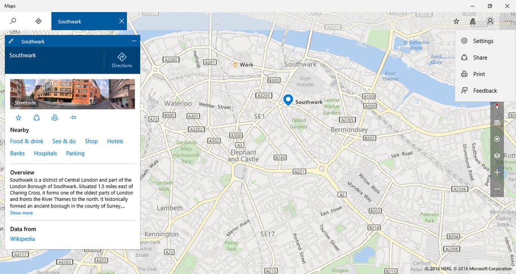
The UI for the Maps app underwent significant alterations, with Microsoft scrapping the hamburger and, when the window is expanded, placing the icons at the top of screen and separating icons for core features like u2018Search’ and u2018Directions’ away from those for less frequently used options.

Some options, such as Settings, are no longer visible by default and are only shown if the user clicks the ellipsis button in the top righthand corner.

Image: Nick Heath / TechRepublic
pic13icons-iterations-3.png
Windows 10 then and now: The changing look of Microsoft’s latest OS

Icon design - May 2015

Icon design - May 2015

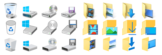
During the just under one year of public testing that took place before the launch of Windows 10, Microsoft experimented many different looks for icons.

This collage captures the changes it made, from top to bottom it shows the icons from earlier versions of Windows, the flatter icons from test versions of Windows 10 made available in 2014 and the icons at launch in 2015.

At the time, Microsoft said it felt it had settled on icons that were u201cmode modern and lightweightu201d, and offered more consistency between desktop and mobile apps. The firm said they tried out thousands of designs for icons before settling on a look.

Windows 10 then and now: The changing look of Microsoft’s latest OS

Icon design - June 2016

Image: Nick Heath / TechRepublic

Icon design - June 2016

As you can see, Microsoft has continued to tinker with the look of icons since Windows 10 launched, making subtle changes such as changing the orientation of the folders.

Image: Nick Heath / TechRepublic
Windows 10 then and now: The changing look of Microsoft’s latest OS

Microsoft Edge - May 2015

Image: Mark Kaelin / TechRepublic

Microsoft Edge - May 2015

While most of the changes to Microsoft’s Edge browser have related to new features, the interface has undergone some subtle tweaks in the past year.

Image: Mark Kaelin / TechRepublic
Windows 10 then and now: The changing look of Microsoft’s latest OS

Microsoft Edge - June 2016

Image: Nick Heath / TechRepublic

Microsoft Edge - June 2016

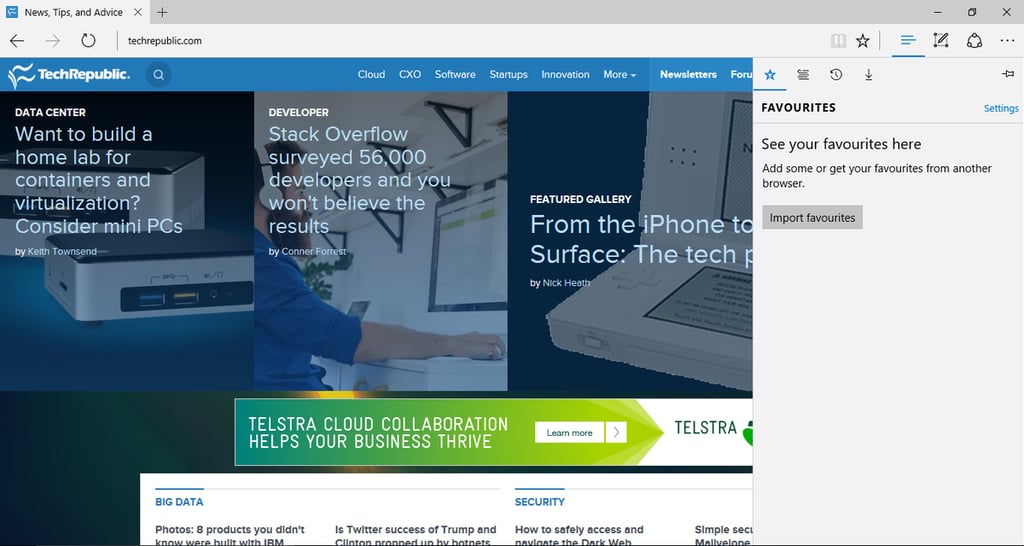
As well as having new icons for sharing and annotating content, the latest version of Edge also includes a revamped Favorites sidebar, as well as an icon for pinning the bar in place.

Image: Nick Heath / TechRepublic
Windows 10 then and now: The changing look of Microsoft’s latest OS

Settings - January 2015

Image: Microsoft

Settings - January 2015

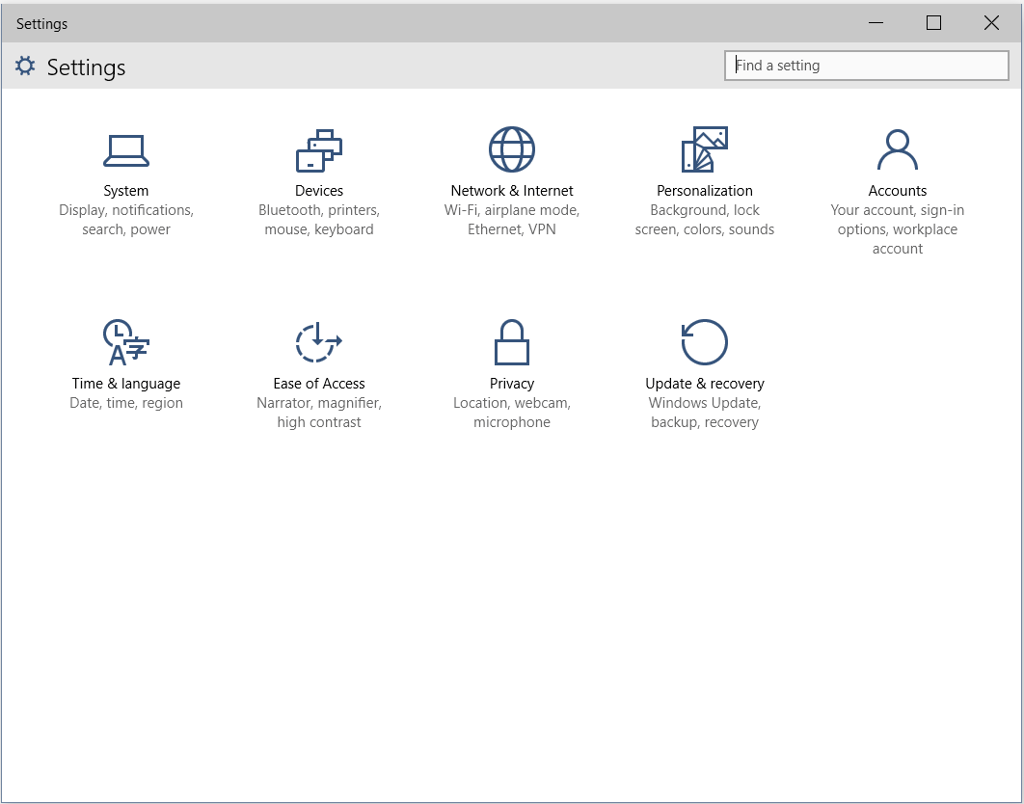
The early Settings app looks broadly the same as it does today, although the heading and search box have been moved since.

Image: Microsoft
Windows 10 then and now: The changing look of Microsoft’s latest OS

Settings - June 2016

Image: Nick Heath / TechRepublic

Settings - June 2016

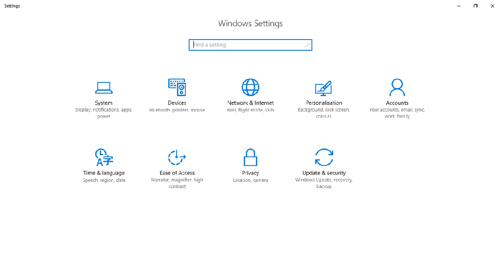
A slightly tidier appearance for the Settings app, with a centered search box and title. The sub-menus have seen greater change, with more Windows configuration options moved from Control Panel into Settings.

Image: Nick Heath / TechRepublic
  • Software
  • Account Information

    Share with Your Friends

    Windows 10 then and now: The changing look of Microsoft’s latest OS

    Your email has been sent

Share: Windows 10 then and now: The changing look of Microsoft's latest OS
Image of Nick Heath
By Nick Heath
Nick Heath is a computer science student and was formerly a journalist at TechRepublic and ZDNet.
  • Account Information

    Contact Nick Heath

    Your message has been sent

  • |
  • See all of Nick's content

TechRepublic Premium

  • TechRepublic Premium

    Guidelines for building security policies

    PURPOSE These guidelines from TechRepublic Premium will help you define the necessary ingredients of a security policy and assist in its proper construction. They’re designed to work hand in hand with the subjective knowledge you have of your company, environment and employees. Using this information, your business can establish new policies or elaborate on those ...

    Published:  March 23, 2023, 12:00 PM EDT Modified:  March 24, 2023, 1:00 PM EDT Read More See more TechRepublic Premium
  • TechRepublic Premium

    Hiring kit: Artificial intelligence architect

    PURPOSE Recruiting an Artificial Intelligence Architect with the right combination of technical expertise and experience will require a comprehensive screening process. This Hiring Kit from TechRepublic Premium provides an adjustable framework your business can use to find, recruit and ultimately hire the right person for the job. From the hiring kit: DETERMINING FACTORS, DESIRABLE PERSONALITY ...

    Published:  March 23, 2023, 12:00 PM EDT Modified:  March 24, 2023, 1:00 PM EDT Read More See more TechRepublic Premium
  • TechRepublic Premium

    Hiring kit: Autonomous systems engineer

    PURPOSE Hiring the right Autonomous Systems Engineer requires a specific and precise recruitment process, supported by a thorough understanding of the project requirements. This Hiring Kit from TechRepublic Premium provides an adjustable framework your business can use to find, recruit and ultimately hire the right person for the job. From the hiring kit: DETERMINING FACTORS, ...

    Published:  March 23, 2023, 12:00 PM EDT Modified:  March 24, 2023, 3:00 PM EDT Read More See more TechRepublic Premium
  • TechRepublic Premium

    Hiring kit: Application support engineer

    PURPOSE This Hiring Kit: Application Support Engineer from TechRepublic Premium provides an adjustable framework your business can use to find, recruit and ultimately hire the right person for the job. From the hiring kit: DETERMINING FACTORS, DESIRABLE PERSONALITY TRAITS AND SKILLSETS The skillset of successful Application Support Engineers is marked by balancing the technical expertise ...

    Published:  March 23, 2023, 12:00 PM EDT Modified:  March 24, 2023, 5:00 PM EDT Read More See more TechRepublic Premium

Services

  • About Us
  • Newsletters
  • RSS Feeds
  • Site Map
  • Site Help & Feedback
  • FAQ
  • Advertise
  • Do Not Sell My Information

Explore

  • Downloads
  • TechRepublic Forums
  • Meet the Team
  • TechRepublic Academy
  • TechRepublic Premium
  • Resource Library
  • Photos
  • Videos
  • TechRepublic
  • TechRepublic on Twitter
  • TechRepublic on Facebook
  • TechRepublic on LinkedIn
  • TechRepublic on Flipboard
© 2023 TechnologyAdvice. All rights reserved.
  • Privacy Policy
  • Terms of Use
  • Property of TechnologyAdvice