


When you create a bubble chart in Excel, you do not select the labels, as Excel would not know what to do with them. Instead, you need to add the chart labels after you create the chart. Adding the x-axis and y-axis labels can be done in the usual way. However, Excel has no specific tools for adding individual data labels to each bubble. You will need to add each data label separately.
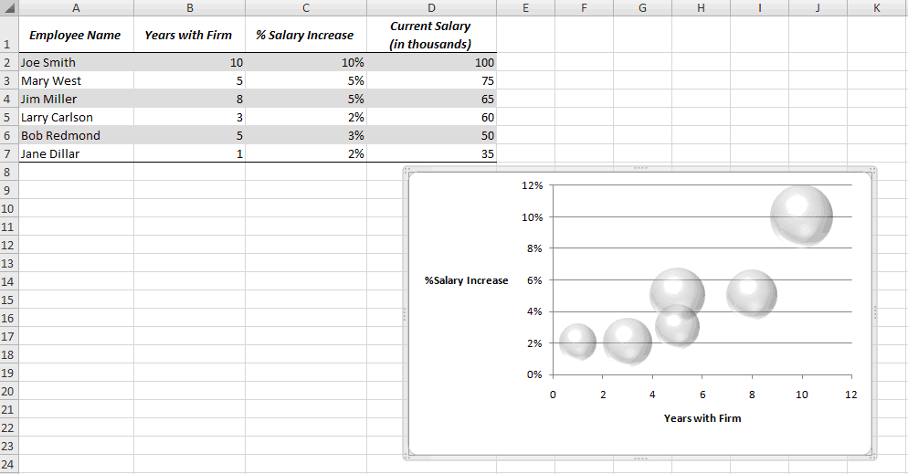
For example, say you have just created the following bubble chart from the range B2:D7.
Follow these steps to add the employee names as data labels to the chart:
- Right-click the data series and select Add Data Labels.
- Right-click one of the labels and select Format Data Labels.
- Select Y Value and Center.
- Move any labels that overlap.
- Select the data labels and then click once on the label in the first bubble on the left.
- Type = in the Formula bar.
- Click A7. (A7 is the name of the employee whose current Salary is represented by the bubble.)
- Press Enter.
- Repeat Steps 5 through 8 to add the name of the employee whose salary is represented by the bubble.
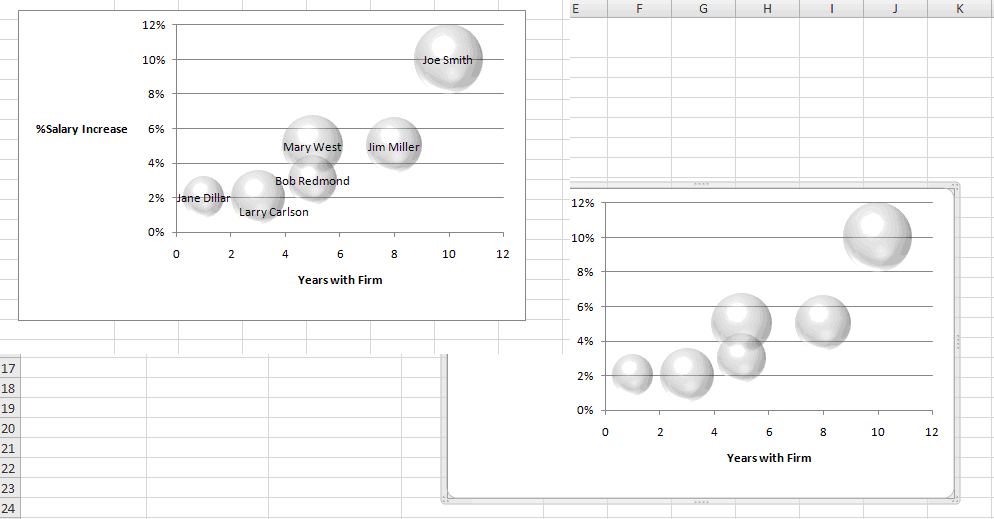
The completed data labels are shown below.
Miss an Excel tip?
Check out the Microsoft Excel archive and catch up on other Excel tips.
Help users increase productivity by automatically signing up for TechRepublic’s free Microsoft Office Suite newsletter, featuring Word, Excel, and Access tips, delivered each Wednesday.