There are lots of ways to highlight a specific element in a Microsoft Excel chart. You might add data labels or use pictures instead of a plain column in a column chart.
One clever visual tool for highlighting a specific chart element or data point is to add a vertical bar. It might represent “today,” or simply draw attention to the worst or best moment in the chart. It’s not a dynamic feature — you are forcing the bar to appear in a specific vertical position for your own purposes.
In this tutorial, I’ll show you how to add a vertical bar to highlight a specific spot in a chart. I’m using Microsoft 365 desktop on a Windows 10 64-bit system, but you can use earlier versions through Excel 2010. For your convenience, you can download the demonstration .xlsx file.
Excel for the web will display an existing combo chart and there are several charting options. However, there’s no combo chart option, so you can’t complete this charting technique in the browser edition.
What’s a combo chart in Microsoft Excel?
Microsoft Excel supports something called a combo chart, which is more than one chart type in the same chart. For example, you might add a line to a bar chart, using the line chart to show an average or some other additional and insightful information.
SEE: Google Workspace vs. Microsoft 365: A side-by-side analysis w/checklist (TechRepublic Premium)
We’ll begin by creating a line chart and then change the chart type to a combo chart. Then, you can format an extra series—a single value—as the vertical bar. Throughout this article, I’ll refer to the line chart based on natural data as the main chart and the vertical bar as the vertical bar chart.
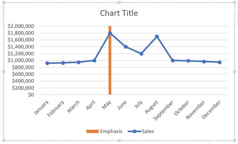
It might be difficult to envision this vertical bar highlight. Figure A shows the combo chart we’ll create. Knowing what the chart looks like will be helpful as we work through the instructions, because nothing about this technique is intuitive.
Figure A

You can position the orange bar anywhere along the primary axis that you want. What it represents is up to you. In our case, we want to focus on the highest value, which is in May at $1,800,000.
How to create the main chart in Microsoft Excel
Some charts look like the creator threw a pair of dice to choose the chart type. Knowing your data and which chart represents it is the better choice.
The simple sheet shown in Figure B is simple on purpose because adding the vertical bar is much more complex. For now, don’t worry about the value in column D; it’s enough to know that we’ll chart it in a bit. I didn’t bother to delete the legends, but you might want to do so.
Figure B
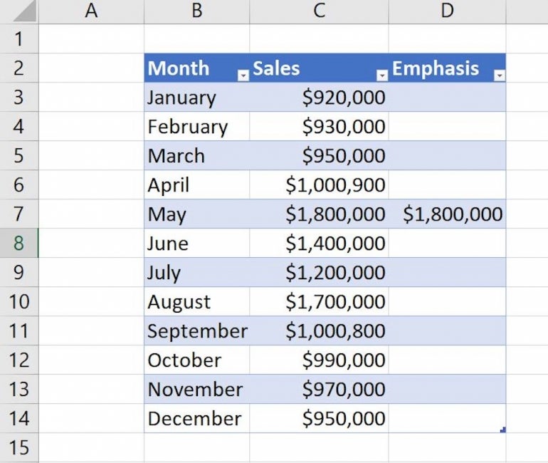
We’ll base a line chart on the data as follows:
- Click anywhere inside the data set, which is a Table object named Sales in this case.
- Click the Insert tab.
- In the Charts group, click Insert Line or Area Chart and choose Line with Markers (Figure C).
Figure C
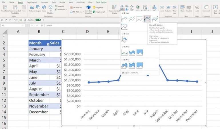
The resulting chart shown in Figure D is a bit cluttered, but this article isn’t about formatting the chart, so try to ignore that.
Figure D
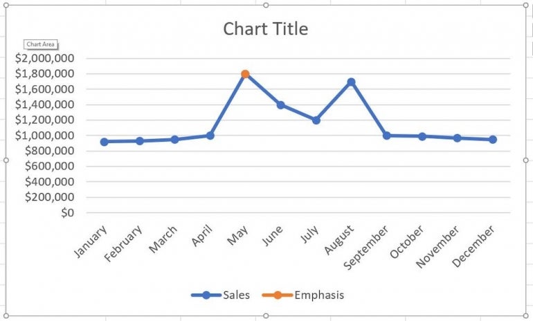
The orange marker for May represents the $1,800,000 in column D.
There are two series for this line chart: Sales and Emphasis (which has only one value, the value we want to emphasize). That’s why we need a combo chart — so we can distinguish that orange marker from the rest of the line.
How to create the combo chart
Right now, the line chart doesn’t display the Emphasis series — the value $1,800,000 — as a vertical bar. It’s a round marker. The blue marker is there, but you can’t see it. Let’s change the chart type to a combo chart so you can see both.
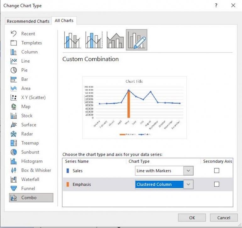
With the line chart selected, click the contextual Chart Design tab and click Change Chart Type in the Type group. Click the All Charts tab (if necessary) and choose Combo at the bottom of the list. Excel will take over a bit and change the type of data for each series: Sales and Emphasis. In the bottom pane, make sure Sales is Line with Markers and Emphasis is Clustered Column, as shown in Figure E, and click OK.
Figure E
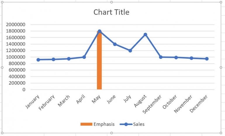
As you can see in Figure F, the orange marker is now a vertical bar. You could stop now, but it looks a bit odd — almost like you made a mistake, doesn’t it? That’s because the vertical bar shares the same upper boundary as the line marker. The vertical bar needs a bit of work.
Figure F
How to format the vertical bar
As is, the vertical bar looks like a mistake, so we’ll change some of its settings to make the emphasis clearer.
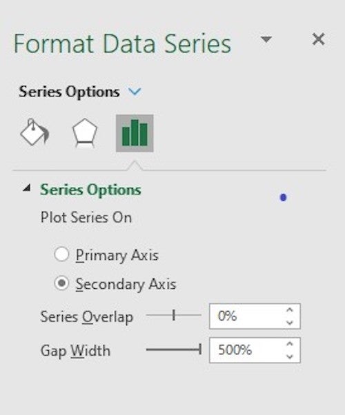
To do so, right-click the orange vertical bar and choose Format Data Series from the resulting submenu. Be sure to right-click the orange bar and not the line chart. In the Format Data Series pane, click Secondary Axis and change the Gap Width to 500%, as shown in Figure G. Doing so reduces the bar’s width so it looks less like a column and more like a line.
Also notice that there’s a new axis to the right — that’s for the secondary axis you just added. This axis will extend the bar a bit.
Figure G
The next step is to make the vertical bar extend beyond the $1,800,000 on the left by changing the secondary axis to its maximum boundary, which is 1,800,000. Doing so will extend the vertical bar.
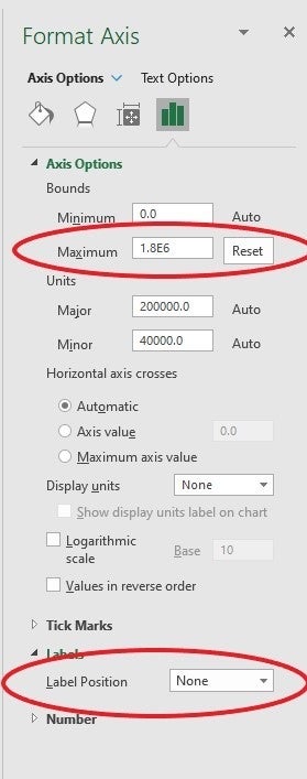
To do so, double-click the axis values to the right. In the Format Axis pane, change the Maximum Bounds value to 1,800,000. Next, expand the Labels heading in the Tick Marks section and choose None from the Label Position dropdown shown in Figure H.
Figure H
As you can see in Figure I, the vertical bar now extends to the top of the chart’s plot area. By extending the bar to the top, it now has purpose — it’s obvious that you want to highlight the month of May for some reason. What happens if you change your mind?
Figure I
How to change the position of the vertical bar
The vertical bar represents the point that you want to make; you can change that emphasis to any month by simply copying that month’s Sales value to the Emphasis column. Doing so will reposition the vertical bar, but the secondary axis isn’t dynamic, so to extend the bar, you must reset that as you did before.
First, you must display the second axis by selecting the orange vertical bar and then doing the following:
- In the Chart Layouts group, click Add Chart Element.
- From the dropdown, choose Axes.
- From the resulting submenu, choose Secondary Vertical (Figure J), which displays the axes values to the right (remember, we hid them earlier after changing the maximum value).
- Double-click the axes values to the right to display the Format Axis pane.
- Click the Text Options icon at the top of the pane.
- Enter 0 as the Minimum setting and 950,000 for the Maximum setting in the Bounds section.
- Click None from the Labels Position dropdown (Figure K).
Figure J
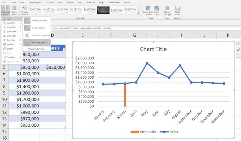
Figure K
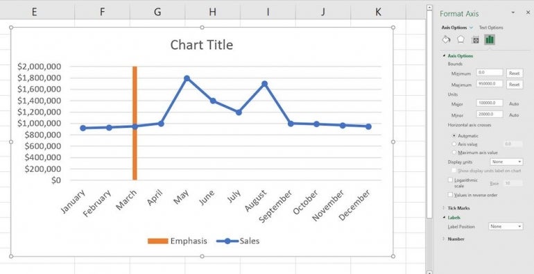
The vertical bar extends from the bottom to the top of the plot area, as it did before. However, you had to make that change, so while this is a neat chart, it isn’t as dynamic as we might like. This is an interesting chart that draws attention to a single entity.


