


Excel offers many ways to visualise your data — charts, conditional formatting, sparklines, PivotCharts and more. However, some of these features are fairly complex to use and it can take time to find the right visualisation to show the trends, outliers and other useful information in your data.
Must-read Windows coverage
- CrowdStrike Outage Disrupts Microsoft Systems Worldwide
- 10 Best Project Management Software for Windows in 2024
- Windows 10 Extended Security Updates Promised for Small Businesses and Home Users
- Securing Windows Policy
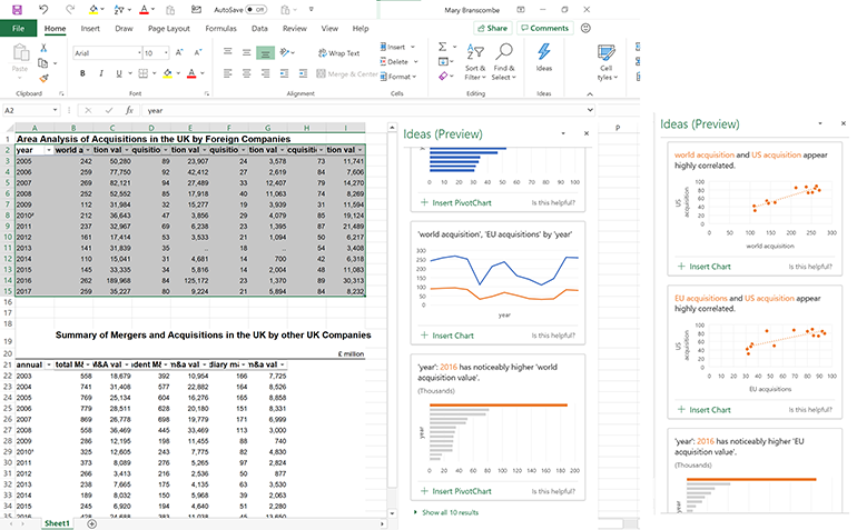
The new Ideas button in the Office 365 subscription versions of Excel will actually make the visualisations and charts for you, and show trends and outliers in your data.
In theory, all you have to do is select one or more cells and then click the Ideas button on the Home tab of the ribbon. You’ll then see a task pane with all the suggested charts for trends, outliers, correlations and PivotCharts for what’s interesting in your data, with the chart type automatically chosen and the axes, labels and titles all filled in.
These are some of the basic features from Power BI — they use the same AI, but because your Excel spreadsheet probably doesn’t have a complex data model defined, which most Power BI data sources do, the results won’t be as in-depth. But just seeing which pieces of data don’t fit with the rest can help you to quickly spot anything unusually good or worryingly bad. It’s particularly useful if you need to look at a data set that you didn’t put together yourself: Ideas is a fast way to get the important highlights.
In practice, getting Ideas to be useful takes a little more preparation, and what you get out of it depends on the data you have to start with. For a start, to get useful labels you need to format your data as a table with a single header row at the top, using the terms you want to see on the charts. Select your data and press Ctrl-T or pick a table style from the Format as Table dropdown in the ribbon. If the table doesn’t cover all the rows or columns you want to include, click Resize Table on the ribbon’s Design tab and either type in the furthest row and column letter and number, or drag to make a new selection before clicking OK.
If there isn’t already a row with headers, type them into the top of each column — don’t reuse header names or leave blanks, and stick to a single header for each column, without any merged cells or double rows of headers. It’s better to use a separate sheet to layout a copy of your data if you need to format it as a report with fancier headers, but you can also right-click a cell and choose ‘Format cells…’ and then choose the Alignment tab and set Horizontal to Center Across Selection.
SEE: Software Usage Policy (Tech Pro Research)
If you need to merge tables, set up nested data or create a more complicated layout, use the Get & Transform tools (what used to be called Power Query): on the Data tab choose Get Data / Combine Queries and either Merge or Append. That way the layout of the data becomes part of the data model that Excel Ideas can use rather than just being text on the spreadsheet.
The more categories you have in the table, the more ways Excel has to group the data and look for patterns, trends and correlations. So if your data has a fairly flat organisation, add some extra columns that you can use for topics and categories.
The file needs to be saved as an XLSX file (or XLSM if it has macros in); Ideas won’t work on the older XLS binary file format, so if the icon is greyed out on the ribbon, check the file format. You also need to make sure your data set isn’t too large; Ideas can only work with up to 16MB of data (that’s about 250,000 cells). If your data is larger than that, click the dropdown arrow for each header and use Excel’s filters to trim it down; (if it’s arranged by date, take the most recent years or filter out any really small figures) and make a copy to run Ideas over.
You also need to check that cells are formatted correctly; if you have cells with text in that are formatted as dates, it tends to confuse Ideas. And if you have dates that are written out as text and not formatted as dates, Ideas won’t know they’re dates; select them and set the cell format to date. Excel will warn you about dates with only two numbers for the year; click on the warning icon and convert them to show the full four digits.
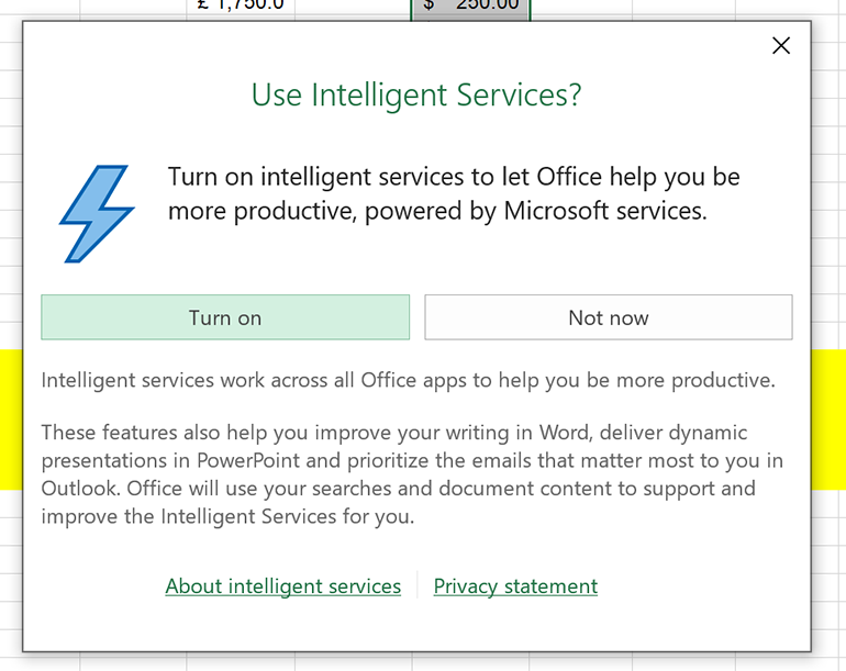
Before you can use Excel Ideas or any of the other recent AI-powered tools in Office like Word Editor or Outlook Focused Inbox, you’ll need to turn on Intelligent Services (even if you’ve been using previous versions of these, you may need to turn this setting on again because it uses the content in your documents to make suggestions). You’ll see a popup when you choose Ideas from the ribbon, or you can choose File / Options and tick ‘Enable services’ under ‘Office intelligent services’.
Smarter than a wizard
Initially, Ideas only finds a handful of different classes of insights. Trends are increases, decreases or repeating patterns in the data, like seasonal results. Rank picks out sets of figures that are noticeably higher than the rest and Majority finds the categories that make up most of a total value. Outliers are unusually good or bad results in data organised by time or correlated with other data. Depending on your data, you might get multiple results for some insights; Ideas may also suggest useful groupings for organising your data.
Often there will be more suggestions than fit on-screen and the more useful ones can be hidden, so it’s worth clicking through to show them all. The Ideas pane isn’t dynamic either; if you edit your data or select a different table to get insights on, you have to click the Ideas button to generate new suggestions. That does let you leave the charts in the task pane while you look through underlying figures that might explain what you’re seeing.
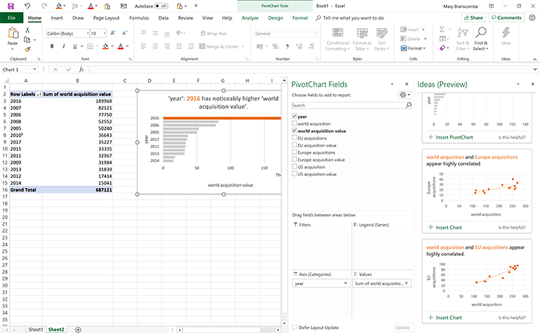
Click the Insert button on a suggestion to place the chart or PivotChart on the spreadsheet so you can dig into it in more detail. For a PivotChart, this creates a new spreadsheet tab showing the filtered data the PivotChart is based on, and opens the PivotChart Fields task pane so you can experiment with adding more fields to see what else you can learn about the data.
Oddly, charts don’t use any colour themes that applies to your spreadsheet (sticking instead to a fairly accessible but simple palette that clearly highlights the single significant value), but PivotTables do pick up your theme settings. Far more annoying, all dates on charts are set to US format with MM/DD/YYYY; you can change that, but it should be picked up from the date format used in your table.
The chart titles are clear and descriptive, and the charts follow good data visualisation practices like showing data labels horizontally so they’re easy to read and sorting bars in descending order so you can clearly see the full pattern even when you can’t spot the exact value.
Ideas is far more useful than the Recommended Charts tool tip because instead of charting all the data in your table it picks out just the data series that tell an interesting story. That’s handy for charts, but it’s phenomenally useful for PivotCharts, unlocking a very powerful feature that many users find off-putting — Recommended Charts can only make blank PivotCharts, leaving you to do all the hard work of putting the right data series in the right place.
Even with the limited number of insights currently available and the formatting you might have to do to make your data suitable for Excel Ideas, it’s an excellent way of quickly getting the important information out of a spreadsheet. It’s also a gentle introduction to some of the more powerful features in Excel. There’s no better way of understanding how tools work than by seeing them used in action on your own data.
See also
- Normalizing foreign data for Access (TechRepublic)
- 2 ways to quickly copy graphic files in Word or PowerPoint (TechRepublic)
- 9 ways to clean foreign or imported data (TechRepublic)
- Office Q&A: Validation violators and Windows Quick access (TechRepublic)
- How to crop images in Microsoft PowerPoint (TechRepublic)
- Microsoft to add new geography, stocks data types to Excel (ZDNet)
- Microsoft Office 365 for business: Everything you need to know (ZDNet)