
According to Microsoft, Power BI reports are “…a multi-perspective view into a dataset, with visuals that represent different findings and insights from that dataset.” It’s another way of saying that a Power BI report is a chart or data visualization.
After creating a Power BI report, you can pin it to a dashboard for others to view. That’s what Microsoft Power BI does: It helps you create meaningful reports, AKA charts, and display them for others in your organization.
SEE: Best business intelligence tools 2022 (TechRepublic)
In this tutorial, I’ll provide step-by-step instructions for creating simple reports in Power BI Desktop; you can also create reports in Power BI service online. Power BI mobile apps don’t support report design. If you want to follow along using the same data, download the demonstration .xlsx file.
How to prepare for Power BI
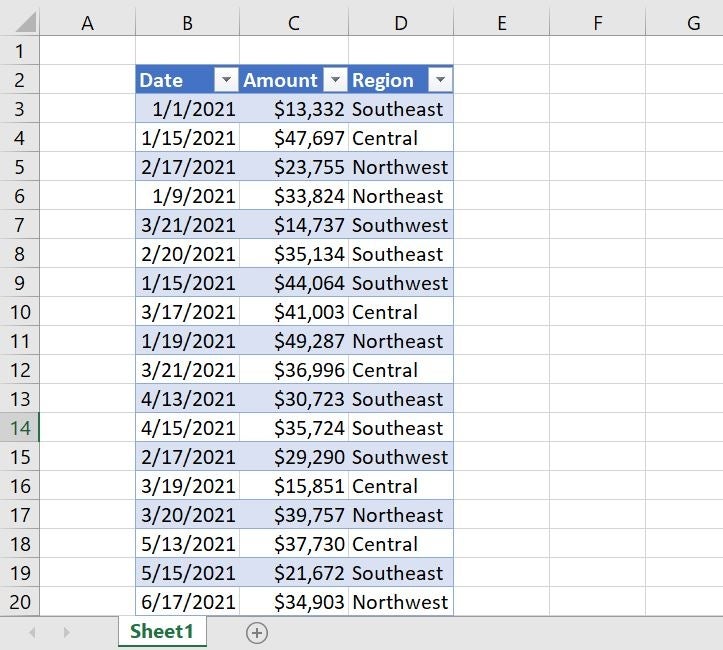
A Power BI report connects to a single dataset and will have at least one report page, but it can have many pages. In order to build reports in Power BI, the only thing you really need is data. I’ll use the simple Microsoft Excel dataset shown in Figure A.
Figure A
Thinking ahead, you’ll lay out report objects on a report page. Objects include visuals and elements.
- Visuals are visualizations of the data. There are more than 30 core visualizations; you can also create custom visualizations.
- Elements provide visual interest but don’t use the data. These elements include text boxes, buttons, shapes and images.
On report pages, you’ll add visuals and elements. You can add, rename, re-sequence, hide, duplicate and delete pages. To select a page, users select the page in the Pages pane in the Power BI service. If you’re using Power BI Desktop, click a page tab.
How to import Excel data into Power BI
First, sign into your Microsoft account and then launch Power BI. Next, you need data, and in Power BI you can import data from many sources, including Excel workbooks (Figure B).
Figure B
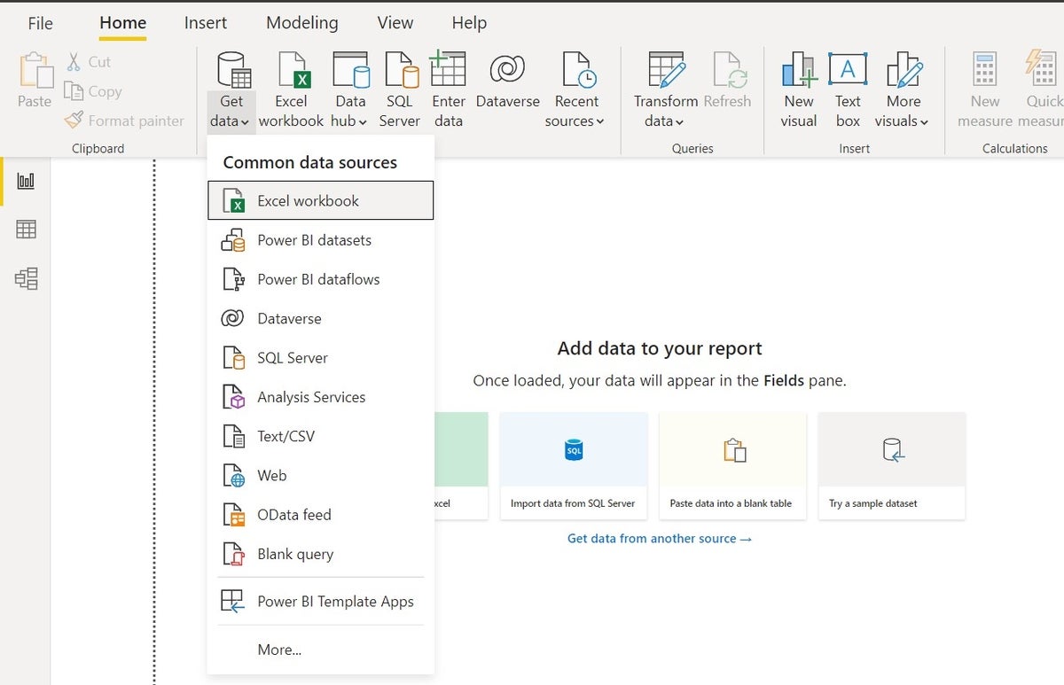
You can create the data in Power BI, but you’ll do so only when the data is missing or incomplete. In most organizations, you’ll find the source data in OneDrive or SharePoint. Importing from an Excel file saved to OneDrive is one of the easiest choices, so I saved my Excel file, PBIImportFromExcel_SourceFile.xlsx, to OneDrive. The data is in a Table named TableSales.
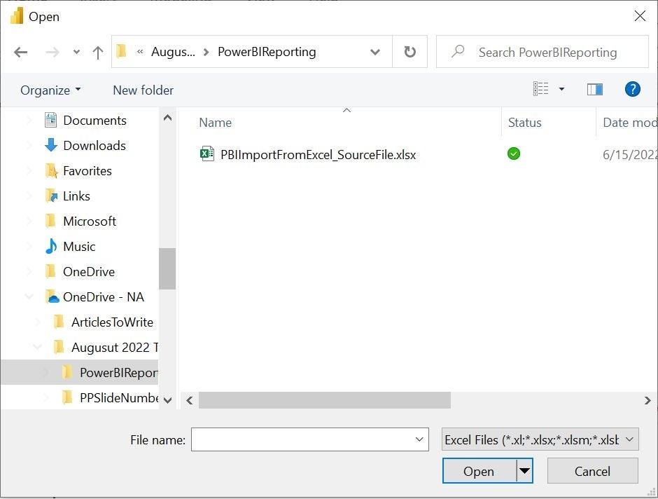
In Page 1, which Power BI opens when launched, click the Excel Workbook option in the Data group. Using the resulting Open dialog, locate the Excel file (Figure C), select it and click Open.
Figure C
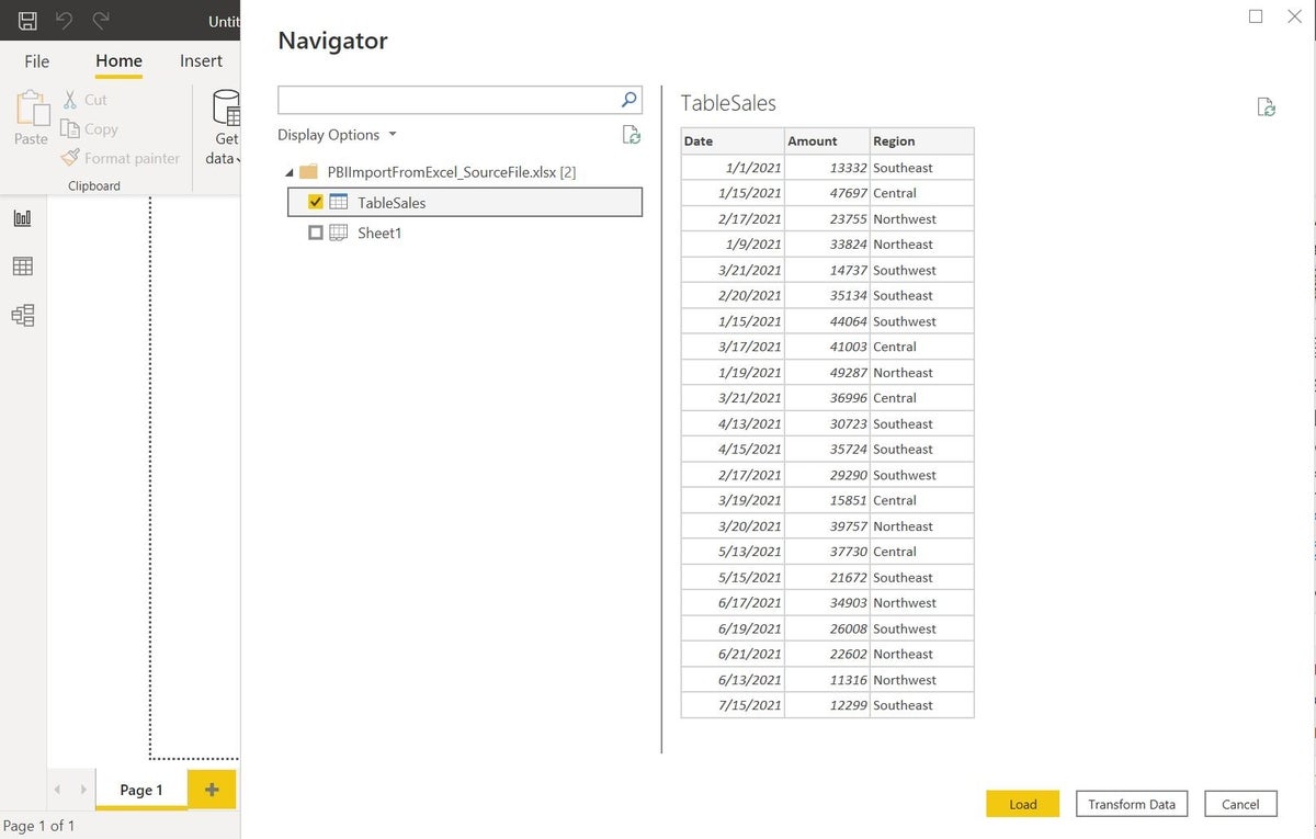
The resulting Navigation pane allows you to choose Table objects or a sheet. Checking TableSales displays a sample of the data (Figure D). Click Load to import it into Power BI, which will create a connection to the data and load it into Power BI. You can start adding visuals based on the imported Excel data.
Figure D
How to choose the right visuals in Power BI
Once you have a report page and data, you’re ready to add visuals to build a report. It’s important to select the best visual for your data and your story. There are a lot of visuals and selecting the best one for your data can be a challenge. Here are tips for choosing the ideal visuals in Power BI.
- Bar visuals are a good choice when there are lots of categories or series.
- A line or column visual is a good choice when you’re showing values over time or you’re showing a consistent flow of data. Don’t use a line visual when there’s a gap between one value to another. You can also use a stacked column visual, an area visual and a ribbon visual.
- A stacked bar is a good choice for a proportional visual, which shows the data as a whole. Other visuals to consider are a funnel visual, a treemap, a pie visual and a doughnut visual.
- Card visuals may be new to you. Use these callouts to draw attention to important information.
- Grid visuals convey a lot of detailed information.
- Performance visuals compare a value to a target. Choose from the gauge, KPI, table and matrix visuals.
- Geospatial visuals plot values by using map visuals.
For our purposes, let’s create a bar and treemap visual. A bar is effective when you have a lot of data, and the treemap will provide a look at the overall sales picture by relating the values to one another.
How to create a clustered bar visual in Power BI
We’re ready to create the first visualization, a clustered bar chart. If you’ve built charts in Excel or some other software, you’re a step ahead because this task requires specialized knowledge. If all else fails, drag and drop fields until you get it right — Power BI is very forgiving.
To create a bar visualization using our Excel data, do the following:
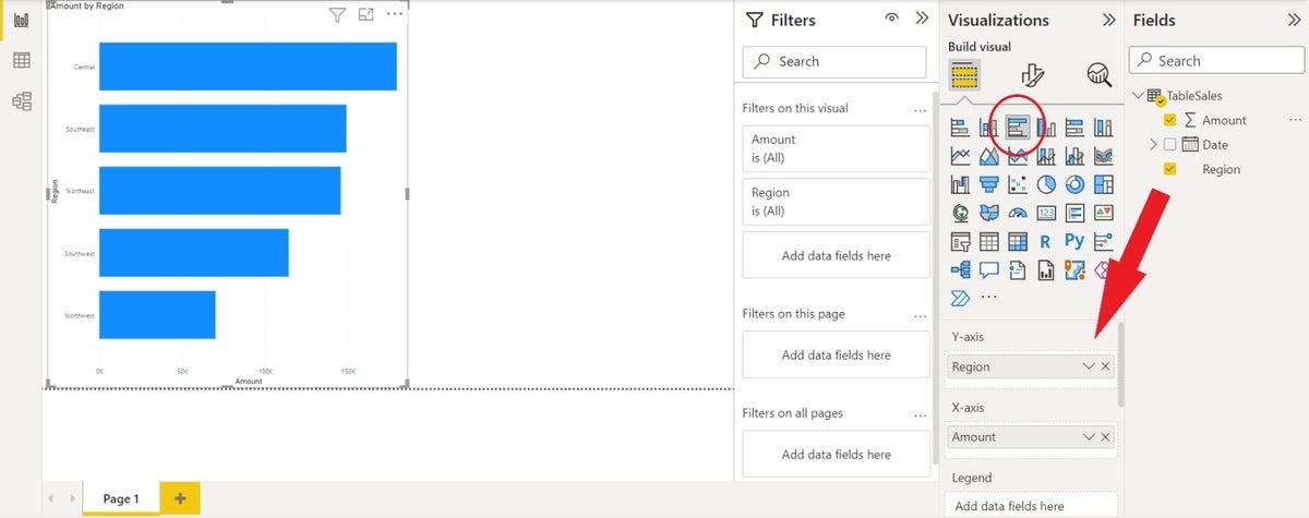
- Click the Clustered Bar Chart in the Visualizations Pane. This will add a blank frame to the page.
- From the Fields pane, drag Region to the Y-Axis control below the Visualizations.
- Drag Amount to the X-Axis control.
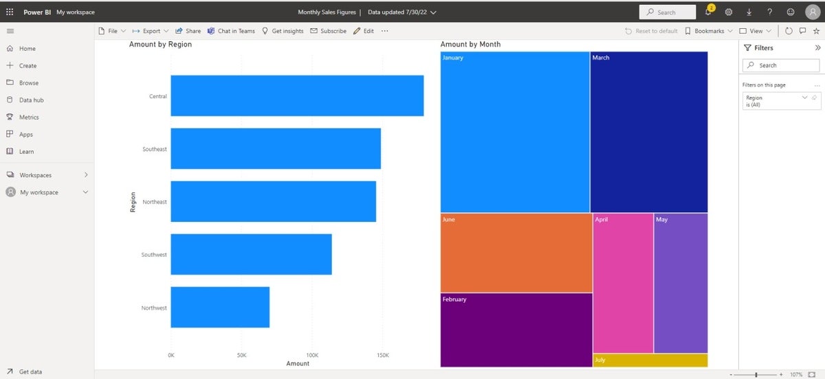
Figure E shows the resulting visualization after being resized. This visualization displays the sales figures for each region. The dates, although imported, are irrelevant. You could review format options, but to keep things simple, this one is good enough as is. Let’s move on to the treemap visual.
Figure E
How to create a treemap visual in Power BI
A treemap visual compares values as a whole. We’ll use this highly effective visualization to compare monthly sales.
To base a treemap visual on our data, follow these steps.
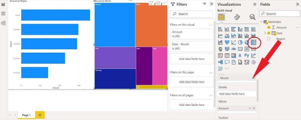
- Click the Treemap visualization, which is the last option on the third line of visualizations.
- Drag Date to the Category control. Power BI will display different date components — remove all but Month.
- Drag Amount to the Values control.
Figure F shows the Treemap visual next to the clustered bar visual. As is, the treemap compares the monthly sales as a whole, and it’s easy to discern that January and March were great months.
Figure F
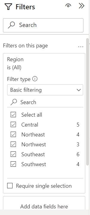
This time we’ll allow users to filter the visualization by regions. To do so, drag Region to the first Filter, the This Page control. Now Power BI displays the regions as a filtered set. Click the Select All option (Figure G) so initially the visualization will represent all regions.
Figure G
Let’s publish the visualizations so users can view them.
How to use a report in Power BI
At this point, you have two visualizations on a report page. In order for users to view the report, you must publish it. To do so, click Publish in the Share group. Click Save if prompted. Use the Save As dialog to choose the location for saving the .pbix file. Give the file a name and click Save. Enter your email address within the organization and click Continue. This will sign you into your account if you didn’t do so earlier. Finally, choose a destination, which is My Workspace for now.
Power BI displays the link to the published report (Figure H) — click it to see the report shown in Figure I. Use the Filters pane to the right to filter the treemap visualization by region(s).
Figure H
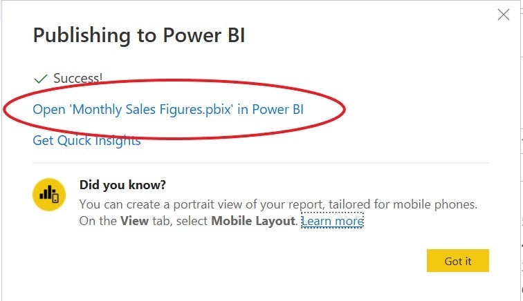
Figure I
Simple and complex Power BI reports
This simple Power BI report is just the beginning. Your business requirements will be the deciding factor as to whether your Power BI reports are simple or complex.


