


Qlik Sense and Tableau help business executives and decision-makers build data-driven strategies. With business intelligence features like automatic data collection, analysis and visualizations, organizations can save a lot of time and energy.
The two BI suites provide cloud-based services and allow users to create guided apps and dashboards from pretty much any source, but they don’t have the exact same approach and performances. Learn about the key features of Qlik Sense and Tableau to help you evaluate each solution and choose the right one according to your business context and expectations.
Jump to:
- What is Qlik Sense?
- What is Tableau?
- Qlik Sense vs Tableau: Comparison table
- Qlik Sense and Tableau pricing
- Feature comparison: Qlik Sense vs Tableau
- Qlik Sense pros and cons
- Tableau pros and cons
- Choosing between Tableau and Qlik Sense
What is Qlik Sense?
Qlik Sense is a BI tool that focuses on contextualization and security. It is particularly efficient for generating smart visualizations and mappings. In addition, Qlik Sense can perform analysis to combine data from multiple sources using the Qlik Analytics Engine, Qlik Sense’s associative technology for data discovery and artificial intelligence.
The Qlik Sense BI suite provides advanced configurations to power users. For example, the engine can take scripts as inputs to make predictions. It also caters to beginners, who can use the drag-and-drop interface to create applications with ease.
What is Tableau?
Tableau is a BI software that focuses on intuitiveness and does not require any preselection. Users with various levels of expertise can use it, but power users can add more filters and optimizations. That said, neither complicated macros nor advanced scripting is required to start.
Tableau is full of features and interactive visualizations. It can source data from multiple sources — such as custom databases, cloud services or Google Analytics — and combine all data natively. In addition, developers can query performant application programming interfaces to integrate Tableau into existing apps or websites.
Its capabilities are pretty high, including statistical, behavioral, multidimensional or predictive analysis. Additionally, its Einstein Discovery tool leverages Salesforce’s no-code platform and machine learning to predict new trends and deliver recommendations.
SEE: For more information, explore our Tableau cheat sheet.
Qlik Sense vs Tableau: Comparison table
| Features | Qlik Sense | Tableau |
|---|---|---|
| Ad hoc query and reports | Yes | Yes |
| Predictive analysis and machine learning | Yes | Yes |
| Bayesian and statistical analysis | Yes | Yes |
| Behavioral analytics | No | Yes |
| Benchmarking | Yes | Yes |
| OLAP (multidimensional analysis) | Yes | Yes |
| Relational display | No | Yes |
| Strategic planning | Yes | Yes |
| Mobile support for iOS and Android | Yes | Yes |
| Documentation or knowledge base | Yes | Yes |
Qlik Sense and Tableau pricing
Qlik Sense pricing
Qlik Sense supports organizations that seek to reach deeper insights from their business data. The Sense solution can be purchased through three price plans. Those interested can take advantage of a 30-day free trial of Qlik Sense by signing up online.
- Qlik Sense Business: $30 per user per month, billed annually. Qlik Sense Business is a cloud-based business analytics solution.
- Qlik Sense Enterprise SaaS: Custom price. Qlik Sense Enterprise SaaS is the premium cloud version of the BI software that is more scalable.
- Qlik Sense Enterprise Client-Managed: Custom price. The Enterprise Client-Managed edition allows customers to deploy in a customer-managed cloud or on-premises environment.
In addition, Qlik has several other pricing tiers available for data integration needs:
- Qlik Enterprise Manager: Custom price. Qlik Enterprise Manager allows users to manage their data pipelines at scale.
- Qlik Cloud Data Integration: Custom price. Qlik Cloud Data Integration is an integration platform-as-a-service solution for real-time data movement and management.
Tableau pricing
In addition to a free tier, Tableau offers three paid tiers to enable users to discover insights through the analysis of their business datasets:
- Tableau Public: Free software version for exploring, creating and publicly sharing data visualizations.
- Tableau Viewer: $15 per user per month, billed annually. Tableau Viewer is view only.
- Tableau Explorer: $42 per user per month, billed annually. Tableau Explorer allows for data manipulation.
- Tableau Creator: $70 per user per month, billed annually. One Tableau Creator seat is required for every license.
Tableau’s Creator edition includes tools to support businesses’ end-to-end data analytics workflows. For smaller businesses or teams with tighter budgets, Tableau’s Explorer and Virtual plans are less expensive, but they provide limited features and capabilities compared to the Creator edition. Those who are interested in Tableau should look into trying its 14-day free trial.
Tableau also offers a free app for Mac and Windows called Tableau Public. This is a limited option that allows anyone to create and share visualizations for free from public data sources and private data. All of these visualizations are hosted for free but are publicly searchable within the Tableau database.
Feature comparison: Qlik Sense vs. Tableau
Data analysis
Qlik Sense and Tableau provide advanced analysis tools and models. Users can create pipelines from multiple sources and leverage the benefits of machine learning to sort data.
SEE: Explore the differences between data modeling and data analysis.
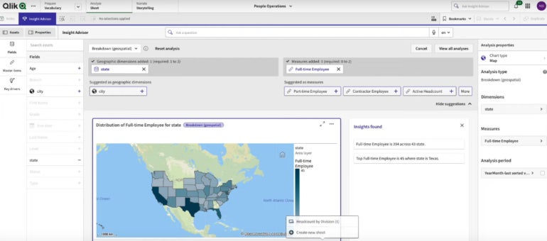
However, Qlik Sense focuses on data association while Tableau promotes exploration for users with author permissions. In other words, Qlik Sense promotes the discovery of critical data relations that are easy to miss, while Tableau requires users to create their own searching pattern and find hints themselves (Figure A). While both software options help users find the data that will drive business decisions, Tableau may require more technical expertise to build insightful reports.
Figure A
Data visualization
Aesthetics and design can really make a difference when it comes to visualizations, as the idea is to highlight key figures and trends to make them easily understandable.
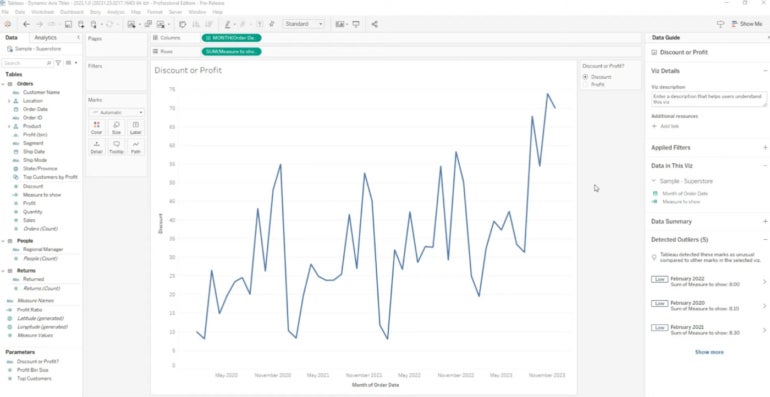
Tableau can generate visualizations that combine many design elements with data for reporting, apps, and dashboards that are designed for business and consumer audiences (Figure B). To see what others are doing with Tableau, users can explore its public gallery or data visualizations.
Figure B
Qlik Sense provides various predefined charts and custom objects that can be used and reused in sophisticated visualizations but with fewer graphical options, as the primary audience is business users. Qlik Sense has more granularity in the types of data combinations or drill-down options, but beginners might find the number of options a bit overwhelming.
That said, the end product includes the Insight Advisor feature, which gives business users the ability to query and use the data associations for self-service insights.
Security
Tableau and Qlik Sense offer a decent level of safety. Their services rely on trusted data sources and other critical aspects of enterprise security, but Qlik Sense has better capabilities, especially regarding access control.
Must-read big data coverage
- What Powers Your Databases? Take This DZone Survey Today!
- New AI Data ‘Universal Translator’ From Salesforce, Snowflake, Others
- Top Tech Conferences & Events to Add to Your Calendar in 2025
- Google Releases Data Commons MCP Server to Supercharge AI Agents
While Tableau complies with an extensive range of security obligations for data, cloud-based operations or network requests, Qlik Sense provides more granularity and access control, for example, with the Section Access that can reduce data to the appropriate scope.
It requires more technical skills, though, but power users and administrators may appreciate this possibility.
Qlik Sense pros and cons
Pros of Qlik Sense
- Offers a wide range of intuitive features.
- Mobile-friendly BI platform.
- Self-service visualization options.
Cons of Qlik Sense
- Plug-ins and add-ons provide more features but require additional fees.
- The per-user pricing of Qlik Sense Business may not be affordable for large organizations with many users.
- The steep learning curve can be inhibitive for beginners.
Tableau pros and cons
Pros of Tableau
- Free software version available.
- AI-augmented analytics and machine learning for uncovering insights faster.
- Allows for predictive model creation without requiring users to write algorithms.
Cons of Tableau
- Processing large volumes of data can cause slow performance.
- Limited customization options can make building specific reports difficult.
- Nontechnical users may have difficulty navigating the software.
Questions to ask before purchasing a BI tool
Before making a purchase decision, be sure to ask these questions:
- Do I really need a BI tool? Qlik Sense and Tableau can help business executives and decision-makers who struggle with tasks like managing excessive reports, analyzing large volumes of data, manual data cross-checking and key figure extraction.
- Is it easy to use? Tableau and Qlik Sense users will need to have a decent level of BI and data analytics knowledge to load data and build the initial reporting, but both tools have drag-and-drop functionalities for beginners.
- How fast is the learning curve; does it require lots of training? While any BI tool will come with its own learning time, Tableau and Qlik Sense offer detailed documentation, videos and even in-person training to help users master their software.
- How flexible is the tool? Qlik Sense and Tableau are flexible tools, but IT leaders should consider how they would integrate into their business’s existing workflow by assessing the third-party integrations and extendability before making a purchasing decision.
- Are there any hidden costs? BI tools can require significantly more RAM and CPU for the calculations of high volumes of data and extra-large datasets, so these costs may impact vertical scaling.
- How good are the visualizations? Visualization preferences will vary per user, so it’s best to compare visualizations offered by each solution to determine whether they highlight key figures and trends that make them easily understandable.
Choosing between Tableau and Qlik Sense
Tableau and Qlik Sense are robust solutions with tools to help businesses gain more value from their data. Each can support a wide range of operating systems and web and mobile platforms. Users can access data and reports from almost every device, and each company has built a strong community and offers excellent support.
However, there are some differences to consider when choosing between Tableau and Qlik Sense. While both solutions use machine learning to identify trends and build robust models, Tableau requires far less technical expertise and is recognized as a reference in the industry. Furthermore, each tool provides a decent level of safety with services that rely on trusted data sources and other critical aspects of enterprise security. That said, Qlik Sense’s software does offer higher access control capabilities.
SEE: Not sure if Qlik Sense or Tableau are right for your needs? Check out these other top business intelligence tools.
Methodology
This is a technical review using compiled literature researched from relevant databases. The information provided in this article is gathered from vendor websites or based on an aggregate of user feedback to ensure a high-quality review.