
- Best for comprehensive data integration: Zoho Analytics
- Best for task-based reporting: Asana
- Best for high-level project reporting: Hive
- Best for data-driven decision-making: Google Looker
- Best for customizable project reporting: Wrike
- Best for visual project tracking: monday.com
- Best for all-in-one project management: ClickUp
- Best for agile project management: Jira
- Best for data visualization: Tableau
- Best for Microsoft ecosystem integration: Power BI
Reporting tools and software are crucial to teams, especially in terms of project management as they provide a structured way to track progress, identify risks and make informed decisions. They offer a sweeping view of project health that helps managers to not only pinpoint areas of concern but also identify successes. With effective reporting, an organization gets transparency and ensures its stakeholders are aligned, which plays a part in making projects successful since everyone involved has access to the same information and insights. I’ve analyzed 10 top reporting tools and software in 2026 worth your consideration.
Top reporting software: Comparison table
| Software | Real-time analytics | Data visualization | Dashboard customization | Automated reporting | Free plan | Starting price |
|---|---|---|---|---|---|---|
| Zoho Analytics | Yes | Yes | Yes | Yes | Yes | $22/month |
| Asana | Limited | Limited | Limited | Limited | Yes | $10.99/user/month |
| Hive | Yes | Yes | Yes | Yes | Yes | $12/user/month |
| Google Looker | Yes | Yes | Yes | Yes | No | Contact for pricing |
| Wrike | Yes | Yes | Yes | Yes | Yes | $10.00/user/month |
| monday.com | Yes | Yes | Yes | Yes | Yes | $9/user/month |
| ClickUp | Yes | Yes | Yes | Yes | Yes | $7/user/month |
| Jira Software | Yes | Yes | Limited | Yes | Yes | $8.15/user/month |
| Tableau | Yes | Yes | Yes | Yes | No | $15/user/month |
| Power BI | Yes | Yes | Yes | Yes | Yes | $14/user/month |
Zoho Analytics: Best for comprehensive data integration
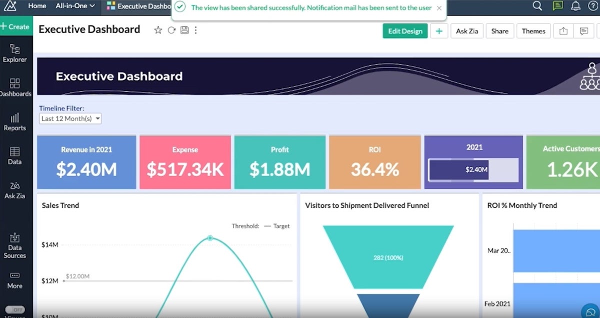
Zoho Analytics is a reporting tool that excels at aggregating data from a wide array of sources as it connects with over 500 data sources, including files, feeds, databases and cloud services. Its comprehensive suite of reporting options includes charts, pivot tables, summary views, tabular views and more. Zoho Analytics also offers an intuitive drag-and-drop interface to further simplify the report creation process and make it accessible for users of varying skill levels.
Pricing
- Free: Includes 2 users, 10,000 rows, 5 workspaces, and unlimited reports and dashboards.
- Basic: Starts at $22 per month, billed annually.
- Standard: Starts at $45 per month, billed annually.
- Premium: Starts at $112 per month, billed annually.
- Enterprise: Starts at $445 per month, billed annually.
- Custom: Available for dedicated compute or advanced requirements; contact Zoho for a quote.
Features
- Extensive data integration from over 500 sources.
- Data preparation and management tools for accurate analysis.
- A wide array of visualization options for insightful reporting (Figure A).
- AI and ML-powered augmented analytics for guided insights.
Integrations
Zoho Analytics’s integrations include Zoho CRM, Salesforce CRM, Microsoft Dynamics CRM, HubSpot CRM and Zoho Bigin.
Pros and cons
| Pros | Cons |
|---|---|
| Comprehensive data integration capabilities. | May be complex for beginners. |
| Wide range of visualization tools. | Customization can require a learning curve. |
| Advanced augmented analytics features. |
Why I chose Zoho Analytics
I selected Zoho Analytics for its broad range of reporting capabilities and user-friendly design. Its ability to present data in various visual formats makes analysis flexible and insightful and caters to diverse reporting needs as well as a wide variety of users.
Learn more about other Zoho products, like Zoho Projects and Zoho Vault.
Visit Zoho
Asana: Best for task-based reporting

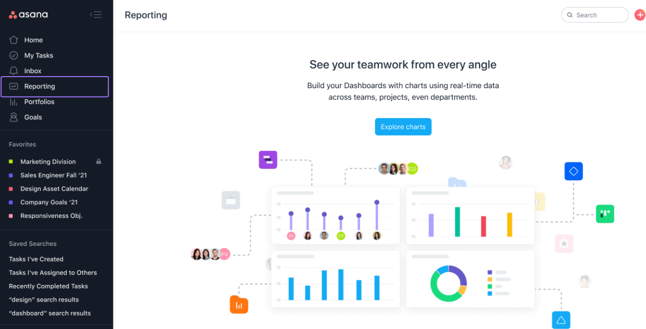
Asana simplifies project management with its Universal Reporting feature, which provides teams with a clear overview of task progress and project health. Its visual reporting format is designed for easy interpretation, meaning that users at all levels within an organization can easily access and use Asana.
Pricing
- Personal: Free for individuals and small teams.
- Starter: $10.99 per user per month, billed annually, or $13.49 billed monthly.
- Advanced: $24.99 per user per month, billed annually.
Enterprise and Enterprise+: Custom pricing.
Features
- Visual and intuitive reporting tools for task and project tracking (Figure B).
- Goal tracking to align daily tasks with strategic objectives.
- Real-time updates to keep teams informed on project progress.
- A variety of highly customizable charts.
Integrations
Asana’s top integrations include Microsoft Teams, Slack, the Asana for Gmail add-on, Asana for Adobe Creative Cloud and Google Calendar.
Pros and cons
| Pros | Cons |
|---|---|
| User-friendly reporting and task management. | Limited depth in analytical features. |
| Effective goal alignment features. | Real-time analytics are somewhat restricted. |
| Wide range of integrations. |
Why I chose Asana
I simply selected Asana for its user-friendly approach to task-based reporting. Asana is also highly effective when it comes to aligning tasks with organizational goals.
For more information, check out our full Asana review.
Visit Asana
Hive: Best for high-level project reporting

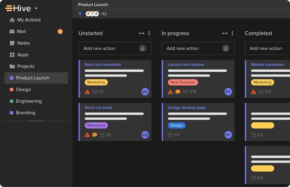
Hive is recognized for its high-level reporting capabilities, offering a suite of options for a variety of project management use cases. With features like goals, analytics dashboards and timesheet reporting, Hive provides a comprehensive tool for gaining visibility and gathering insights into projects.
Pricing
- Free: Free plan available.
- Starter: $5 per user per month.
- Teams: $12 per user per month.
- Enterprise: Custom pricing.
- Add-ons: Some capabilities, including custom dashboards, automations, timesheets, proofing and approvals, and team resourcing, may be available as paid add-ons.
Features
- Goals for setting, tracking and monitoring goals across teams.
- Analytics dashboards to showcase project status, project breakdowns and more.
- Timesheets reporting to analyze data across timesheets.
- Multiple views like Portfolio, Summary, Table, Kanban and more (Figure C).
Integrations
Hive’s top integrations include Google Calendar, Gmail, Google Sheets, Google Drive and Slack.
Pros and cons
| Pros | Cons |
|---|---|
| Customizable high-level reporting options. | May require initial setup time to customize views. |
| Variety of views for different reporting needs. | Some advanced features might be available only on higher-tier plans. |
| Efficient project and action management features. |
Why I chose Hive
I selected Hive for its versatile high-level reporting options and customizable views. They bring a flexible and comprehensive overview to projects.
For more information, check out our full Hive review.
Visit Hive
Google Looker: Best for data-driven decision-making

A rather different entry from most tools on this list, Google Looker stands as a unified business intelligence platform that excels at turning data into actionable insights. It offers self-service BI that allows users to access, analyze and act on up-to-date, trusted data. As a reporting tool, Looker offers reliable data experiences at scale and empowers users with real-time insights.
Pricing
- Looker pricing not published publicly. Contact Google for pricing.
Features
- Embedded analytics and applications for enhanced data experiences.
- Data modeling to unify business metrics across teams and applications.
- Real-time insights to empower users with up-to-date information.
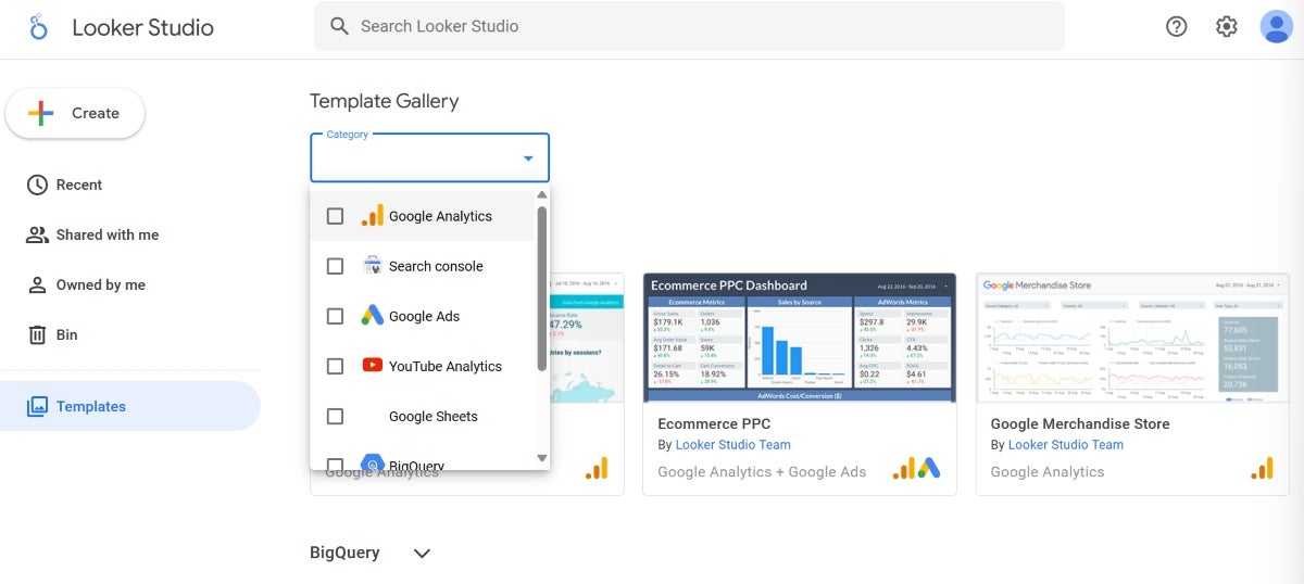
- An extensive template gallery for templates on many of Google’s applications (Figure D).
Integrations
Looker offers extensive integration capabilities, including BigQuery, Spanner, Cloud SQL and Cloud Storage.
Pros and cons
| Pros | Cons |
|---|---|
| Unified platform for all BI needs. | Lacks pricing transparency |
| Real-time insights for up-to-date decision-making. | May require a learning curve to fully utilize advanced features. |
| Extensive integration capabilities with data sources. |
Why I chose Google Looker
Google Looker’s reporting capabilities can be seen particularly through its embedded analytics and real-time insights. It easily unifies business metrics across teams and applications. It’s also a great tool for users predominantly using applications in the Google ecosystem.
Visit Google
Wrike: Best for customizable project reporting

Wrike stands out for its highly customizable reporting features. This flexibility, combined with Wrike’s thorough resource management and advanced analytics, makes Wrike competent enough to provide detailed insights into project performance and resource allocation and flexible enough to adapt to various workflows.
Pricing
- Free: Includes web, desktop, and mobile apps, project and task management, board view, and table view.
- Team: $10 per user per month.
- Business: $25 per user per month.
- Enterprise: Custom pricing.
- Pinnacle: Custom pricing.
Features
- Customizable reports for tailored project insights (Figure E).
- Resource management to monitor progress and identify risks.
- Advanced analytics for deep visibility into project performance.
Integrations
Wrike’s top integrations include Jira, GitHub, Google Sheets, Azure DevOps and HubSpot.
Pros and cons
| Pros | Cons |
|---|---|
| Highly customizable reporting options. | Customization options may require time to master. |
| Comprehensive project and resource monitoring. | Extensive features can be overwhelming for newcomers. |
| Advanced analytics capabilities. |
Why I chose Wrike
Wrike has robust reporting capabilities and customizable features, which give users the flexibility and depth needed to gain extensive insights into their projects and resources.
For more information, check out our full Wrike review.
Visit Wrike
monday.com: Best for visual project tracking

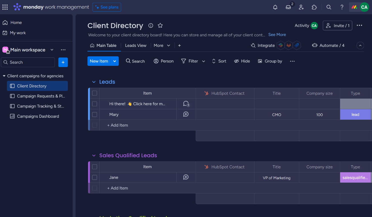
monday.com is a favorite among teams that love visual task management and prioritize ease of use as it offers a visually intuitive platform for project tracking. Its advanced reporting features, such as stacked charts and workload views, provide a thorough overview of project progress and team capacity. monday.com’s dashboard customization is very flexible; this enables teams to mold their reporting to meet their project needs.
Pricing
- Free: Includes up to 2 seats, 3 boards, and basic work management features.
- Basic: $9 per seat per month, billed annually, or $12 per seat billed monthly.
- Standard: $12 per seat per month, billed annually, or $14 per seat billed monthly.
- Pro: $19 per seat per month, billed annually, or $24 per seat billed monthly.
Enterprise: Custom pricing.
Features
- Stacked charts for multi-dimensional data analysis.
- Workload views for balanced resource allocation.
- Pivot tables for detailed data breakdowns.
- Customizable dashboards for tailored project insights (Figure F).
Integrations
Some of the best monday.com integrations include GitLab, OneDrive, Todoist, Slack and Microsoft Teams.
Pros and cons
| Pros | Cons |
|---|---|
| Highly visual and intuitive interface. | Can be overwhelming for new users due to numerous features. |
| Advanced reporting for comprehensive project insights. | Some advanced features require higher-tier plans. |
| Flexible dashboard customization. |
Why I chose monday.com
monday.com is a visually intuitive platform and has advanced reporting capabilities. It delivers a balance between visual project tracking and in-depth reporting.
For more information, check out our full monday.com review.
Visit monday.com
ClickUp: Best for all-in-one project management

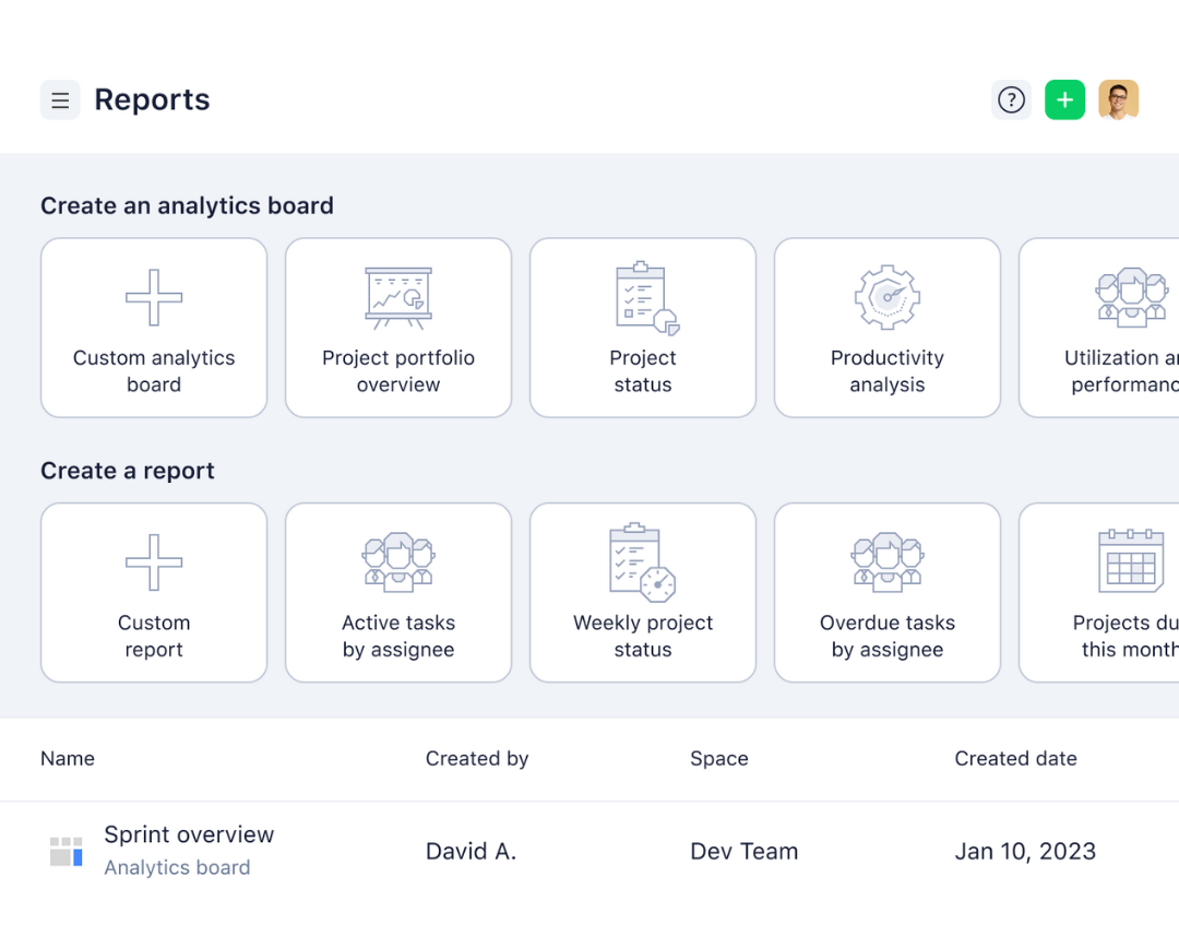
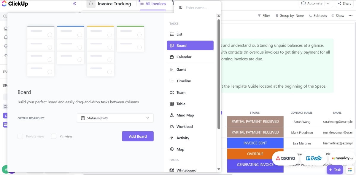
ClickUp is recognized for its all-in-one approach to project management, offering a wide range of features from task management to time tracking and goal setting. Its reporting features are designed to provide teams with insights into productivity and project progress, supporting data-driven decision-making. ClickUp’s customizable dashboards and reporting tools allow teams to monitor key metrics and track performance effectively.
Pricing
- Free Forever: Includes 60MB of storage and core task management features.
- Unlimited: $7 per user per month, billed annually, or $10 per user billed monthly.
- Business: $12 per user per month, billed annually, or $19 per user billed monthly.
- Enterprise: Custom pricing.
Features
- Comprehensive dashboards for project overview (Figure G).
- Customizable reporting for tailored insights.
- Goal tracking to align efforts with objectives.
- Time tracking to monitor task durations and productivity.
Integrations
Some of ClickUp’s top integrations include Gmail, Zoom, HubSpot, Make and Google Calendar.
Pros and cons
| Pros | Cons |
|---|---|
| Versatile all-in-one project management solution. | Steep learning curve due to feature richness. |
| Extensive customization options for dashboards and reporting. | Customization can be time-consuming. |
| Generous free plan with substantial features. |
Why I chose ClickUp
I included ClickUp because of its comprehensive feature set and flexibility, offering teams an all-in-one solution for project management and reporting. It proves suitable for a wide range of project types and sizes.
For more information, check out our full ClickUp review.
Visit ClickUp
Jira: Best for agile project management

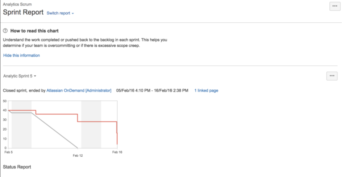
Jira is tailored for agile project management with specialized reporting features like sprint reports, burndown charts and velocity charts. These agile-centric reports give teams critical insights into their agile processes to help them optimize workflows and improve sprint planning. It’s worth considering for software development teams and those that follow scrum or kanban frameworks.
Pricing
- Free: Includes up to 10 users.
- Standard: $7.91 per user per month, billed annually.
- Premium: $14.54 per user per month, billed annually.
- Enterprise: Custom pricing.
Features
- Sprint reports for tracking sprint progress (Figure H).
- Burndown charts for visualizing task completion.
- Velocity charts for assessing team performance over sprints.
- Cumulative flow diagrams for Kanban teams.
Integrations
Jira has extensive integrations with development tools like Bitbucket, Confluence, GitHub, Opsgenie, Jenkins and Dynatrace.
Pros and cons
| Pros | Cons |
|---|---|
| Tailored for agile project management. | Primarily focused on software development teams. |
| Comprehensive reporting for scrum and kanban teams. | Can be complex for non-technical users. |
| Wide range of integrations with development tools. |
Why I chose Jira
Jira has robust agile reporting features and is capable of providing deep insights into agile project management processes, especially for teams practicing scrum or kanban methodologies.
For more information, check out our full Jira review.
Visit Jira
Tableau: Best for data visualization
Tableau sets the standard for data visualization, offering a wide range of chart types and interactive dashboards that make complex data understandable at a glance. As reporting software, it offers a user-friendly interface and powerful data handling capabilities for users to create detailed and insightful visual reports.
Pricing
- Tableau: Starts at $15 per user per month, billed annually.
- Tableau Enterprise: Starts at $35 per user per month, billed annually.
- Tableau Next: Starts at $40 per user per month, billed annually.
- Tableau Cloud+ and Tableau+: Contact Salesforce for pricing.
Features
- Wide range of visualization options.
- User-friendly interface for non-technical users (Figure I).
- Powerful data handling and processing capabilities.
Integrations
Tableau’s top integrations include Salesforce, Google Analytics, Microsoft Excel, Amazon Redshift and Snowflake.
Pros and cons
| Pros | Cons |
|---|---|
| Advanced data visualization capabilities. | Higher price point compared to some competitors. |
| Intuitive interface for easy use. | Can require significant resources for large datasets. |
| Strong data connectivity options. | Lacks free version |
Why I chose Tableau
I considered Tableau because of its unparalleled data visualization capabilities and user-friendly interface. It should make it to your shortlist if your teams value both data accessibility and detailed reporting.
For more information, check out our full Tableau review.
Visit Tableau
Power BI: Best for Microsoft ecosystem integration
Power BI is a key player in the reporting and analytics space, especially for those deeply embedded in the Microsoft ecosystem. Its seamless integration with other Microsoft products, like Excel and Azure, makes it a no-brainer for teams that want compatibility and ease of use with their reporting tools. What makes it a great reporting and analytics tool is its ability to handle large datasets and provide advanced analytics, including AI capabilities and custom visualizations.
Pricing
- Power BI Free account: Includes access to Power BI for personal report creation and viewing Power BI content hosted in Power BI Premium or Microsoft Fabric capacity.
- Power BI Pro: $14 per user per month, paid yearly.
- Power BI Premium Per User: $24 per user per month, paid yearly.
- Power BI Embedded: Variable pricing; contact Microsoft sales.
- Fabric Capacity: Pay-as-you-go pricing; contact Microsoft sales.
Features
- Seamless integration with Microsoft products.
- Advanced analytics with AI capabilities.
- Custom visualizations for personalized reporting (Figure J).
Integrations
Aside from a variety of tools in the Microsoft ecosystem like Microsoft Office 365, Power BI’s top integrations include Asana, HubSpot, Google Sheets and Salesforce Pardot.
Pros and cons
| Pros | Cons |
|---|---|
| Strong Microsoft integration. | Can be complex for new users. |
| Comprehensive analytics and AI features. | Limited integration outside the Microsoft ecosystem. |
| Flexible pricing with a robust free version. |
Why I chose Power BI
I chose Power BI due to its strong analytics capabilities combined with its seamless integration with tools in the Microsoft ecosystem. It’s a particularly fitting choice for teams that already use Microsoft products.
For more information, check out our full Power BI review.
Visit Power BI
More project management coverage
- Best AI Project Management Tools
- Best Project Management Software
- Best Free Project Management Software
- Project Manager Resume Template (Free Download)
Key features of reporting software
Real-time analytics
Real-time analytics allows users to view, assess and analyze data as it flows into the business, which can be displayed on dashboards or reports. With this, users get to make decisions faster since they get instant, descriptive insights from the most current data.
Custom reports
Custom reports save time as they automate the data gathering and report generation processes. After the initial setup, reporting processes can be entirely streamlined, with live data feeds ensuring that any additional requests can be quickly addressed by making changes to existing reports.
Dashboard customization
Dashboard customization is crucial in reporting software as it allows users to set up their reporting environment based on their needs. Custom dashboards can provide in-depth data on various aspects of business operations, illustrating potential revenue and areas where improvements are needed. Businesses can mix and match data sources for a comprehensive view of their digital environment.
Automated reporting
This kind of reporting streamlines the process of generating regular reports and reduces the manual effort required while making sure that stakeholders receive timely updates. Users can schedule report generation and ensure that reports are always current and reflect the latest data.
Data visualization
Data visualization transforms complex datasets into graphical representations, making it easier to understand trends, patterns and outliers. This feature helps to make data more accessible and actionable, which enables users to quickly grasp the insights presented in the data.
How do I choose the best reporting software for my business?
Choosing the best reporting software starts with matching the tool to your business needs, not just picking the platform with the longest feature list. The right option should fit your budget, reporting goals, data sources, team size, and technical comfort level.
Match the software to your business size
Small and midsize businesses may want reporting software with strong features, accessible pricing, and a manageable setup. Tools like Zoho Analytics and ClickUp can be good options for teams seeking value without giving up important reporting functionality, while larger enterprises or companies with more complex reporting needs may lean toward Power BI or Tableau for advanced analytics and broader ecosystem support.
Identify the reports you actually need
Before choosing a tool, think about the reports your team creates most often and the data behind them. A platform may look impressive during a demo, but it should support the reporting work your team relies on every week, whether that means simple dashboards, real-time updates, detailed visualizations, or more advanced analysis.
Consider who will use the tool
Reporting software should match the people using it day to day. Teams that prioritize real-time data and collaboration may prefer monday.com or Asana because they offer user-friendly interfaces and integrate with productivity tools, while teams with more data-heavy workflows may benefit from Tableau’s customization options or Power BI’s deep Microsoft integration.
Check your data sources and integrations
Your reporting software should connect easily to the systems your business already uses, such as spreadsheets, CRMs, accounting platforms, project management tools, databases, or marketing systems. Power BI may be a strong fit for companies already using Microsoft products, while Tableau can work well for teams that need flexible visual analysis across multiple data sources.
Choose a tool that can grow with your business
The best reporting software should fit your budget and technical requirements today while still supporting future needs. Look for a tool that can adapt as your data, users, and reporting needs change, so your team can keep making decisions based on accurate, up-to-date information.
Methodology
Our approach to identifying the top reporting tools for 2026 involved a detailed examination of each tool’s core features, ease of use, use cases, and pricing. This allowed us to provide popular tools that cut across industries, use cases and team sizes.
Additionally, I tested the tools where possible to understand how they approached reporting and compared my findings to verified reviews by real users. From this, I got to understand the pros and cons of each tool.
Frequently asked questions (FAQs)
What are the benefits of reporting software?
Reporting software helps teams collect, organize, and analyze project or business data in one place. The main benefits include better visibility into performance, faster decision-making, easier progress tracking, automated reporting, and clearer communication with stakeholders.
What is database reporting software?
Database reporting software pulls information from databases and turns it into reports, charts, dashboards, and other visual summaries. It helps users analyze large volumes of structured data without manually sorting through spreadsheets or raw database records.
Which software is best for reporting?
The best reporting software depends on your needs. Zoho Analytics, Tableau, and Power BI are strong choices for business intelligence and data visualization, while Asana, Wrike, monday.com, ClickUp, and Jira are better suited for project management reporting.
If your Mac workflow needs better structure, these project management tools are built to keep tasks, teams, and deadlines moving.