Image: utah778, Getty Images/iStockphoto
Must-read Windows coverage
- CrowdStrike Outage Disrupts Microsoft Systems Worldwide
- 10 Best Project Management Software for Windows in 2024
- Windows 10 Extended Security Updates Promised for Small Businesses and Home Users
- Securing Windows Policy
Pivot tables in Microsoft Excel are a great way to organize and analyze data, and the more you know about the feature, the more you’ll get out of it. For instance, filtering a pivot table is a great way to focus on specific information, and you’ll often see this capability added to dashboards. Fortunately, filtering a pivot table is easy, and in this article, I’ll show you two ways to do so.
I’m using Microsoft 365, but you can use earlier versions. You can download the .xlsx demonstration file or work with your own data. The browser edition fully supports the PivotTable tool.
SEE: How to add a drop down list to an Excel cell (TechRepublic)
This article assumes you know how to build a basic pivot table, but also provides instructions for building the example pivot table. If you need help with the basics, you might want to read How to use Excel’s PivotTable tool to turn data into meaningful information before continuing.
The pivot table in Excel
We’ll need a pivot table before we can start filtering, so to that end, we’ll build the pivot table shown in Figure A, based on the data shown in the same sheet. To do so, click anywhere inside the data set and do the following:
- Click the Insert tab and then click PivotTable in the Tables group.
- In the resulting dialog, click the Existing Worksheet option so you can see the data and the pivot table at the same time and enter F1 (Figure B) as the location.
- Click OK, and Excel will display a pivot table frame and a field list.
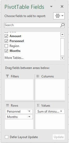
- Using Figure C as a guide, build the pivot table shown in Figure A.
Figure A
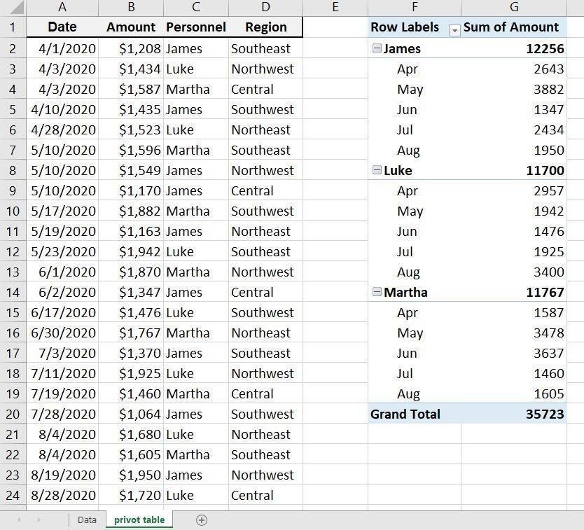
Figure B
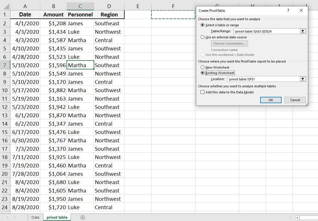
Figure C
This simple pivot table displays daily amounts for each person, summing amounts that share the same date. Because there’s a date, Excel automatically adds date components, such as month, quarter, and year. I’ve retained the default, month. The data order in the data set doesn’t matter a bit. The pivot table is a good report, as is but you might want to focus on specific information.
How to use an AutoFilter in Excel
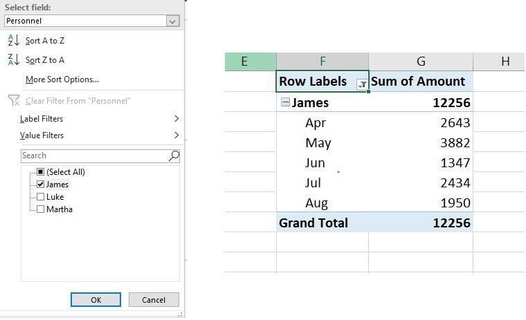
Once you build the pivot table, you can begin filtering right away using what’s already there. That dropdown list in the Row Labels cell is an AutoFilter, similar to the filter you use in a normal data set. Click it and you’ll see several options, which you’re probably already familiar with. There are a number of built-in filters, such as Contains, Does Not Contain, Equals, and so on. In this case, uncheck Select All and check James to see only the records for James (Figure D).
Figure D
You could also collapse the areas for Luke and Martha, by clicking the [-] icon to the left of their names. The difference is that their names and total amounts will still be visible. You’re only removing their details.
Using the Row Labels dropdown, you can also perform a search filter by entering an entire or partial value. For example, let’s use this feature to view all the personnel with the letter a in their names:
- Fully expand the pivot table if necessary.
- In the search control, enter the letter A (Figure E).
- Click OK.
Figure E
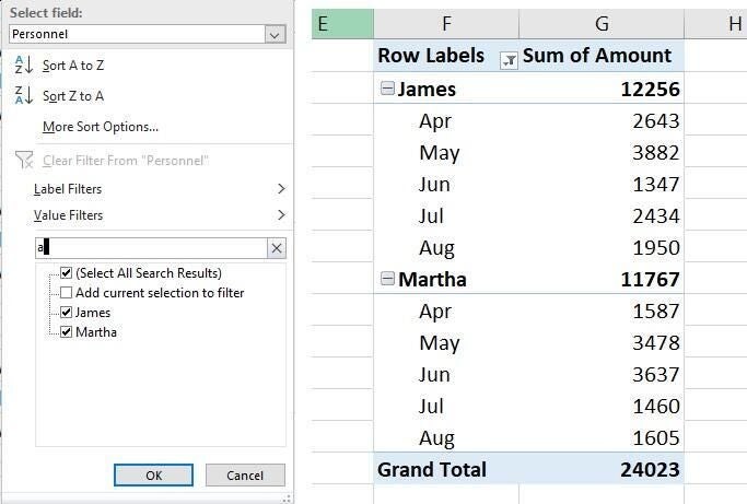
In this simple and contrived example, it’s hard to imagine performing such a search. But once you’re dealing with lots of data and different search items, you’ll be glad to know this feature exists. Notice also that the filter items at the bottom of the dialog automatically adjust for you. It’s also important to note that this time of filter doesn’t change the pivot table’s structure. This won’t be true in the next section.
These types of searches are great for a quick check, but they aren’t user-friendly. If others are manipulating the pivot table, you’ll want to add filters that are more intuitive.
How to add a filter to the interface in Excel
The dropdown and search filters are good for you, but they’re not great for others who might be viewing the information in your pivot table. Fortunately, you can add a filtering control to the interface. To illustrate, let’s add a filter for the region as follows:
- First, completely expand the pivot table, if necessary.
- Click inside the pivot table to display the field list. If it doesn’t pop up, right-click the pivot table and choose Show Field List from the bottom of the resulting submenu.
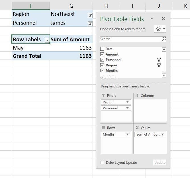
- In the field list, drag Region from the top pane to the filters area (Figure F). Excel will add a filter above the pivot table. From the dropdown, choose Northeast, and watch the pivot table update accordingly.
Figure F
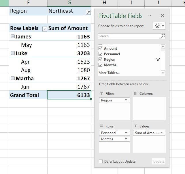
You can drag any field in the pivot table to the filters area. For instance, Figure G shows the data filtered by personnel, specifically James for the Northeast region. Notice, however, that doing so removes the personnel details from the actual pivot table. James has $1,163 for the month of May in the Northeast region. If you like, spend a little time changing filters and watch the resulting pivot table change.
Figure G