


Must-read big data coverage
- What Powers Your Databases? Take This DZone Survey Today!
- New AI Data ‘Universal Translator’ From Salesforce, Snowflake, Others
- Top Tech Conferences & Events to Add to Your Calendar in 2025
- Google Releases Data Commons MCP Server to Supercharge AI Agents
Charts are a great visual tool for sharing information; they share your data’s story with a quick glance. For Power BI, charts are everything, and there are many from which to choose. One of the easiest to create is the sparkline visual.
Power BI embeds tiny charts at the cell level in either the table or matrix visual. They’re easy to add and pack a lot of punch.
In this tutorial, I’ll show you how to add sparklines to a visual in Microsoft Power BI Desktop on a Windows 10 64-bit system. You can download the demo files for this Power BI tutorial.
What are sparklines?
Sparklines are tiny graphs that you embed into a data table. If you’re familiar with Microsoft Excel, you might have already encountered them. They’ve been around for a long time, and they’re popular because they fit into a single cell right next to the source data.
Viewers get a quick glance into trends, growth, minimum and maximum values, and so on. They’re easy to implement considering the story they tell about your data.
Choose sparklines when you want to display the details stored in a table with a chart that displays minimal information. Usually, Power BI hides the X-axis and given the space restrictions in a cell, you won’t use them for detailed analysis.
Before we create sparklines, we need data. In this example, we’ll import a simple Microsoft Excel sheet.
SEE: Microsoft Power Platform: What you need to know about it (free PDF) (TechRepublic)
How to import Excel data into Power BI
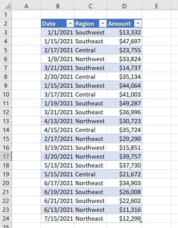
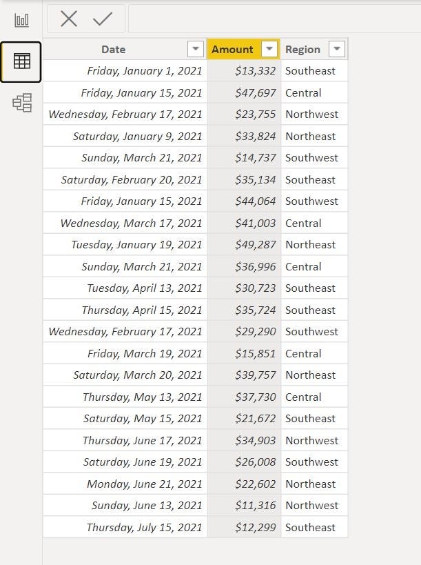
We’ll import the simple Excel sheet shown in Figure A. If you’re following along using the demonstration .xlsx file, save it to OneDrive or SharePoint and note the location.
Figure A
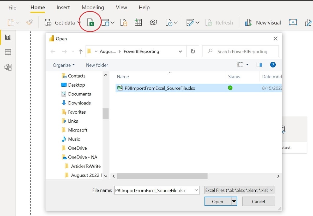
To import this data, launch Power BI as you normally do, and close the information window. In the default window, click the Excel icon next to Get Data in the menu. In the resulting Open dialog, locate the demonstration file, PBIImportFromExcel_SourceFile.xlsx (Figure B), or the file you intend to use instead.
Figure B
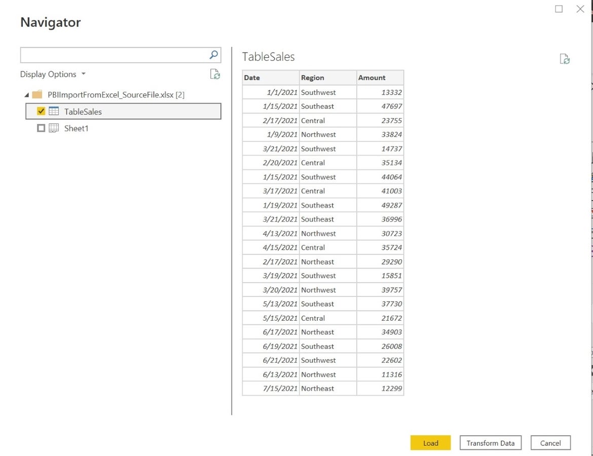
Click Open to import the data into Power BI. The Excel file has a sheet and a Table object. In the resulting Navigator, check TableSales (Figure C) and then click Load.
Figure C
With the data available in Power BI, let’s build a visual.
How to build the visual in Power BI
Power BI supports sparklines in the Table and Matrix visuals, which makes sense because Power BI embeds the tiny charts in cells.
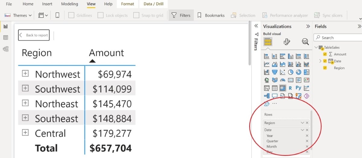
To build a simple matrix visual, choose Matrix from the Visualizations pane. Populate the matrix by dragging Region and Date to the Rows bucket, and drag Amount to the Values bucket.
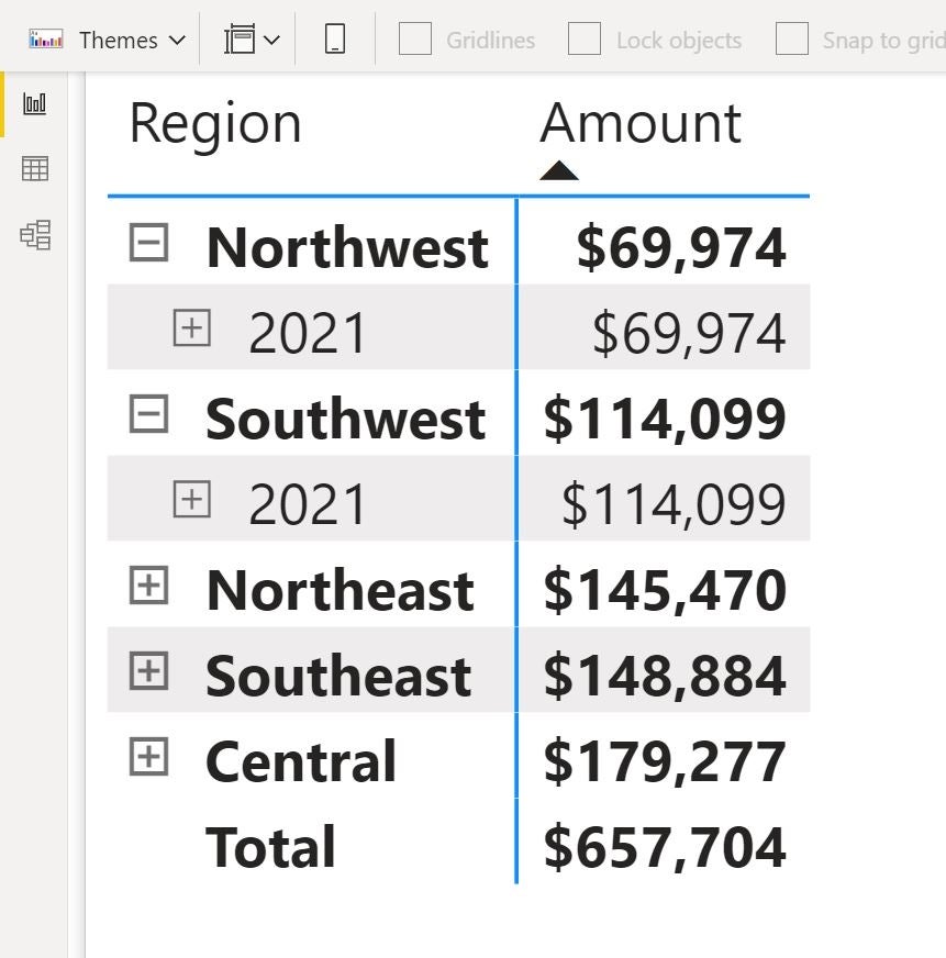
Figure D shows the resulting matrix, which requires only a bit of explanation.
Figure D
Expand any region in the matrix, and you’ll find the dates grouped for that region (Figure E). Click the plus sign to the left of a region to display the first subset, which is the year.
Figure E
Thanks to Power BI’s time intelligence and the underlying Date table that Power BI creates automatically, you have several time components for filtering.
If the Date table is unfamiliar to you, consider reading How to know if the Auto date table is adequate when using Power BI, later. It isn’t necessary to complete this article, but it is something you’ll want to learn if you’re going to use Power BI.
Continue to click the plus signs to display all the time components for a particular region, so you can see how much information is automatically in your visual. I’m also working in Focus Mode, which makes the visual more readable.
Notice that I applied the currency format to the Amount column. You can do so in the Report window, but it’s much easier in the Data window. Using the Visualizations pane, it’s a few layers deep, and once you find the options, they’re a bit confusing.
Click the Data icon to the left. In the Data window, click the Amount header and then click the Currency icon ($) in the menu. Then, click the Report icon to return to the matrix visualization.
You’ve got a simple visual, so the next step is to add the sparklines.
How to add sparklines to the visual in Power BI
With a simple matrix visual ready, adding the sparklines may seem the easiest part. To do so, make sure to select the matrix if necessary, and in the Visualizations pane, find the Values bucket, and right-click Amount (Figure F).
Figure F
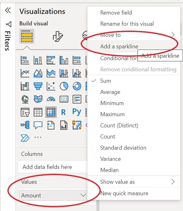
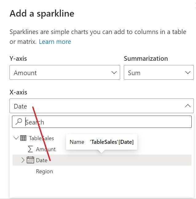
In the resulting submenu, click Add A Sparkline. In the resulting dialog, choose Date as the x-Axis (Figure G). To do so, use the dropdown and Power BI will display the table’s hierarchy, so you can choose the right field.
Figure G
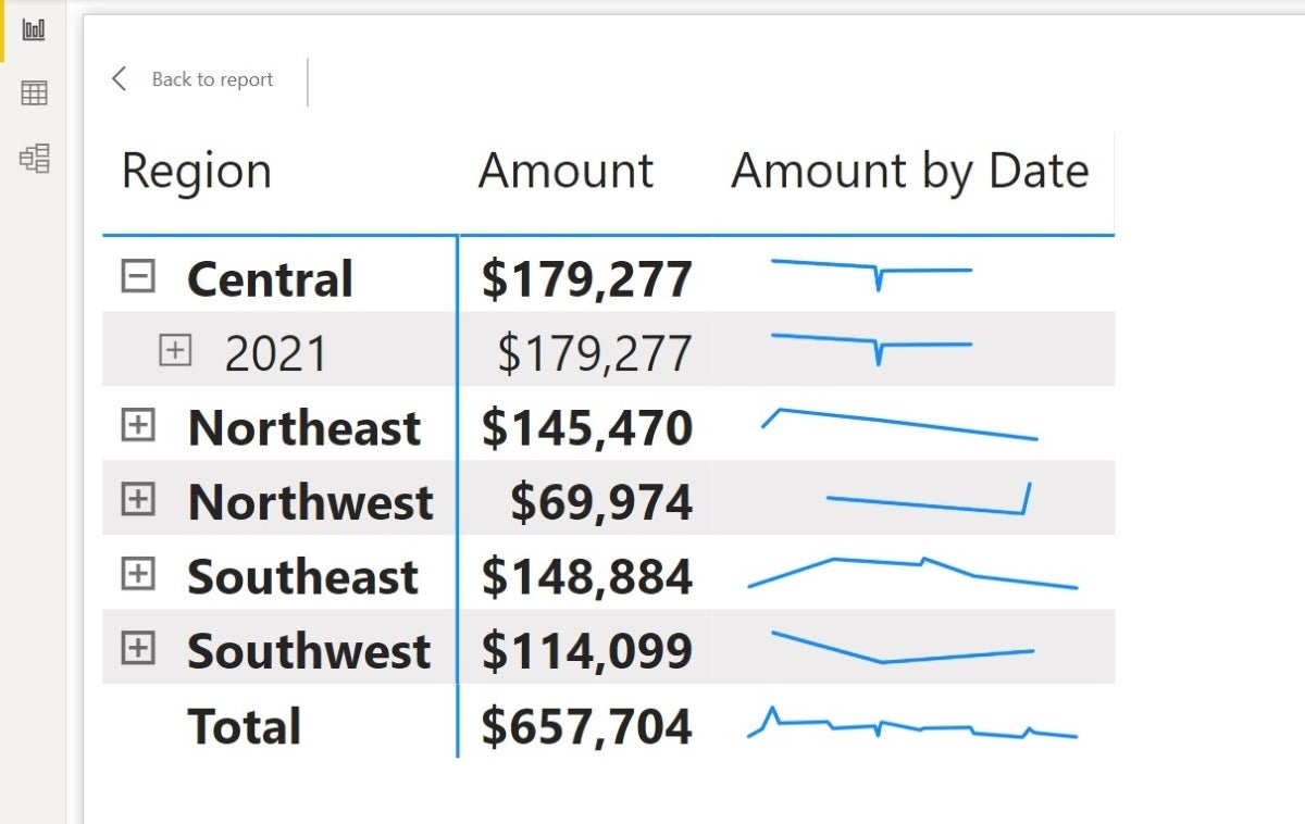
Click Create to see the sparklines shown in Figure H.
Figure H
If you’re wondering about the x-Axis choice, remember, sparklines are a time element. You’re viewing values over time. This option will always be a time/date column. The date values determine the time span.
The best place to learn more about that span is the raw data, which you can see by clicking the Data icon to the left. As you can see in Figure I, the dates begin with January 1, 2021, and continue through July 15, 2021.
Figure I
As you expose more date information, as shown in Figure J, the sparklines lose their usefulness; they have no meaning when trying to represent single date values. For this reason, you might want to remove those layers at the bucket level, unless end users might be filtering down to the individual sales amount. However, if that’s the case, I suggest you create a second visualization for that.
Figure J
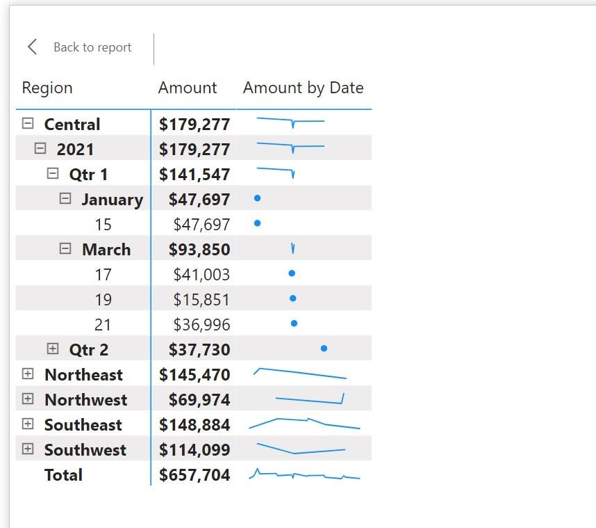
How to interpret the sparklines in Power BI
Sparklines expose information you might miss looking at a spreadsheet:
- The central region had a serious dip in sales and appears to have no sales for the end of the period. That calls for a closer look.
- Sales for the northeast region have declined over the period. Again, you will want to take a closer look at what’s happening.
- The northwest region had no sales at the beginning of the period but had a sudden surge at the end of the period.
- Southeast sales were trending up for a while but came back down.
- Southwest sales had a trend downward but appears to be recovering.
Stay tuned
We’ve successfully, and quite easily, added sparklines to a matrix visualization in Power BI. You could stop here, but stay tuned for a future article, in which I’ll show you how to improve the default results with a little formatting.