


PivotCharts and slicers go together like peanut butter and jelly — the slicer complementing the chart by allowing the viewer to filter. However, both objects take up a lot of room, which can be a problem especially if you plan to move the chart and slicer to a dashboard.
Fortunately, the solution is easy. In this tutorial, I’ll show you how to reduce a column of slicer buttons to a vertical row of buttons. Then, you can easily move those buttons onto the chart. By doing so, you have the functionality of both objects in the space of only one.
I’m using Microsoft 365 on a Windows 10 64-bit system. The slicer object is available for 365 subscribers, Excel on the web, and versions of Microsoft Excel down to 2010. You may download the demonstration file for your convenience.
SEE: Windows, Linux, and Mac commands everyone needs to know (free PDF) (TechRepublic)
How to add the PivotChart in Excel
When PivotTable and PivotChart objects were new, you had to base a PivotChart on a PivotTable. Now, Excel does that setup for you. That means you can create a PivotChart without first creating a PivotTable.
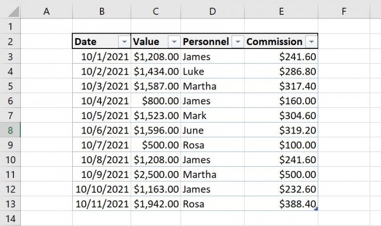
Now let’s suppose we want a PivotChart that displays the data in Figure A. The data is in a Table object named Commission. As you can see, this data tracks sales and commissions for six employees. We want to turn this data into a PivotChart that lets you filter the chart by employee: A slicer will do so nicely. However, we don’t want two different objects — the chart and the slicer. We’d rather the slicer filtering functionality be a part of the chart.
Figure A
To begin, we need to create the PivotChart as follows:
- Click the Insert tab.
- In the Charts group, click PivotChart; don’t change any of the default settings. Excel will open the empty chart frame in a new sheet (Figure B). If the PivotChart Fields list doesn’t open, click the empty frame.
- In the PivotChart Fields pane, drag Commission to the Values list.
- Drag Personnel to the Axis (Categories) list.
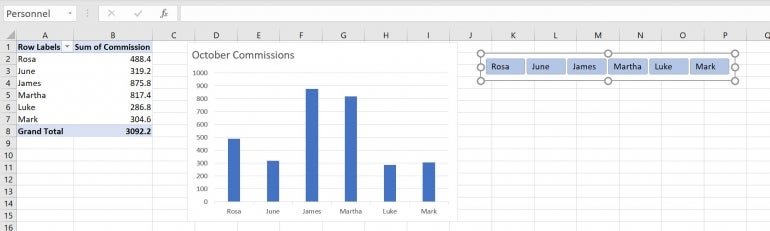
- Then, right-click Personnel in the top pane and choose Add As Slicer (Figure C).
Figure B
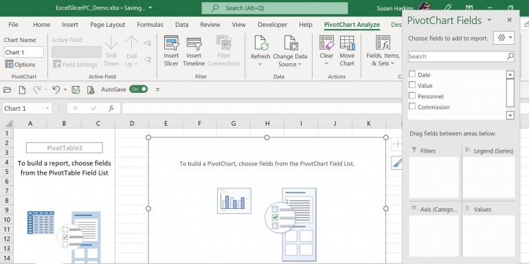
Figure C

At this point, we have a PivotTable, which Excel created for you, a PivotChart and a Slicer. You could position the two and call it quits at this point, but we want the slicer functionality to be on the chart, not a separate object.
How to add slicer buttons to the chart in Excel
Must-read Windows coverage
- CrowdStrike Outage Disrupts Microsoft Systems Worldwide
- 10 Best Project Management Software for Windows in 2024
- Windows 10 Extended Security Updates Promised for Small Businesses and Home Users
- Securing Windows Policy
A slicer is an interactive object that displays buttons that you click to filter data in tables, PivotTables and PivotCharts. By default, a slicer displays a lot of information: A filtering button for each unique value in the category, a Clear Filter button and a scroll bar that enables scrolling when items aren’t visible in the slicer.
If you think moving such a busy object onto a chart is going to create a mess, don’t worry. You can reformat the slicer to show only the buttons in a vertical row. First, let’s clean up the chart a bit to make room for the slicer buttons:
- Enter a new title: October Commissions. Move it to the left margin.
- Delete the Legend.
- Hide the Sum of Commission and Personnel buttons as follows: In the PivotChart Fields list, select Sum of Commission in the Values list and choose Hide All Field Buttons on Chart (Figure D).
Figure D

Now let’s convert the slicer object into a series of buttons that we can move onto the chart as follows:
- Select the slicer.
- In the buttons group, change the Columns setting from the default 1 to 6 — there are six buttons (six employees).
- Increase the width until you can see the names on all six buttons.
- Click Slicer Settings in the Slicer group.
- In the resulting dialog, uncheck the Display Header in the Header section. Now the slicer is one simple row of six buttons (Figure E).
Figure E
The chart isn’t quite big enough for the row of six slicer buttons. You can increase the size of the chart a bit, but the buttons will still obscure the title.
In this situation, you can move the title out of the chart and into a cell above the chart. You can’t move the title; you must delete the title in the chart and then enter the text above the chart. You then have room for the buttons, as shown in Figure F.
Figure F
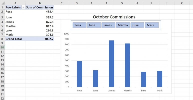
Simply click the buttons to filter the connected PivotChart. Clicking a button will remove the column for that person. To use multiple buttons in one filter, hold down the Ctrl key while clicking buttons.
I’ve left the chart in the same sheet with the PivotTable. Most likely, you’ll want to move it to a dashboard.