


A people chart is an infographic, which leads me to a second definition. An infographic tells a story, visually. Its purpose is to inform and educate, but in the business world, it’s often used to build brand awareness. If you’re like me though, buzz words drive you a bit nutty. So, in Susan’s world an infographic is a chart filled with related images. A people chart uses icon-type images of people; hence people chart. They’re much more fun than the more traditional column or line charts, and viewers grasp the information or story with a quick glance. In this article, I’ll show you how to create a Microsoft Excel people chart.
SEE: Windows 11: Tips on installation, security and more (free PDF) (TechRepublic)
Must-read Windows coverage
- CrowdStrike Outage Disrupts Microsoft Systems Worldwide
- 10 Best Project Management Software for Windows in 2024
- Windows 10 Extended Security Updates Promised for Small Businesses and Home Users
- Securing Windows Policy
I’m using Microsoft 365 on a Windows 10 64-bit system, but you can use an earlier .xlsx format versions back to 2013 and Excel for the web. I recommend that you hold off on upgrading to Windows 11 until all the kinks are worked out. For your convenience, you can download the demonstration .xlsx file. The menu version, .xls, doesn’t support people charts.
People Graph is an Excel add-in
Excel supports the people chart, but not directly. It’s an add-in that you’ll retrieve from the Microsoft store every time you need one. Before you start, I recommend that you reduce the zoom. The chart is large and unless you reduce the zoom, you will find it hard to work with the chart. Now, to insert one now, do the following:
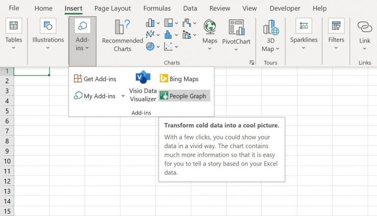
- Click the Insert tab.
- Click the Add-ins dropdown and choose People Graph (Figure A). The terms graph and chart aren’t truly interchangeable, but the product name uses graph. I’ll be using chart, which is a graphical representation of the data. All graphs are charts; not all charts are graphs. The key difference here is that a graph represents relationships between the data. Our people chart could be either, so I’m going with chart.
Figure A
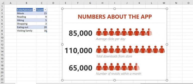
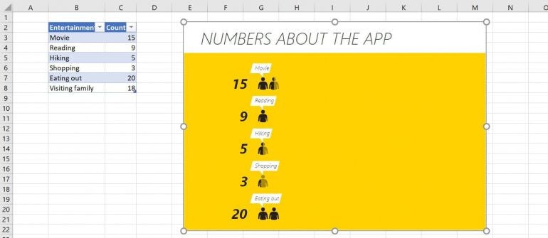
To populate an Excel people chart, you need some data. Figure B shows a simple data set along with the dummy chart. Click the Trust This Add-in button to get started, which will populate the empty chart frame with dummy data.
Figure B
How to connect the Excel data to the chart
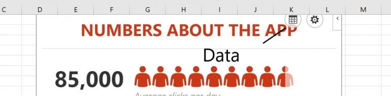
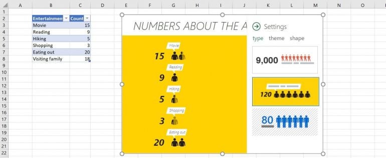
At this point, you’re ready to connect the chart to real data. Click the dummy chart and then click the Data icon shown in Figure C.
Figure C
The gear icon to the right will access settings. Click the Select Your Data option and select the data, the entertainment survey table shown in Figure B, and click Create. I don’t know of any way to connect the dummy chart to data on another sheet. It looks like the dummy chart must be in the same sheet as the data set.
Within seconds, you’ve created the people chart shown in Figure D. Fortunately, you can customize the chart a bit if you don’t care for the original design.
Figure D
How to customize Excel’s people chart
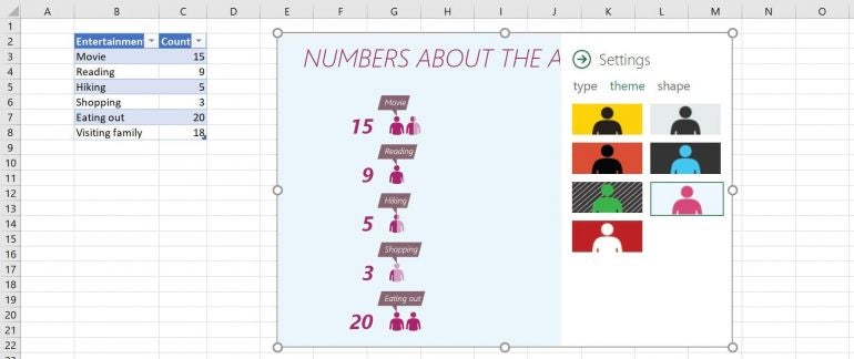
The original settings are adequate, but you might want to customize the chart a bit. First to consider is the chart type. There are three, and to access them, click the Settings icon (the gear icon shown in Figure D) and choose Type. The three defined chart types are shown in Figure E.
Figure E
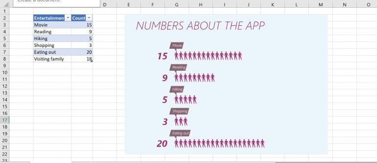
After choosing the type, choose Theme; there are seven. I like the little conversation blubs of the second chart type, but I don’t care for the orange background, so I chose the last theme, the red people on a white/gray background, as shown in Figure F.
Figure F
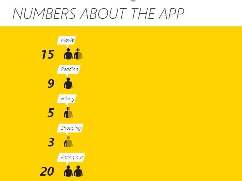
The last, or third setting, lets us change the shape of the people. There are 16! I selected the third, which looks like a person “on the go” to better define the entertainment topic. Close the settings pane to see the finished chart sown in Figure G.
Figure G
Worth noting
If you use a table object to store the source data, the people chart will update automatically when you update the source data. The people chart can be an interesting part of a dashboard. It’s quick and easy to create and really changes the mood—it’s much more interesting that a traditional column or line chart, and the story is easy to discern, which just a quick glance.