
Image: Aajan/iStock/Getty Images Plus
Most of us use Microsoft Excel to analyze data—what’s the total, who’s performing best, which invoices are outstanding and so on. That’s what Excel does–it turns data into information we can use. Now that Analyze Data is available, on-the-fly information is just a few clicks away.
In this article, we’ll review Excel’s Analyze Data feature, how to use it most efficiently, and then work through a few examples that will display charts and even PivotTables that analyze your data, almost instantly. You can even ask questions using natural language!
SEE: 83 Excel tips every user should master (TechRepublic)
I’m using Microsoft 365 on a Windows 10 64-bit system. Currently, only Microsoft 365 and Excel for the Web support Analyze Data. You can work with your own data or download the demonstration .xlsx file.
What is Analyze Data in Microsoft Excel?
Excel’s Analyze Data feature offers a lot of information with a quick click. In a nutshell, you click inside the data and then click Analyze Data in the Analysis group on the Home tab. Excel opens the Analyze Data pane, which will display several different visual interpretations of the data, such as totals, averages, rank, trend and so on. If you like something, you can add it to your sheet (or dashboard sheet). This feature will also display a few natural language questions that you might want to pursue. Or you can enter a question yourself.
This feature goes well beyond the Quick Analysis tool that was added a few years ago. If you’re not familiar with this feature, select two or more cells anywhere in the data set and then click the tool at the bottom-right of the selection. In the resulting dialog shown in Figure A, click any of the possible evaluation possibilities. It’s quite simple, but it isn’t as powerful as Analyze Data.
Figure A
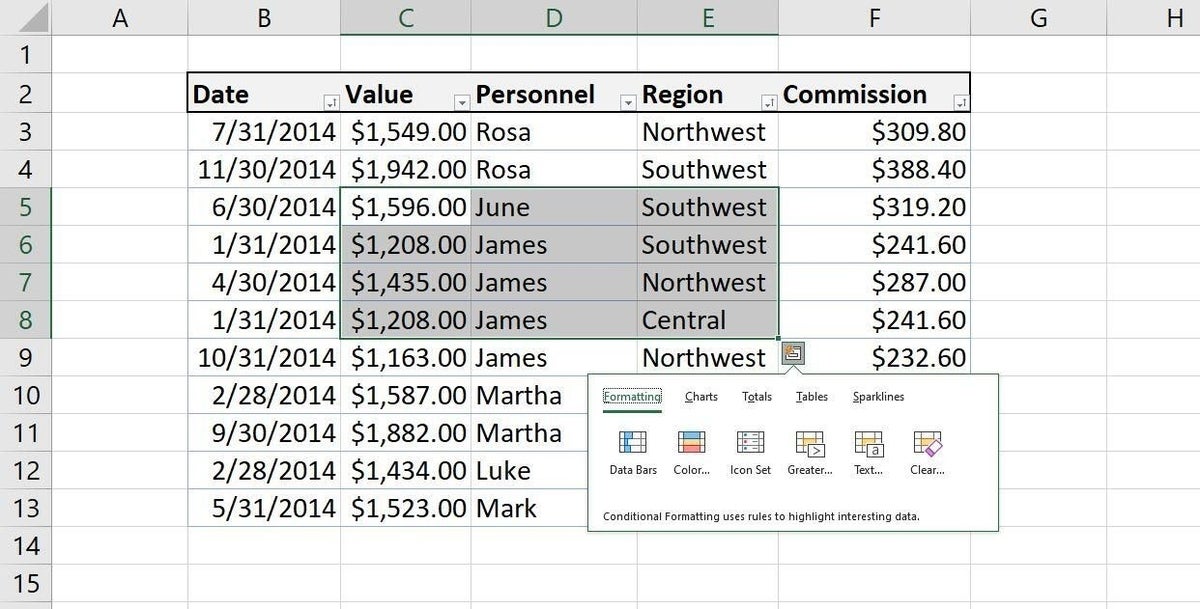
To compare Quick Analysis to Analyze Data, make the same selection and then click Analyze Data on the Home tab. As you can see in Figure B, this feature goes well beyond Quick Analysis and perhaps the most interesting option is that you can enter a natural language question. (This option is currently available in English; other languages will be supported gradually.)
Figure B
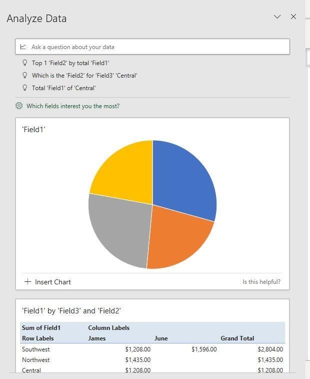
You can’t see all the available charts in the figure, but if you’re following along, you’ll find at least four charts that analyze the selected data in the most logical ways. Because the selection is a subset, Analyze Data refers to the three selected columns as Field1, Field2, and Field3. The first two charts provide a hint about the underlying data:
- The two largest values are fairly close.
- June has no sales for the Northwest and Central regions (for the selected subset).
- James has a substantially higher total than June (for the selected subset).
However, without traditional data labels and legends, some of the charts might need a bit of interpretation on your part. Fortunately, you can insert a chart in a sheet and modify it as you would any other chart. Doing so might be quicker and easier than starting from scratch.
Now that you’ve had a quick look at the feature, there are several guidelines that when followed, will return the best results from this feature:
- Format your data as a Table object. (Click anywhere inside the data range and press Ctrl + T.)
- Header text should be a single row of unique labels for each column. (Avoid merged cells.)
- Analyze Data doesn’t support datasets over 1.5 million cells. That won’t be an issue for most of us, but if you’re that one, you need to know.
- Analyze Data doesn’t interpret dates formatted as strings. You must convert these strings into valid Excel data types.
Now, let’s see what the feature does with the full data set.
How to use Analyze Data in Excel
Now that you know a bit about the feature, let’s put it to work. Select the entire Table and then click Analyze Data. Figure C shows the first few results; there are three questions at the top and four charts. The first chart shows the total commission and value for each region; the second breaks down the values by personnel. The frequency chart probably isn’t helpful but the fourth, interestingly, shows a correlation between the values and the commission, as it should because each commission is 20% of the corresponding value.
Figure C
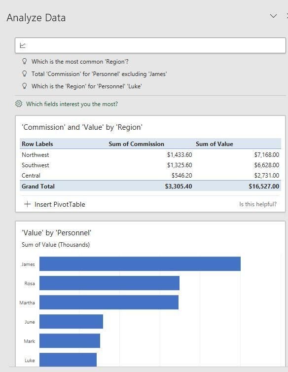
At the very top, there are three natural language questions based on the data. Click inside the control and you’ll see that there are actually several questions. Click any of them to see the appropriate visual. For example, Figure D shows commissions by region. This list of questions updates along the way so it’s easy to lose a question.
Figure D
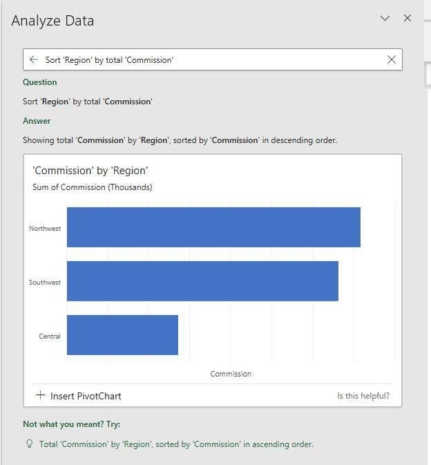
Not only does the feature present the question, but it determines the most appropriate visual. For instance, the visual for this question is a bar chart, displaying commissions in descending order. If that’s not exactly what you were hoping for, always check near the bottom for alternatives.
To return to the original pane, click the back arrow to the left of the question. In that pane, you’ll see the original visuals. The PivotTable shows the total commissions and value for each region. The following bar chart sums values by personnel … and so on. Depending on the data set, you might end up with several charts.
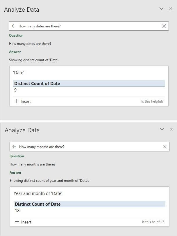
Now, let’s return to the top to look at the natural language question option. There are more questions, just click inside and you’ll that list of three questions expand. If the question you want to ask isn’t in that list, you can ask it yourself. It might take a while to get the hang of this option because it won’t always return what you expected. For example, ask the question: How many dates are there? Figure E shows the correct result: there are nine distinct dates. Next, ask this question: How many months are there? The answer is correct according to Analyze Data, but it isn’t the expected answer. If you had a column of months, the feature would return the expected answer.
Figure E
Let’s try a few more reasonable questions. Figure F shows the result of Top 3 commission. You could also try Bottom 3 commission, Top 3 region, or Top region. The result of a bit more difficult question, Percentage of Northwest, is shown in Figure G. The northwest region accounts for almost half of all sales.
Figure F

Figure G

We’ve looked at the basics and with a little exploration, you should be able to put this feature to good use. But there’s one more option you should know about. In the first pane, notice the little gear and the question, Which fields interest you the most? By clicking it, you can focus on specific data. Figure H shows a field list. In our data set, removing a column (field) doesn’t make much sense, but that won’t always be the case. The Summarize Value By option lets you change the setting. Three are available:
- Not a Value
- Sum
- Average
Figure H
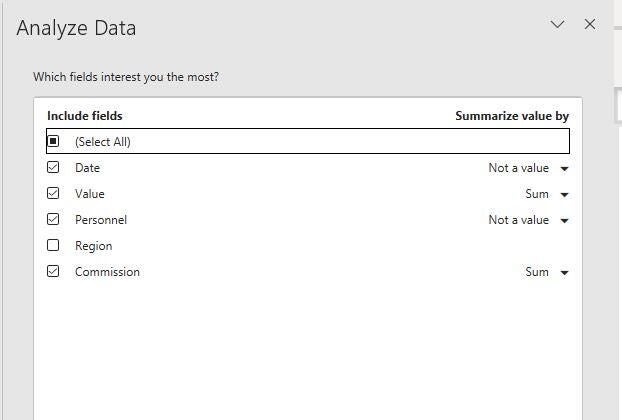
The option, Not a Value, shows up when the data set contains data that isn’t summed or averaged, such as dates. You can sort by dates, but you wouldn’t sum or average them. Analyze Data will use these values as row labels when used with other fields. When this field is used by itself, Analyze Data returns a unique count.
Excel’s Analyze Data returns a lot of great information considering how easy it is to implement and use. Learning how to ask questions is the most challenging feature, but that will get easier with experience.


