
Slicers and filters are great tools for the Power BI end user, but they’re a bit limited. You can’t add just any column to a slicer or filter and then take up space, so what alternatives are available?
In 2022, Power BI added parameters, which let designers combine columns from different tables and columns that aren’t part of the original visual. That means you can use one parameter instead of several slicers to give users a similar experience.
SEE: Hiring kit: Microsoft Power BI developer (TechRepublic Premium)
In this tutorial, I’ll show you how to add a field parameter to a Power BI visual. We’ll compare it to a limited slicer so you can clearly see the advantages of using parameters. For this tutorial, I’m using Power BI on a Windows 10 64-bit system. The demonstration file is from AdventureWorks and can be downloaded from GitHub here.
Jump to:
- How to enable the field parameter feature
- How to create the visual
- How to create a field parameter
- How to implement the parameter
- How to use the parameter slicers
- Final considerations for Power BI users
How to enable the field parameter feature
Technically, a parameter is something you pass — usually a value passed to a snippet of code. It’s similar in Power BI, but you’re passing a value to a visual.
Parameters are similar to slicers and filters, allowing the end user to update a Power BI visual. However, they’re more robust, because the end user is dynamically changing the underlying columns even if they’re not part of the visual.
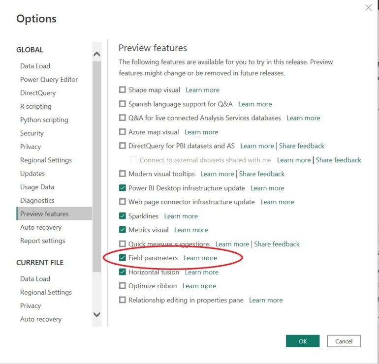
Before you can create a parameter, you must enable the feature. Fortunately, doing so is easy. After opening the Power BI file (.pbix), do the following:
- Click the File tab.
- Choose Options and Settings from the left pane.
- Choose Options.
- Choose Preview Features.
- Check the Field Parameters option (Figure A).
Figure A
- Click OK. This will not work if you skip this step.
How to create the visual
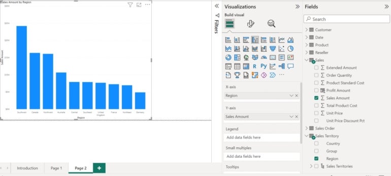
Power BI offers two types of parameters: Fields and Numeric Range. We’re going to create a Fields parameter that lets the end user update the visual shown in Figure B, which is based on the region and sales amounts in AdventureWorks.
Figure B
To build the visual, do the following:
- Click Clustered Column Chart in the Visualizations pane.
- Using the Fields pane, expand the Sales table and check Sales Amount.
- Expand the Sales Territory table and check Region.
Updating the visual with slicers
Now, let’s suppose the end user wants to update this visual by product category and country. Let’s try a slicer first:
- If the visual is selected, click somewhere outside that visual to remove the selection.
- In the Visualizations pane, click Slicer.
- Expand the Sales Territory table, if necessary.
- Check Country (Figure C).
Figure C
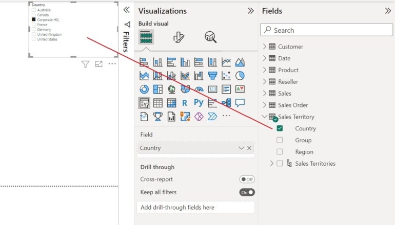
The slicer works fine, but now it’s time to add a second one for the product category:
- If the visual is selected, click somewhere outside that visual to remove the selection.
- In the Visualizations pane, click Slicer.
- Expand the Product table and check Category.
Both slicers work as expected, but your use case requires two. Why not use one parameter instead?
How to create a field parameter
It isn’t necessary to add two slicers to the visual. A single parameter can do the job, reducing the amount of area used. In this simple example, it doesn’t seem necessary, but in a busy dashboard, you and the end user may both benefit from the streamlined operations of a parameter.
Now, let’s build a field parameter that updates by category and country:
- Click the Modeling tab.
- Click the New Parameter dropdown.
- Choose Fields from the dropdown.
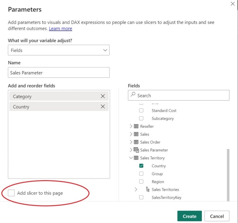
- In the resulting dialog, Power BI sets the first option to Fields and names the parameter. Rename it to Sales Parameter — when working with your own data, you’ll want to use a meaningful name.
- On the right, expand the Product table and check Category.
- Expand the Sales Territory table and check Country.
- Uncheck the Add Slicer To This Page option (Figure D).
Figure D
- Click Create.
Power BI adds the field parameter to the Fields pane, as you can see in Figure E. You can also see the DAX code used to create the parameter. If needed, you can modify this code to update the parameter.
Figure E
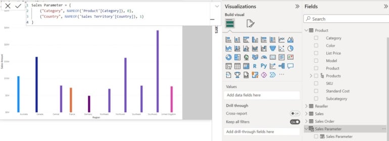
With the parameter added to the Fields pane, you can now add the parameter to the visual.
How to implement the parameter
Parameters are added to reports as slicers with the following steps:
- If the column visual is selected, click anywhere outside the visual to unselect it.
- In the Visualizations pane, click Slicer.
- In the Fields pane, expand the Sales Parameter.
- Check the Sales Parameter column to add it to the slicer visual.
Now that the parameter is in the Fields pane, you can add it to the visual as follows:
- Select the column visual.
- Drag the Sales Parameter column to the X-axis bucket (Figure F).
Figure F
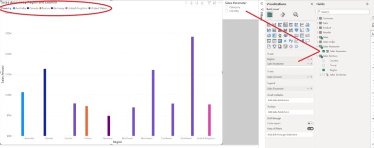
Before we try the parameter, there are a few things you should notice. By adding the parameter to the chart, you have updated the visual a bit. In addition, Power BI has added a new legend to the visual, based on the parameter. It updates with the X-axis because that’s the bucket the parameter is in.
How to use the parameter slicers
Using the parameter slicer is easy because you use them the same way you would use a traditional slicer. Simply click either Category or Country in the slicer. From there, you can quickly add a new dimension to the original visual.
Figure G shows the visual after you’ve checked Category. The column colors coordinate with the new legend: Bikes make the most revenue in all regions, and accessories are the items making the least.
Figure G
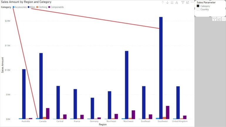
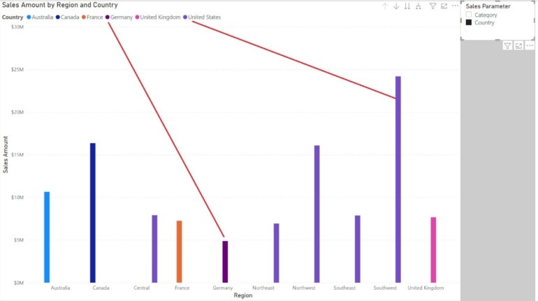
Figure H shows sales by country: The Southwest region brings in the most revenue. By using the legend, you can see that the region is in the United States.
Figure H
Final considerations for Power BI users
One thing we didn’t discuss is the relationships between tables. Using a parameter to combine columns from different tables is impossible if there’s no relationship to support them. This is probably in place, but if you can’t create the visual or a parameter to update it, look at the relationships. If this is a new Power BI file, it’s possible that you’ll need to create relationships between the tables in question.
SEE: Hiring Kit: Database engineer (TechRepublic Premium)
The more options the end user has to control visuals, the better. Designers can offer those opportunities by including the right type of filtering feature. Slicers are fine, but parameters are a better solution when you’re working with a busy dashboard.
Read next: Best business intelligence tools (TechRepublic)


