


Image: Andrey Popov, Getty Images/iStockphoto
Charts are a great visual tool for sharing information quickly–a glance, and the point is made. Unfortunately, even with Excel’s flexible built-in tools, creating meaningful charts can be a bit time-consuming. That’s where in-cell charts, such as sparklines come in handy. With a few quick clicks, you can embed a chart adjacent to the data. To further enhance and even influence readability, you can apply a few simple formats–all click choices. No angst, just clicks. In this article, I’ll show you how to create sparklines and tweak them to improve their impact.
More about Software
- Software Installation Policy
- Five Methods to Insert a Checkmark Into Microsoft Office Products
- How to Hide and Handle Zero Values in an Excel Chart
- How to Use Section Breaks to Control Formatting in Word
I’m using Office 365 Excel (desktop) on a Windows 10 64-bit system, but this feature is available in Excel 2010 and 2013. You can work with your own data or download the demonstration .xlsx file. You can display sparklines in the browser, but you can’t create or modify them.
SEE: System update policy template download (Tech Pro Research)
https://www.zdnet.com/article/microsoft-office-365-for-business-everything-you-need-to-know/
Easy visuals
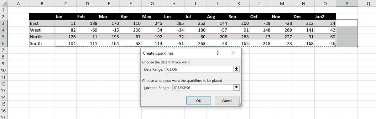
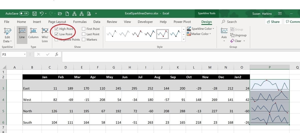
Besides their visual impact, sparklines are easy to embed: Select a column adjacent to the data, click the Insert tab, and then click an option in the Sparklines group. Done. Almost instantly, you have a visual representation that tells the data’s story quicker than the data itself. Let’s work through a quick example using the data in Figure A:
- Select adjacent cells–in this case, that’s P3:P6.
- Click the Insert tab and then click Line in the Sparklines group.
- In the resulting dialog, identify the data range, C3:06.
- Click OK.
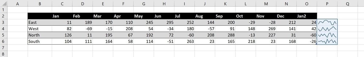
As you can see in Figure B, embedding a simple trend line for each region required only a few clicks. You can stop here, but with only a little effort, you can improve on the default lines.
Fudge… a bit
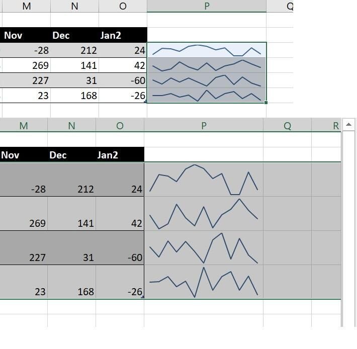
The easiest way to format the embedded lines requires no format at all: Simply adjust the width of the column and/or the height of the row. Figure C shows a few examples. A trendline shows progress over a specific time period, and it’s similar to the line option we just used. By changing the width or height, we can change the perspective. For instance, by changing the width, the trend seems a bit less severe than the original line suggested. By changing the height of the row, we reclaim a bit of that severity. You’re not cheating, but this is one way to influence the overall picture.
Just how low is that dip?
As is, the lines still lack an anchor. Just how high is high and how low is low? There’s no legend. Adding an axis as follows will help:
- Select the embedded sparklines (P3:P6).
- Click the Design tab.
- In the Group group, click the Axis option and choose Show Axis. (Figure D).
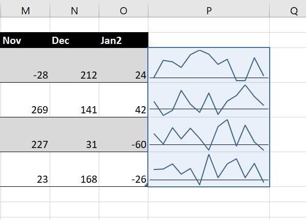
The axis indicates 0, so some of the dips mean more than a loss–they indicate a deficiency. You’d not know that without the axis. At this point, you might want to change the width and height again to see how it changes the perspective with the axis. You could stop right here, but markers can help draw attention to specific points.
Markers
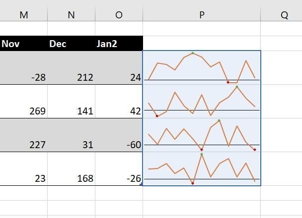
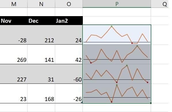
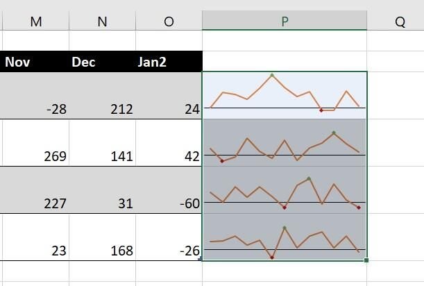
This feature offers a number of marker options. You can add a marker to every point, but in this case, the high and low points might be more effective. To add these markers, select the sparklines and click High Point and Low Point in the Show group on the Design tab. Figure E shows the results.
An axis clarifies which points are negative, and a red marker makes sense for those markers. You can, however, change the high point marker to green using the Marker Color option in the Style group. However, the green marker doesn’t show as well. The answer is to change the line color using the Sparkline Color option in the Style group. Figure F shows a very different line. (There are two low markers for the North because the lowest value, -60, occurs twice.)
Even things up
You can do a lot to influence the perspective by formatting the lines, points, and markers. But there’s one option that might not jump out at you, especially with the current example. The high point values are close in range, so let’s mix things up a bit. Change the value in H3 to 400 and the value in H6 to -100. If you expected the high and low points to be a bit more distinguishable from the other sets, you might be disappointed.
Sparklines, by default, don’t use the same scale within the same set. So, -69 and -100 appear to occur in the same general area below the axis. Similarly, 400, 269, 288, and 263 all seem to be along the same horizontal line as well, as you can see in Figure G.
Fortunately, there’s an easy fix for this. Select the sparklines and choose Same for all Sparklines from the Axis dropdown (in the Group group on the Insert tab) in the second section. Then, choose Same for all Sparklines from the third section. In our example, the difference, shown in Figure H is subtle, but it’s there.
There are a number of formatting options and for the most part, they’re self-explanatory. Spend a little time exploring until you’re familiar with them. Also take a look at the other two sparklines: column and win/loss.
Send me your question about Office
I answer readers’ questions when I can, but there’s no guarantee. Don’t send files unless requested; initial requests for help that arrive with attached files will be deleted unread. You can send screenshots of your data to help clarify your question. When contacting me, be as specific as possible. For example, “Please troubleshoot my workbook and fix what’s wrong” probably won’t get a response, but “Can you tell me why this formula isn’t returning the expected results?” might. Please mention the app and version that you’re using. I’m not reimbursed by TechRepublic for my time or expertise when helping readers, nor do I ask for a fee from readers I help. You can contact me at susansalesharkins@gmail.com.
See also
- Office Q&A: Disappearing macro buttons and mysterious character conversion (TechRepublic)
- How to use basic PowerPoint skills to make pictures fit (TechRepublic)
- Excel tip: Three cell formats that will make header text fit (TechRepublic)
- How to use Word mail-merge (TechRepublic)
- Office Q&A: How to use a macro to set Find defaults (TechRepublic)
- 20 pro tips to make Windows 10 work the way you want (TechRepublic download)
- Microsoft Office 365 for business: Everything you need to know (ZDNet)
- It takes work to keep your data private online. These apps can help (CNET)
- Programming languages and developer career resources coverage (TechRepublic on Flipboard)