


Image: Paul Barnwell/Shutterstock
Must-read Windows coverage
- CrowdStrike Outage Disrupts Microsoft Systems Worldwide
- 10 Best Project Management Software for Windows in 2024
- Windows 10 Extended Security Updates Promised for Small Businesses and Home Users
- Securing Windows Policy
Sparklines in Microsoft Excel are charts—tiny little charts that display inline with the data because they fit into a cell, usually adjacent to the data they’re evaluating. With a quick glance, not only can you learn about a single entity, but you can compare that entity to others. They’re great in dashboards, but their real strength is in their simplicity. They are super easy to implement; you get a lot for little effort. Sparklines chart numeric data as you might expect. They can handle non-numeric data when it creeps in, but viewers might not understand how the sparklines represent those values. In this article, I’ll show you how sparklines handle non-numeric data and a few fixes for those instances.
SEE: 83 Excel tips every user should master (TechRepublic)
I’m using Microsoft 365 Excel (desktop) on a Windows 10 64-bit system, but this feature is available back to Excel 2010. You can work with your own data or download the demonstration .xlsx file. You can display sparklines in the browser, but you can’t create or modify them. This article assumes you have basic Excel skills, but even a beginner should be able to follow the instructions to success.
If you’re not familiar with sparklines, you might want to read How to turn ordinary sparklines into meaningful information with a few simple formats. You’ll learn how to create and format them.
How sparklines plot values in Excel
Sparklines evaluate numerical data and as we all know (all too well), sometimes there are other values other than non-numeric. We don’t always expect them, so we fail to plan for them. In this case, there should probably be no non-numeric values in your data set. My advice before you even start, is to clean up your data, but that’s not always practical. When you can’t work with a pristine data set, you need to know how sparklines handle values other than numbers:
- A complete set of numeric values creates a connected line with a data point at each value.
- An error value is ignored (no data point).
- Blanks leave gaps in the sparkline.
- Zero values are plotted.
- Data in hidden rows or columns are ignored, but you can reset that default option.
Now, let’s see these rules in place.
When non-numeric values are part of the data set, sparklines will represent them in various ways. Figure A shows a simple data set with blanks, zeros and errors. As you can see, the sparklines don’t show any kind of alerting error, and viewers probably won’t understand what they see. (What I think odd is that the sparkline in H5 plots the text in C5 at 0; I would expect the sparkline to ignore the text value by leaving a gap.)
Figure A
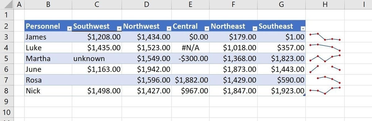
Let’s take a look at each record:
- James chart is fine; all evaluated values are numeric.
- Luke has an error, which the sparkline ignores. You can tell because there’s no marker. If markers aren’t enabled, you might miss that completely. To see markers, click the Sparkline tab and check the option.
- Martha has text in the first cell, which the sparkline plots as 0. For me, this is the only failing for this feature. To be consistent, the sparkline should ignore it.
- The empty cell for June is completely ignored; the sparkline doesn’t even connect the lines!
- Rosa’s empty cell is also ignored, but because it’s at the beginning of the line, you might not notice it, especially if there aren’t other sparklines.
- Like James, Nick’s sparkline is in tact because all of his values are numeric.
SEE: Windows 10: Lists of vocal commands for speech recognition and dictation (free PDF) (TechRepublic)
If you don’t know how to create the sparklines, do the following:
- Select H3:H8, the location of the sparklines. Alternatively, you don’t have to select the range before; you can do so later. It’s only a choice.
- Click the Insert tab and click Line in the Sparklines group.
- In the resulting dialog, specify the value range and the location range (H3:H8).
- Click OK.
That’s it! If you don’t like the way sparklines plot these non-numeric values, you have options.
Changing default settings
If you don’t like the way the sparklines plot non-numeric values by default, you can revamp the data.
First, let’s deal with the blanks. If you really don’t know the value, 0 seems appropriate enough. It isn’t the same thing a a true blank, but as a general rule, it’s better than leaving the cells blank. To make this change quickly, do the following:
- Select the range, C3:G8.
- Click F5 and then click Special in the resulting dialog.
- In the next dialog, click the Blanks option (Figure B).
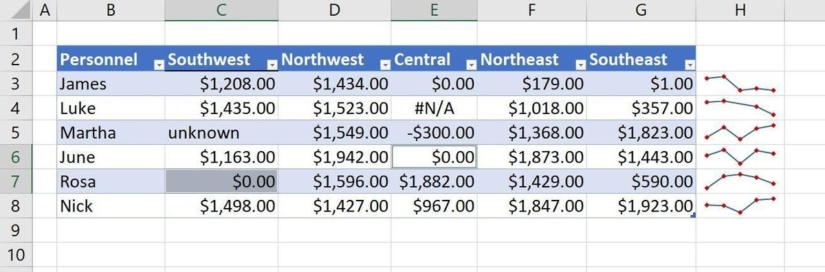
- Click OK and immediately enter a 0.
- Without clicking or pressing anything else, press Ctrl + Enter to enter 0 in all blank cells in the selected range (Figure C). As you can see, the blank cells now contain 0 and the sparklines plot them.
In such a simple data set, you could easily enter the 0s manually, but that won’t always be the case.
Figure B
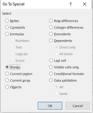
Figure C
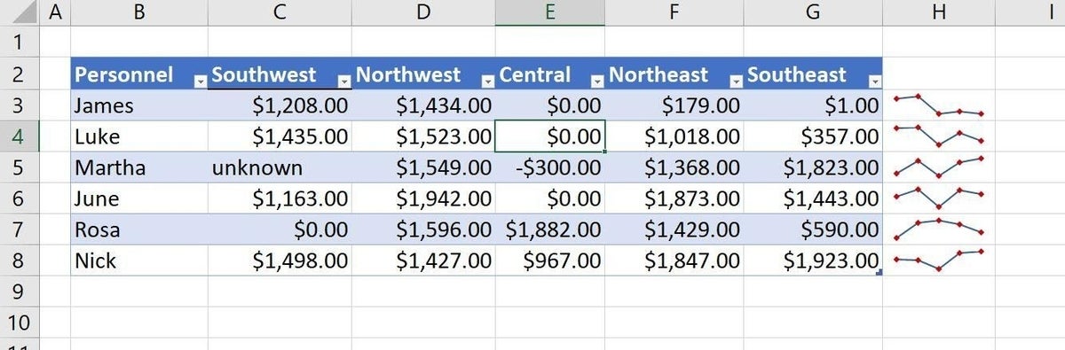
Next, let’s deal with the #N/A value. It’s really a manually entered #N/A error value. But the best way to deal with it is to fix the error. In this contrived example of course, there is no fix. Simply replace it with a valid numeric value, even 0. Any value will do, but Figure D shows a replacement value of 0.
Figure D
To find all error values, use the Go To Special feature again. Look for the Formulas option, and select Errors.
At this point, you could stop. All the sparklines are plotting all the values, including the text value in C5, which the feature plots at 0. However, the text value is incorrect in most any setting. Because we’re not dealing with null values as a legitimate value, it would be best to enter 0 than leave the text—in my opinion—unless you have a good reason to leave it. If you do, be forewarned that doing so might result in erroneous results in functions and expressions.
Stay tuned
There’s more than one way to find error values in a data set, and in an upcoming article, we’ll review them.